Google Sheets is getting a bit more powerful today in its battle to take on Excel thanks to a slew of updates.
Now you can add data labels to display the exact value for bars or points on a graph. You can also change the shapes of your data points – stars, triangles, pentagons and more are available to pretty up your document and differentiate different lines.
When you input formula, Sheets will now automatically preview results instantly as you type – Google says it’s particularly useful for catching errors quickly.
You can also filter rows and columns by conditions such as “greater than”and “text contains,” while pivot tables now allow you to add calculated fields to apply formulas to your data. A GETPIVOTDATA function also makes it easier to retrieve data from your tables.
A big part of Google Docs is the ability to collaborate with users, but that has it’s consequences too. Previously, your choices were pretty black and white; either you allow someone to collaborate or you deny them access.
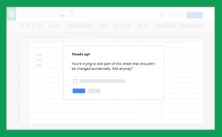
Now you can also add a warning to prompt users before they make changes to a cell – useful to prevent accidental mistakes.
The updated sheets is rolling out to everyone today.
➤ Google Sheets: Do more with your data [Google Docs Blog]
Get the TNW newsletter
Get the most important tech news in your inbox each week.