You would’ve been forgiven for thinking Google Alerts were a thing of the past, but back in January the internet giant gave the popular notifications service a significant lick of paint, representing its first notable upgrade in a while.
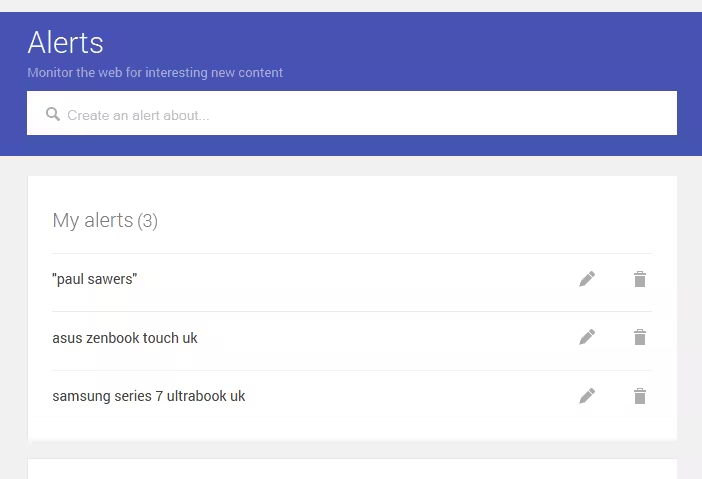
But now, Google Alerts has been given what could be described as its biggest aesthetic overhaul yet. The first thing you see when you access the page is a giant search box followed by your current alerts, which can be deleted or edited on the spot.
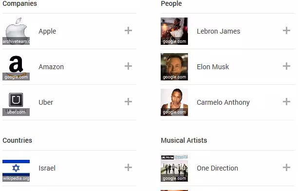
You’ll also now see a list of suggested alerts directly below this, covering everything from companies and people to countries and musicians.
It’s definitely a lot cleaner looking, and it’s clear that this is being geared towards discoverability with a more general audience, though perhaps those with a need for Google Alerts were perfectly fine with the old interface, even if it was a bit more scrappy.
➤ Google Alerts [Via Search Engine Land]
Get the TNW newsletter
Get the most important tech news in your inbox each week.