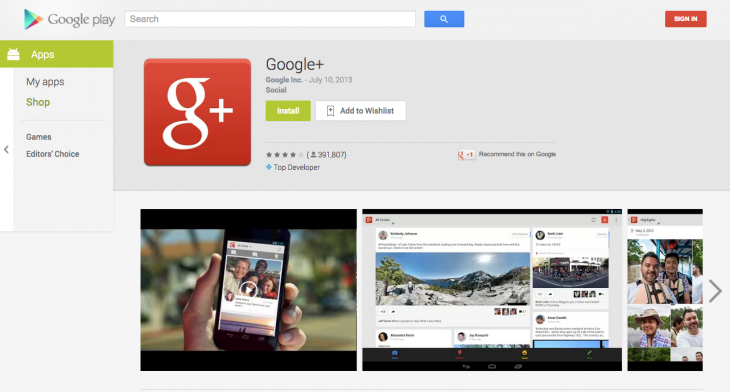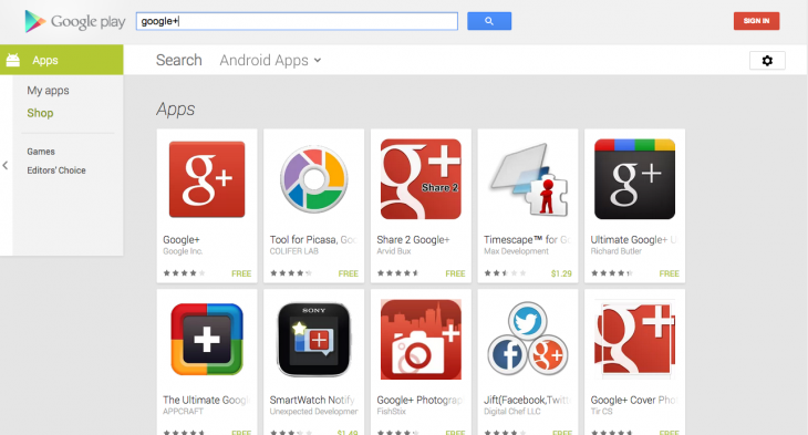
Google today has revamped the Web interface of its Google Play store. This new release is being unveiled to everyone starting today and brings the Android version to the Web.
With this new design, users will find that it’s a lot simpler to understand what an app is about. What’s more, if you look at the details of a specific app, you’ll notice that the screenshots have been enlarged. In looking at the store, users will see that it takes up the entire screen with all of the information listed on the single page — no more tabbed pages.
In the left hand side is the primary navigation that allows users to scroll through the Google Play Store while also seeing a list of apps that they’ve installed. It also will enable searches based on whether it’s a movie or TV show, music, book, magazine, or by device.
Even the app listing has been updated as well with larger icons.
Photo credit: KIMIHIRO HOSHINO/AFP/Getty Images
Get the TNW newsletter
Get the most important tech news in your inbox each week.


