Hacker and programmer Grant Paul, better known as Chpwn, has been using his Galaxy Nexus and is generally liking the device. Unfortunately, he has been coming across enough inconsistencies in the user experience of Ice Cream Sandwich that he has begun to document them on a Tumblr called ICS Paper Cuts, in a tribute to Mozilla’s project of the same name.
The issues are largely small, but are relatively numerous. They range from an inconsistent handling of the back button to alignment layout problems and non-descriptive labels. Ice Cream Sandwich is still very new and that is likely behind many of the issues, Paul acknowledges.
Still, it is interesting to see just how schizophrenic some of the behaviors of gestures, spacing of tabs and labeling can be across Android 4.0. I’ve been using the Galaxy Nexus and ICS myself and can vouch for many of these annoying issues.
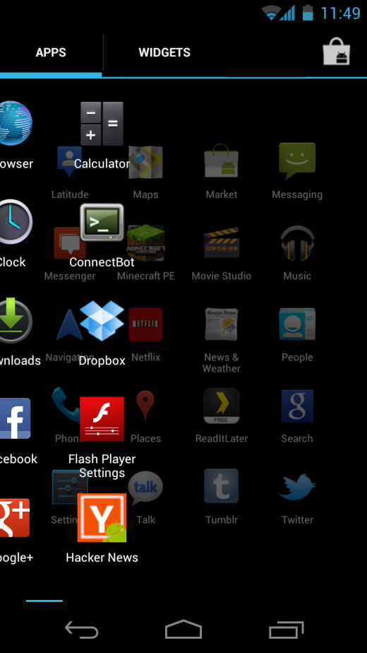
On browsing apps, something I passionately agree with:
Everywhere else in the OS takes a single swipe to switch tabs. Here, it takes a variable number to reach the Widgets tab, depending on how many apps you have installed. Instead, the app list should scroll vertically, as in Android Gingerbread, and only require a single swipe to see Widgets.
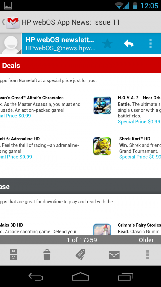
On the poor ‘rich content’ view in the Gmail app:
There’s no Pinch-to-Zoom in the Gmail app, so there’s no way to see this whole email at once, even on a huge screen like the Galaxy Nexus. It works in the browser; it should work here too.
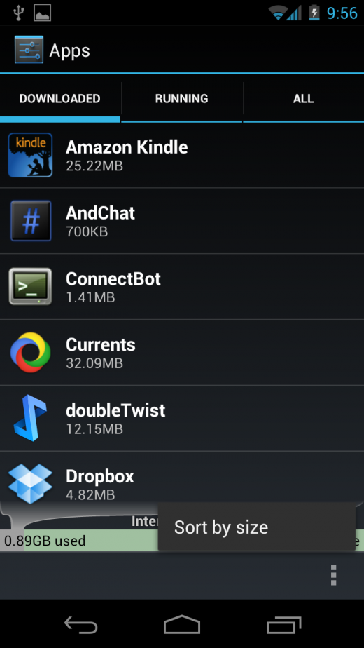
The inconsistency of the tab-switching behavior drives me nuts:
First, you have the (annoyingly common) entire toolbar dedicated to a single button with a single item in the pop up menu. Then, unlike everywhere else on Android 4.0, swiping sideways inexplicably doesn’t switch tabs. And, finally, the graph at the bottom is both visually ugly and doesn’t fit the ICS style.
It’s important to note that there is a spirit here of constructive criticism that can be used to improve. Paul isn’t bashing ICS, nor am I, but it is very clear that there is a lot of unaddressed issues with the way that it works.
Android has suffered from a reputation for a lack of polish since its inception. Ice Cream Sandwich is easily the best looking and operating version of Android in many ways. But now that it has hit 4.0 and addressed many of its maturity issues, it is important that Google and the Android team don’t let up, because the fight is far from over.
You can check out Paul’s Tumblr here for more examples.
Get the TNW newsletter
Get the most important tech news in your inbox each week.


