Google has today launched a fresh new version of its Google Search for iPad app. The new version of the app has undergone a complete overhaul with a new look, and more visual interface for searching throughout.
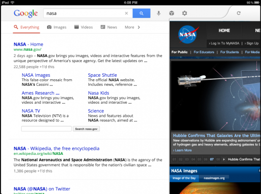
The new searching interface is tightly integrated with Google Instant, which means that you will start seeing results immediately upon beginning your search query. Once you’ve chosen a result, a pane slides in from the right-hand side, much like the official Twitter app for iPad. This pane will allow you to continue to browse results while the page loads and to switch back and forth between the two sections quickly.
The layout of the image viewing section has gotten a nice overhaul as well. You can tap on any image to activate a rolling carousel of the results, letting you swipe left and right through the images. This new carousel has also been extended to search history, allowing you to scoot through a visual representation of your past searches instead of a list of truncated results.
Tapping the icon on the top right of the screen, the one that looks like a two pages next to one another, will give you an instant preview that allows you to get a visual overview of the search results delivered. This lets you pick and choose through the results based on looks.
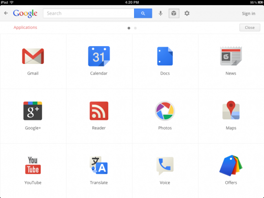
There is also a ‘services’ section that gives you shortcuts to many of the main Google services like Gmail, Google+, Photos, Maps, Calendar, Docs and more. This makes the Google Search app for iPad into a sort of control panel for your whole Google life on the iPad.
The revamp of the iPad app makes the Google Search experience on the iPad the best on any tablet, Android included. We’ve spent a few minutes playing with the app and it is clear that a lot of work went into this app. It’s the polar opposite of the experience delivered by the Gmail app for iPhone just recently. It’s completely possible that this is the best app that Google has ever made for any tablet.
The addition of the control panel that gives easy access to other Google products is interesting. If you wanted to know what a straight Google Chrome tablet might feel like, this is probably the closest you’ll get. Aside from the main interface, the other tools load in the browser, much like Chrome does, but the web apps take extensive advantage of Apple’s accelerated scrolling and touch capabilities.
Some properties that have apps of their own, like Google Earth, send you to the App Store.
The iPhone app also got some love, with a new full-screen viewing mode.
You can grab the updated app here on the App Store.
Get the TNW newsletter
Get the most important tech news in your inbox each week.


