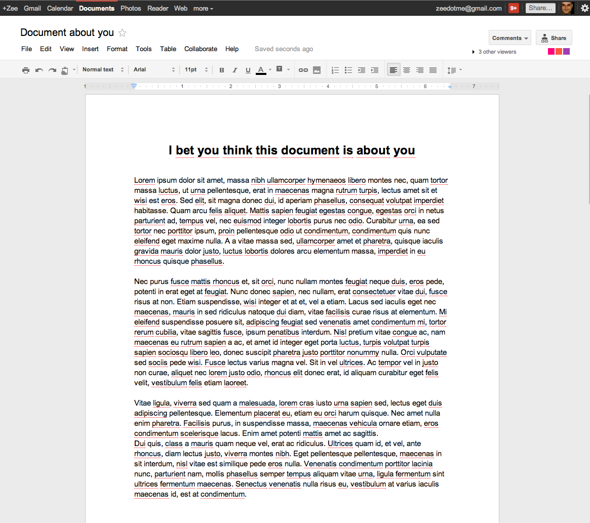
You’ll notice from this image below that Google Docs has “a pimp new look”. In July, Google Docs upped its game from 1GB to 10GB uploads and in early August, Google started rolling out a new version of Google Docs’ document dashboard bringing it up to speed with the design of both Gmail and Calendar. As European Editor Martin Bryant writes in our earlier post, “The redesign emphasizes clean, open space, with larger gaps between documents listed in the main menu.”
Today, we see a brand new document editor introduced to Google Docs with a minimalist feel and new color squares on the far right, one for each visitor. You’ll also notice a new collaboration menu in the top navigation. The new look is being rolled out to all users in usual Google style, but you can access it immediately by clicking the small gear icon next to your name in the Google navigation bar at the top of the screen. Select ‘Try the new look’ and it’s yours.
(Click image to enlarge)
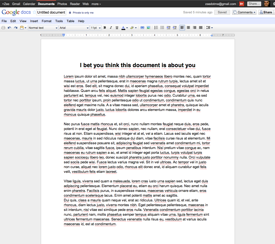
It’s a pretty spiffy update in comparison to the old Google Docs here (click image to enlarge):
Featured Image Source: sokolovsky/Shutterstock
Get the TNW newsletter
Get the most important tech news in your inbox each week.


