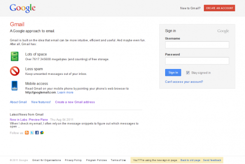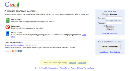
Google is updating its sign-in page, and users are now able to preview its brand new look.
If you go to the main Google sign-in page (you’ll need to sign-out first), it’s likely it may look as it normally does, but if you look at the bottom of the page, there should be an option that says: Coming soon: A new sign-in page! Preview it. And here’s what it looks like:

It’s thought that this has been available for some people for up to a week, but is only now being rolled out further afield. If you compare it with the old one here you can see some of the changes that have been made:

This is all part of a larger redesign of Google products, which it has outlined in its Changes to the sign-in page of Google Products page. And in June this year Chris Wiggins, Google’s Creative Director for Digital, said in a blog post:
“We’re working on a project to bring you a new and improved Google experience, and over the next few months, you’ll continue to see more updates to our look and feel.”
When you click the ‘preview’ button at the bottom of the sign-in page, the new page will become your default sign-in page across all Google products that have the new design enabled. And if you don’t immediately like it, you can still switch back to the old look by clicking to return to the old look.
It’s not immediately clear when the new log-in page will permanently replace the old one.
Thanks to @CraigReville for the tip.
Get the TNW newsletter
Get the most important tech news in your inbox each week.


