Only minutes after we posted user mockups of what a redesigned Gmail might look like, Google has released a preview of what the real new Gmail will look like, including themes that you can test out today.
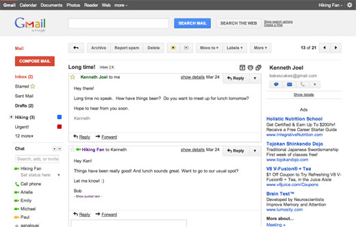
It’s eerie how accurate the earlier mockups were. These screenshots show a Gmail that has adopted the Google+ minimalist, orange and gray aesthetic, though it’s not an identical aesthetic — the buttons for instance are larger.
Simply go to Gmail Settings, click over to the Themes tab and select “Preview” or “Preview (Dense)” as your theme to try this yourself. Google has provided two themes because the end result is an elastic responsive design that shifts its information density to accomodate your screen size, but for now, you need to pick based on the density you prefer.
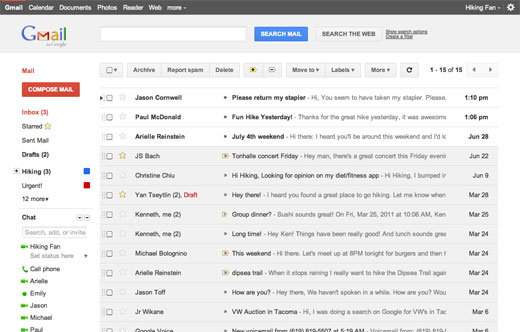
The Preview theme, which spreads information out over more space and so must be the theme designed for larger screens, spreads things out a little too much. The eye doesn’t naturally scan over emails in the inbox because the whitespace between each message is a little too big for information that is provided in only one-line increments. The spacing works for Google+ because the items are generally a paragraph or more in length.
If you flick over the Preview (Dense) you get something that’s akin to the current layout with a new skin on it, and it works. It’s still easy to scan through your inbox and pleasant to both look at and use. The only complaint I have is that the advertisements seem more prominent than before — but I’m sure ad blindness will kick in soon enough!
I’m hearing some reports that there are little spacing issues with either theme on particularly small screens, and some strangeness occurring when the window is resized from very small to wider.
Of course, this is a preview, and it’s “step one of a monster series of upgrades over the next few months” according to Jason Cornwell, who is a Googler working on the project.
After the limited launch of Google+ and updates to the designs of other Google products, Gmail had started to look rather dated (heck, I’d thought so before the new Google look started popping up), so this is a welcome development — one I’ll be adopting today.
Get the TNW newsletter
Get the most important tech news in your inbox each week.
