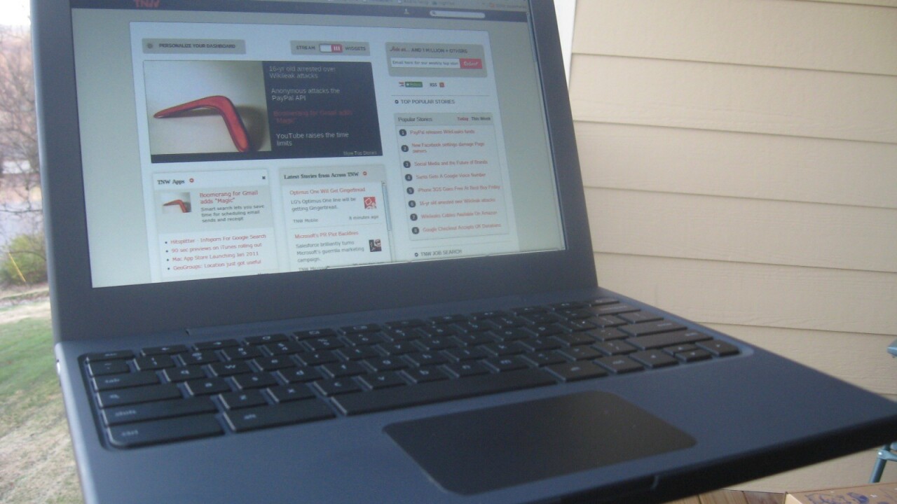
 When we first laid eyes on the test platform for Google’s Chrome OS, it was love at first sight. At a bare minimum, it was ultimate curiosity at first sight. Now, after only two days of waiting, a few of us here at TNW have gotten our hands onto our test units and it’s time to let you know about the OS as a whole, but also about the device on which it is presently being tested.
First Impressions
First, a video. Why? Because you need to see this machine as close to hands on as you can to really get a feeling and understanding for it. As our own Adam Mills points out, if you’re used to using Chrome then this will feel like a tidy version of home for you:
- Great, tactile feel to the machine. Velvety finish to the case.
- Extremely comfortable keyboard. Feels identical to a MacBook.
- Battery is half charged, on boot. After 1 hour, the level hasn’t moved.
- Instant-on is amazing. Works exactly as described.
- Included SD card reader is handy for extra storage.
- Silent. Dead silent. Is this thing on?
 Taking the device out of the box, it’s a sparse bit of treasure. All that was included was the netbook, a power adapter and 2 sheets of paper that gave a walk through and basic instructions for the device. Setup was supremely simple. Connection to WiFi was painless and fast. I took a picture, entered some details and then was at a familiar Chrome screen.
Operating in a Web-only environment is a bit different. You have to shift your way of thinking away from local saves of files and local applications. The initial setup screen of the Chrome OS helps you to get a handle on this pretty quickly. There are some great tips in there, as opposed to the typical “here’s how to plug in your computer” things that we normally see.
MacBook and MacBook Pro users will be delighted by the fact that the touchpad has a two-finger scroll enabled by default. It works exactly as it does on an Apple device, if a bit jerkier and slower.
Overall, the hardware is really well done. For a test platform, it’s downright impressive. Generally speaking, test hardware is mediocre at best. This? We could use this for a long time to come as long as it holds up as well as it seems that it would.
Working In Chrome OS
Remember that “bit different ” comment that I made earlier? That’s really all that there is to it. If you’re familiar with Chrome and if you’ve been using Chrome apps or extensions, then everything about operating like this will make sense to you. The browsing experience itself is absolutely not different, you just have to bear in mind that you’re working entirely online and so there are not locally-hosted applications that you might normally use.
 We were pleasantly surprised to find out that you can work in WordPress within the platform. The iPad, in all of its glory, still has no way to store files locally and then upload them into WordPress. That’s been a sore spot for us since day one. The Chrome OS, while it does have limited space on this machine, still does allow you some areas of the storage in which you can save files and then upload them to WordPress.
The missing F keys, which have been replaced by a row of keys that help you navigate and operate, makes a lot of sense in its use. You’ll find forward and back, refresh, full screen and even a key to cycle through open tabs. Have something that pops open in a new window? You’ll need to use this button to move to that window. It takes a moment to figure out, but works well in practice.
There are some settings to the Chrome OS that are different than what you’ve seen in the browser itself. Located in the same place, under the familiar wrench on the right hand side, you’ll have a new menu system that opens in a page of its own instead of in a popup window:
Beyond this screen, there is another for your “Personal Stuff” that can address any sharing or synchronization issues you might want to adjust. There’s also a dedicated “Internet” menu where you can adjust your WiFi or 3G settings. The rest of the menu? It’s almost exactly what you’ve seen in Chrome, just in a different format.
Around the Web
To be honest, the test unit feels a bit underpowered. With 4 or 5 tabs open, the input starts to get a bit laggy. With a single tab, however, everything works just fine. It’s worth noting, though, that I do have TweetDeck open and it tends to be a bit of a resource hog with all of the columns that I use.
Flash on the Cr-48 is…workable. It’s not great. It’s not even really good. But it is workable. Adobe did just issue a statement noting that it is still a “work in progress”. Watching videos in Flash on YouTube gives a passable experience, but not one that I’d want to have for my daily use machine. Again, this might be due to system resources. Bear in mind, this is not the computer that you will have running Chrome OS, it’s just the one that we have.
Want to watch Netflix? You’re pretty much out of luck in Chrome OS. At least for now. Chrome OS is open-source, based on Linux. As such, Netflix doesn’t support the platform, though there has been talk in the past of making it happen.
The Verdict
Did Google just give us a glimpse at what cloud computing is supposed to be like? Our knee-jerk reaction is yes. If you’re like us, working primarily on the Internet via cloud-based operations, then the Chrome OS is a dream. Low overhead, high function and massive battery life are a must for Cloud-based computers and even our test platform handles this like a dream.
It’s worth repeating, because I want to make this clear: This is not the notebook that you’ll be using. It might be similar, but smart manufacturers will beef them up a bit from where this one sits. It’s a tiny bit underpowered, but hugely functional. Bundling the Verizon Wireless 3G is a genius move and the price points are relatively easy to swallow. Keeping track of your use will be paramount, but Verizon has notoriously simple tools for doing that via its website.

Get the TNW newsletter
Get the most important tech news in your inbox each week.


