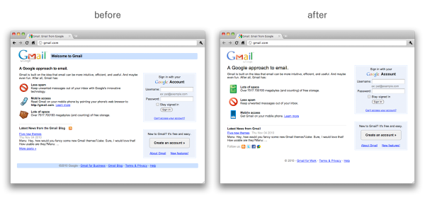
While we doubt that this had anything to do with either Gmail’s downtime today, less than an hour ago, Google announced slight changes in its Gmail logo as well as a few of its login page and other pages.
Here’s the new, slightly more rounded Gmail logo (before and after) as well as the before and after of the login page:


Google also redesigned two pages that show why it feels Gmail is better than other options and news, which is of course interestingly timed as Facebook earlier today also announced its revamped Facebook Messages, which we felt was like redesigning the term “meh“.
Get the TNW newsletter
Get the most important tech news in your inbox each week.


