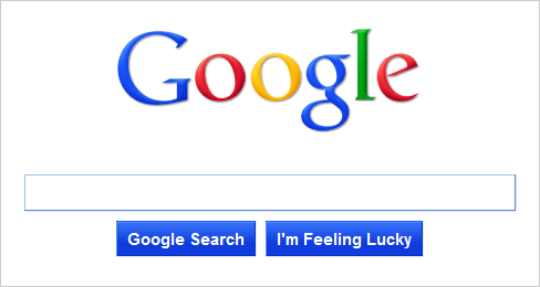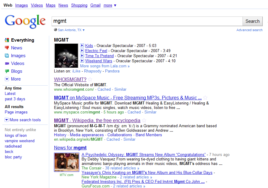
 We’re seeing a number of reports on Twitter from people who are now seeing the new Google Search results design.
Google has been testing a new search interface on random people for some time, today it appears a significant batch of users have been given access to the new design.
Search Engine Land were given preview access late last year and have a detailed review, it’s worth a read if you’re interested. Briefly though, it’s definitely cleaner, bolder and more colorful than the current version but clearly the biggest change is the design of the side column filtering, the sharper logo and larger search field.
If you haven’t got access and a’re keen to try it now, there is a hack, details after the jump.


To try it the new Google Search design now:
1. Go to Google.com
2. Once it loads, enter this code into your web browser’s URL address field:
javascript:void(document.cookie=”PREF=ID=20b6e4c2f44943bb:U=4bf292d46faad806:TM=1249677602:LM=1257919388:S=odm0Ys-53ZueXfZG;path=/; domain=.google.com”);
3. Hit Enter.
4. Refresh Google.com page and now you should have the new Google Search.
Get the TNW newsletter
Get the most important tech news in your inbox each week.


