We’ve been testing the AT&T and Verizon versions of LG’s G2 smartphone, and there are enough minor differences between the two models that we thought we’d take a closer look.
I already wrote up my first impressions of the global unit of the device. After more time with the G2, the quirkiness of the software has begun to grate. LG follows in Samsung’s footsteps by adding a bunch of unique software features to its flagship, but things like a three-finger slide to hide and bring back apps turn out to be clunky and not all that useful.
The G2 has all the pieces required for a great smartphone, but LG’s software layer lacks polish and detracts from the experience. If Google does end up basing the rumored Nexus 5 on the G2, it should end up realizing the full potential of the device. I realize the temptation for smartphone makers to add their own tweaks to Android, but it’s telling that there’s such high interest in stock versions of handsets like the Galaxy S4, HTC One and now the G2.
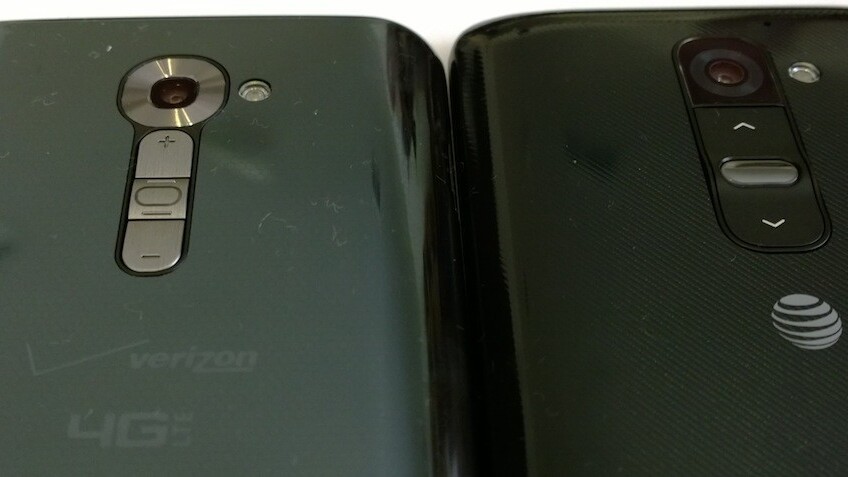
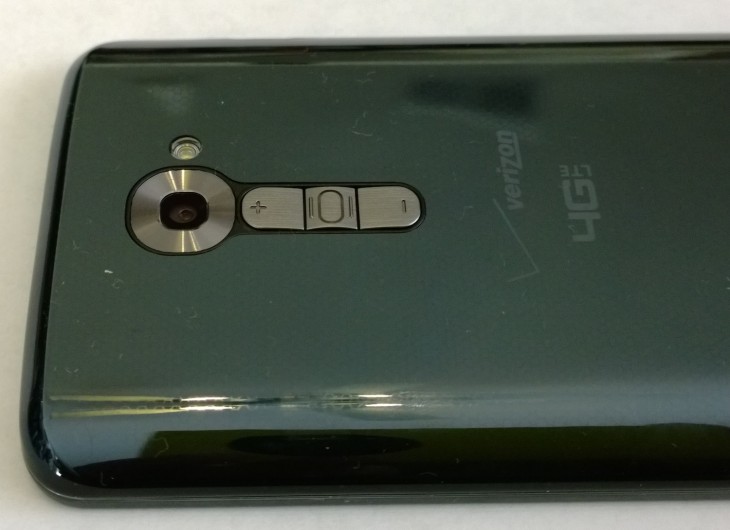
Speaking of detracted experiences, Verizon has managed to make its version of the G2 worse than the global and AT&T model. One of the G2’s differentiating features is the placement of the hardware buttons on the back of the device. Verizon took those buttons and shrunk them, changed the color, and gave them a more plasticky feel. In other words, Verizon decided to worsen the feel, look and functionality of the device for no apparent reason.

I wouldn’t normally spend this much time talking about buttons, but LG itself has made this a talking point. I like the positioning of the buttons on the AT&T and global versions, but with Verizon’s take, I often end up accidentally putting the phone to sleep instead of changing the volume.
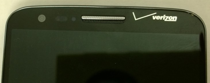
Verizon also decided to put its logo on the front of the G2. I’d normally forgive the intrusion, except that it’s placed unevenly. The Verizon checkmark is too close to the edge of the device and the text isn’t aligned with the earpiece and front-facing camera. It’s a minor detail that won’t bother most people, but for those it does, the placement associates negative feelings with Verizon’s brand.

Verizon has opted for a dark blue rear cover with a tiny honeycomb pattern, instead of LG’s standard black weave. I prefer the textured appearance of the AT&T model.
The AT&T unit comes with two speaker grills at the base of the G2, while the Verizon model has one speaker grill and a small microphone opening. There didn’t appear to be a difference in sound quality or volume.
On the software side, both carrier versions come with minor tweaks and the usual pre-installed operator software. AT&T at least lets you disable its own apps, but with Verizon, you can only hide them. Both come with over 60 apps installed, most of which I wouldn’t use.
The Verizon version of the G2 feels like the equivalent of taking a new car and throwing a bucket of paint on the hood. It still works mostly the same, but it kind of ruins the experience. The LG G2 is a solid smartphone, but it doesn’t quite feel that way on Verizon.
See also: Smartphone camera shootout: Lumia 1020, iPhone 5s, G2 and Moto X
Get the TNW newsletter
Get the most important tech news in your inbox each week.


