Facebook on Tuesday announced it has completed rolling out the new sections on its Timeline profiles to everyone. Furthermore, the company says users are now collectively adding almost 200 million items daily.
Two months ago, Facebook debuted the new one-column Timeline. The company emphasized the redesigned sections on user profiles that let people have one place to add items of interest.
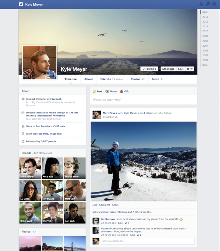
Yet everyone realized this was Facebook’s way of admitting the previous two-column design for posts simply wasn’t working. In case you’ve abandoned the service, here’s the new one-column Timeline (posts appear on the right side, and only on the right side, while everything else is on the left):
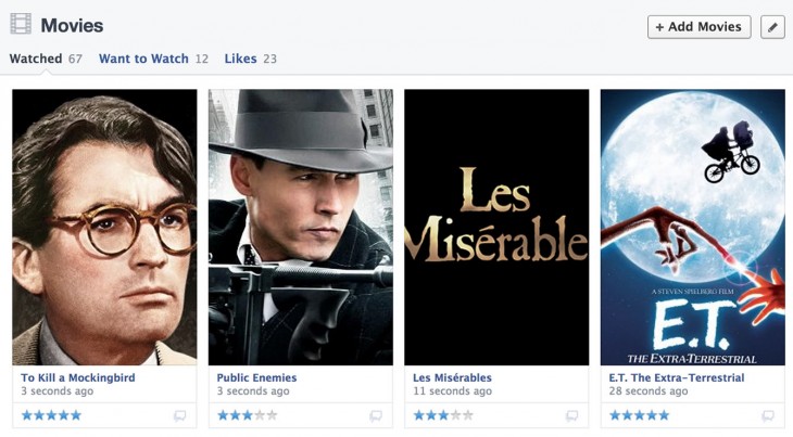
Content from apps are now more prominent as they have their own sections in the left column of the Timeline and on the About tab. You can add content to the books, music, movies, TV, and fitness sections manually or by choosing to include content from the apps you use. As of today, the music section can play songs Liked by friends with just one click, workouts can be tracked with friends in the fitness section, and you can also rate content directly on people’s Timelines and add ratings from apps:
You can also add an app as a stand-alone section on your Timeline and About page. Each app section gets one or more collections to showcase whatever you want from the app, and developers have the option to configure the data that appears.
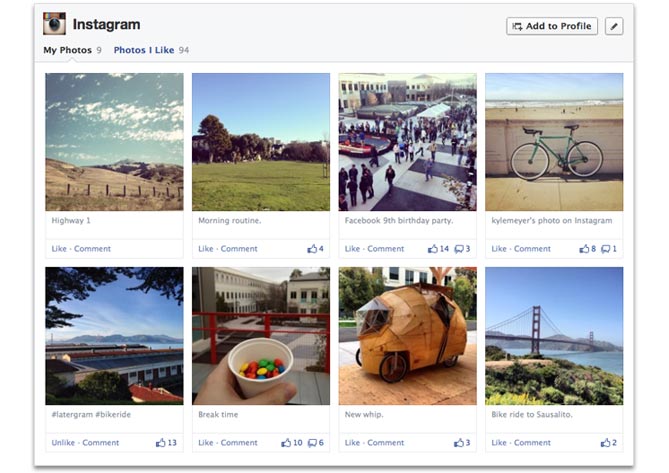
The Facebook-owned Instagram app section displays a user’s photos and those they like:
Previously, only top-ranked Open Graph stories and aggregations would appear on a person’s Timeline. Now, when someone adds an app section, it will appear in the same place until they edit its order or visibility.
To add an app as a section, you need to install it and then click the “Add to Profile” button on its app section page. Developers can encourage their users to add their app by linking to it on Web or invoking it on mobile.
If you’re a developer yourself, Facebook has added a new “Collections” tab to help you set up app sections. The company also offers a few best practices:
- Give people a way to add your custom section to timeline: Consider including a URL in your app to give your users a preview of your section and help them decide whether to add it to timeline.
- Choose the right template for your section: Apps with great visual content should use the gallery template to draw people’s attention, and there are also list and map templates.
- Focus on quality and completeness before submitting your section for approval: To make the review process simple, submit your section only after making sure your object images and descriptions are complete and look great from the perspective of your users.
Developers will need to submit collections for review to Facebook. If you’re interested, check out the newly published documentation.
Top Image Credit: Brendan Smialowski/Getty Images
Get the TNW newsletter
Get the most important tech news in your inbox each week.


