![Facebook now showing larger images and longer link previews to increase user engagement [Updated]](https://img-cdn.tnwcdn.com/image?fit=1280%2C720&url=https%3A%2F%2Fcdn0.tnwcdn.com%2Fwp-content%2Fblogs.dir%2F1%2Ffiles%2F2012%2F05%2Ffacebook-sceenshot.jpg&signature=770266d9a8e02ddf553edabb68fd116f)
Fresh from announcing its new Graph Search product this week, Facebook has made a smaller but nonetheless interesting change after it enlarged the size of images and text descriptions that accompany links shared to the social network. The changes appear to be aimed at increasing user engagements/clicks and making the site more visual.
Update: Facebook has confirmed the feature is rolling out globally, adding that it believes larger stories in the News Feed that link offsite are more visually compelling for people and Pages.
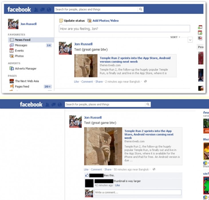
Today, certain preview images load at a significantly larger size than they did previously, with more room for descriptions. However, the fact that other links in news feeds are loading with the smaller image size, suggests that this is an early test — or slow rollout — perhaps aimed at measuring clicks to determine whether large preview images encourage more clicks from Facebook users. Equally, the more visual approach may increase Likes, comments and other engagement on posts.
As the images below show, the new design is still very new but it does make a difference. That’s evidenced by the fact that a link I posted this morning was initially published with a regular sized thumbnail. However, after refreshing the page a little later, it resized to a larger thumbnail — as an eagle-eyed friend of mine noted with a comment.
You’ll also note that the ‘new’ link contains a longer text description which may help provide more context and also encourage to click through to find out more.
Large images could draw more clicks from Facebook users, which is good news for brands that are aiming to drive traffic to their Facebook Page or external websites. Facebook has faced controversy for the way it serves updates, prioritizing advertising and hiding some ‘organic updates’, and while this will not directly address that, it may help brands get more footfall and increased engagement from the links that do appear to its 1 billion plus users.
That business angle is the critical one and Inside Facebook this week reported that Facebook had informed advertisers that it would make image previews three times larger, stressing the benefits that this could bring.
Facebook has been consistently keen to emphasize images within news feed, Timelines and across the site. It revamped the social network with a more image-centric design last year and a new single-column layout appears to be slowly rolling out to users, having initially gone live in New Zealand this month.
The changes spotted today are only affecting the social network on desktop devices. It’s not clear whether the changes will come to mobile. TechCrunch speculates that a more visual layout for the Facebook mobile app is being tested by employees ahead of a launch at some point this year, but only time will tell what does happen.
We’ve reached out to Facebook for comment, and will update this article with any response that we’re given.
Headline image via spencereholtaway / Flickr
Get the TNW newsletter
Get the most important tech news in your inbox each week.


