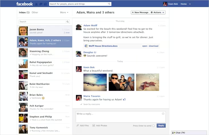
Facebook has just launched a nice-looking update to its Messages feature, introducing a two-pane layout that makes for a cleaner way to use the service. There’s also support for multiple photos and a set of keyboard shortcuts.
The changes mirror some of the features that have only been available in Messenger for iOS and Android until now. The two-pane configuration makes for easier browsing of your list, while maintaining an open thread of conversation. Each of your conversations is essentially turned into a mini-timeline of posts, mimicking the main interface quite well.
The old interface was an incredibly lame set of window-spanning single messages that you had to click on to see conversations, so this is an enormous improvement.
You can still search for names and keywords from the box at the top left of the interface, letting you dig through your list of messages. A set of keyboard shortcuts have been added as well and you can see the list by hitting Cntrl + Q on a Mac or Alt + Q on a PC.
It’s notable that Facebook is now calling the web version of Messages “Web Messenger“. Not in the body of the post, but that’s what the screenshot is called. Perhaps this heralds a name change for the product to ‘Messenger’ to match the other versions of the app on mobile. Update: Facebook says that this is a simple screenshot naming error.
The feature appears to be rolling out today, as some users are reporting that the don’t have the new interface yet.
Image: Goiaba via Flickr
Get the TNW newsletter
Get the most important tech news in your inbox each week.


