Facebook’s hovercards (small boxes containing information on a user when you mouse-over their name) have been upgraded numerous times in the two years since they were introduced, but today sees a nice visual upgrade — the introduction of a user’s Timeline cover image.
Now, when a user hovers over a name on their News Feed or a friend’s profile, Facebook displays not only a profile image but now displays a smaller version of a user’s cover image, giving the viewer more context on who they are.
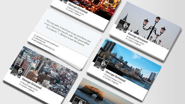
If we didn’t know any better, we would say that Facebook is emulating a business card layout with its new hovercards, making it easier for a user to get to know someone but also identify if they are someone they may already know.
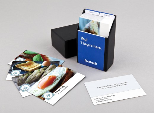
In fact, they mirror almost exactly the business cards offered by Moo.com, which would allow Facebook users to create their own business cards by pulling data from their Facebook profile or Pages.
In 2010, Facebook launched the new popups in the Interest section of a user’s profile, linking more favourite books, activities and movies and their corresponding Facebook Pages. Since then, the hovercards have been updated frequently and now display mutual friends and where your Facebook friends are working.
Friends can also be added, deleted and messaged from the popups, simplifying different processes that would require additional clicks to perform.
In April, Facebook made another minor change to users’ Timeline profiles, incorporating a new design for Friend listings that include both a person’s name and profile photo, making it easier for other users to make new connections via their existing connections.
Today’s update allows users to gain a little more understanding of a person’s personality, making them more recognisable. The company thrives on connecting people (think advertising and more interactions) and it will hope the new tweak assists it in doing that.
Get the TNW newsletter
Get the most important tech news in your inbox each week.


