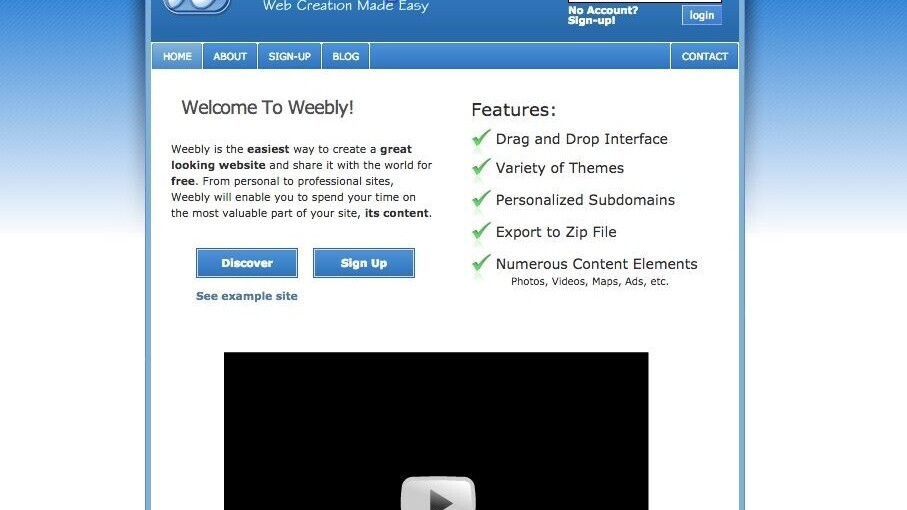
The Web has come a long way since it’s inception, and its design has changed drastically along the way. Weebly is highlighting just how much change Web design has had over the past ten years by taking a look at its own site.
Weebly says that over 250 million users now visit its homepage every month, but that wasn’t the case when it launched in 2006. Back then, Weebly tells The Next Web “MySpace was still a thing, and Weebly’s HQ was a Penn State dorm room.” No real desire for robust Web design at that point.
The next two years were all about mobile, as the iPhone and Android arrived. Now that the entire Web was accessible via a phone, “Mobile responsiveness” was on the tongues of designers everywhere:
This changed how designers started to think about structure, layout, and overall appeal for the first time on a much smaller screen. A minimalist approach started to take hold. It didn’t take root quite yet in ‘08 but the seed was certainly planted, largely thanks to the iPhone.
Oddly enough, Weebly’s 2009 visual refresh was inspired by Google Maps. The company says “Google Maps brought a graphical interface to the general public and with that, a new form of reliance on technology. Trusting that an app with nothing but visuals could guide you from A to B, not get you lost and give you best the possible route, showed how people started to engage their devices in a new way: solely through guided-graphics. At Weebly, we tried to add more visuals that help explain the power of the product in a single glance.”
2011 let designers pack in more info thanks to fast LTE, and 2012 ushered in the era of true mobile apps.
It wasn’t until 2013 and full-bleed photos that design really became modern. A year later, the “immersive” experience — which is what most webpages are today — came to the forefront. It’s iterated from there with the advent of livestreams and video, but has largely remained the same.
Though Weebly is just one example, it’s a really cool look at how technology pressing forward reinvigorates design — and so often! It’s basically been an annual update cycle since 2006 for Weebly, and most of the Web as we know it.
Get the TNW newsletter
Get the most important tech news in your inbox each week.


