
Design trends often span several years (even decades for some types of design), but Web design is a quickly moving and changing industry where trends come and go quite often.
We’re still working with some of those trends now: responsive web design, flat design, performance and speed, and perfecting the user experience. However, what are some of the new and emerging trends we can expect to see in 2016?
Let’s look through some of the trends we can expect to see more of this year.
Next: First up…
Still experimenting with navigations and menus
As a Web designer myself, I’ve noticed we just can’t seem to get the navigation or menu of a website down. We keep playing with it, experimenting, and doing different things to get it to work well and be useful.
We do things such as put it in a new and unexpected place, hide it behind a hamburger icon (a trend I mentioned for 2015), or just throw it up there because we know it is needed but it doesn’t look very good.
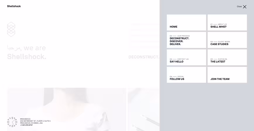
We struggle to figure out exactly the best way to showcase this important piece of content to make it usable no matter the screen it’s being viewed on. We continue to experiment in ways to figure out what works best. For example, Shellshock above is experimenting with both the hamburger icon menu reveal with a cards inspired layout for their navigation.
Expect to see more experimentation as we work through trying to figure out how to do navigations and menus well.
(Image screenshot from: Shellshock)
To scroll or not to scroll
Have we reached the point where scrolling increases readership, but we want less scrolling? Possibly. For 2016, I anticipate some sites going with minimal scrolling while others embracing the long scroll.
There’s benefits and drawbacks to both: long scrolling feels natural and is easier than clicking but it spaces out content and makes it harder to scan to find info while shorter scroll gets to the point quickly but it may be so quick that causes bounce rates to increase.
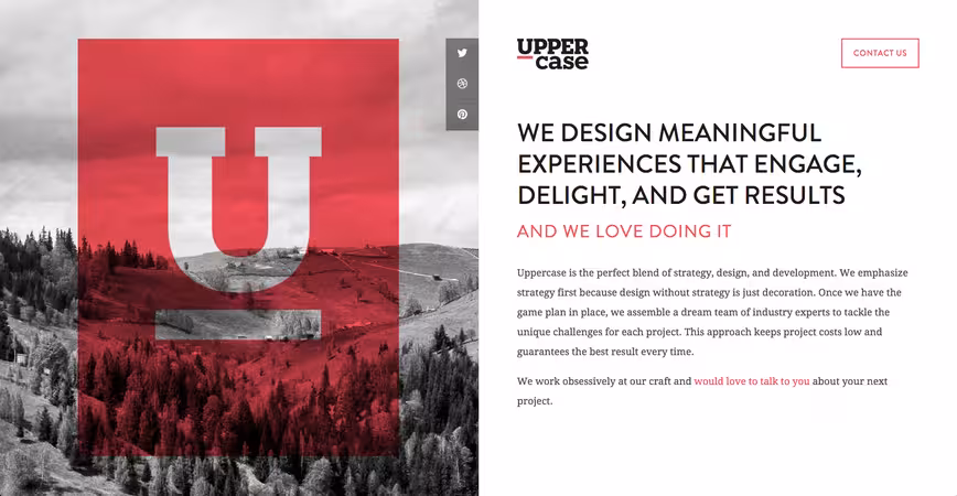
Above, Uppercase has opted to go with a no-scroll site. What you see in the screenshot is what their site currently loads. All of what you need is right there without needing to scroll further.
It will be interesting to see the scrolling battle play out in 2016 and which one comes out on top. Currently, there are more long scrolling sites than shorter scrolling sites, but only time will tell which is truly the best way to consume content.
(Image screenshot from: Uppercase)
Designing in modules and components instead of entire pages
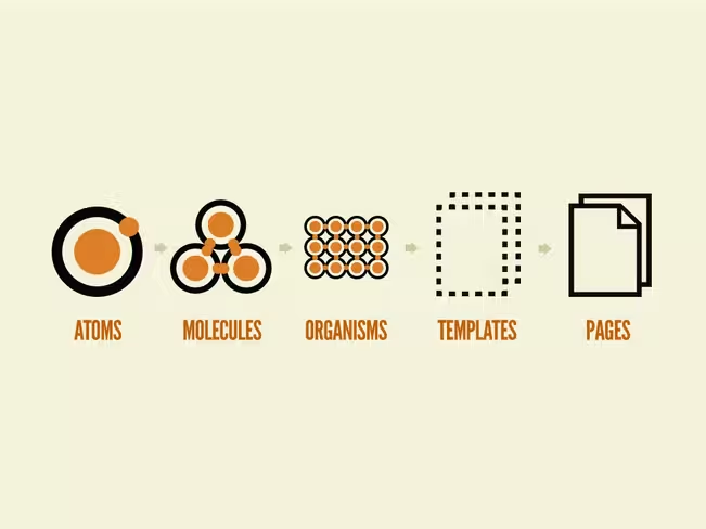
Web design is moving toward modular and component design instead of mocking up entire layouts and comps for a particular web page. These components often involve designing how the search function will work, how the navigation will be laid out, etc.
We’ve matured into knowing that we have repeated elements on different screens, and that these elements need to be designed both so that they work independently but can still work with the rest of the site.
Not only are we more concerned about how these components look in terms of design, but they all carry their individual functionalities with it too. Designing with components and modules allows the same functionality to be replicated no matter where it appears on the site.
A good resource for this type of design is Brad Frost’s Atomic Web Design.
(Image credit: Brad Frost, Atomic Web Design)
Design continues to flatten out

With responsive design pretty much taken over the Web, expect flat design to continue to be a dominate design aesthetic throughout 2016. Not only will there be websites that launch with flat designs, those sites who’ve already embraced the flat design trend will look to make things even flatter.
Take for example Google’s logo. The company changed its logo to make it more flat (losing the bevels) and changed the font. It found that a cleaner sans-serif font for its logo helped cut the size of the logo file used on sites by more than half. Google also found that it was easier to read on smaller devices.
This includes updates to logos (like Google), icons, images, and other elements that maybe didn’t get fully flattened the first first time. You can thank the drive and determination to get our websites to load faster and snappier, weigh less, and get content to viewers more effectively.
Material design takes off

Google released its Material design language back in June 2014 but the adoption has been a bit slow. However, designers now have a better understanding of Material design and I anticipate they will start opting to use it more in their designs as documentation and examples become more widespread.
Material design focuses around tactile but dynamic elements that remind us of paper and ink. Shadows that are realistic, items that overlap do so with regards to reality, interactions stay inside of material and don’t impact other material around it.
Since we’ve seem to have reached peak flat design, designers are opting for the next thing, and Google offers that up in their Material design language. I anticipate many more sites to follow this same material design aesthetic in 2016.
(Image credit: Google Material Design)
Ditching the stock elements for something better
We’re starting to see more and more websites ditching the use of stock elements such as stock photography and icon sets over something that feels much more designed and personal to the site itself.
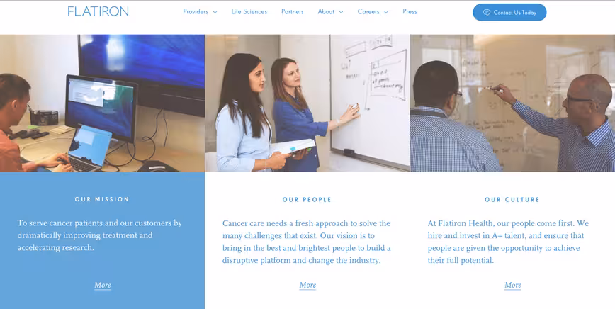
Some websites are opting for using their own photography for use on their home pages or blog posts instead of picking a stock photo. Other websites are ditching stock photography for videos, infographics, or even GIFs to help convey their message. For example, Flatiron Health has opted for their own photography in areas of their website to help be more inviting and personable and less corporate.
Icon sets are another stock element that’s being dropped in favor of something more custom. There are thousands of sets out there, so it’s easy just to pick one and run with it, but for designers, they’re noticing that little extra touch to create custom icons can help set a site apart from others.
(Image screenshot from: Flatiron Health)
Forms and inputs go full-screen
Much like I talked about a year ago with responsive Web design practices being carried throughout an entire website instead of just the mobile versions, this trend also has come from the wide-spread adaptation of responsive website design.
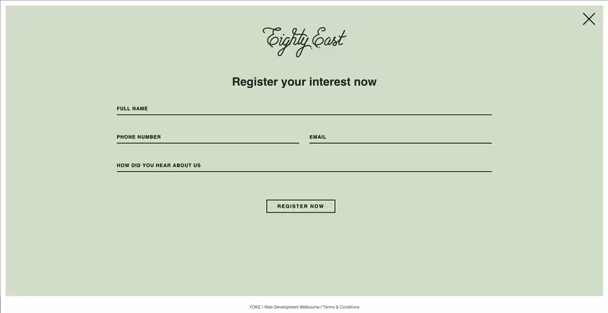
More sites and apps are going with the full-screen forms and input screens (such as signups and logins) instead of it existing in only one small part of the site. Click on “login” and or “contact” and you may be greeted with a full-screen overlay with the form needed instead of being sent to a different page. A great example of this is Eighty East’s contact form. When clicking “contact” you get a full-screen contact form.
As mentioned above, this trend comes from responsive design best practices for several reasons: keeps another screen from being loaded, gives more screen space for easier touch by fingers on touch screens, and encourages users to complete the form (for those forms that present one input at a time).
(Image screenshot from: Eighty East)
Rich but subtle animations
As Web design is flattening out, websites are starting to look more and more alike. One way designers have been trying to help make their sites stand apart from the crowd is through the use of rich, clever but subtle animations throughout.
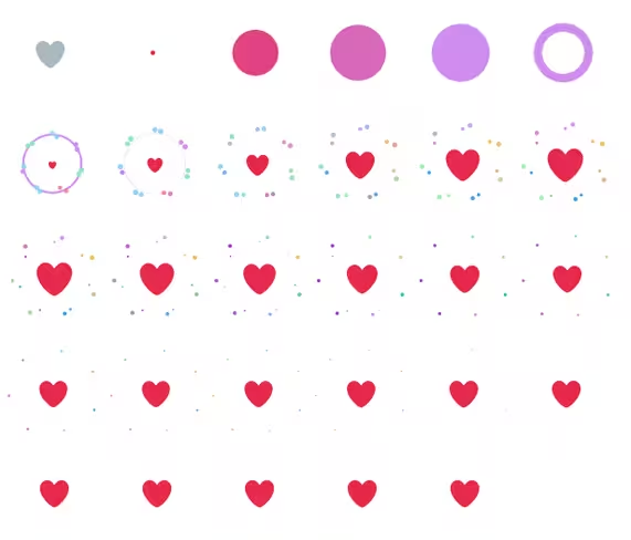
Designers are opting for changing the every day animations we’ve all grown accustomed to but still serve a purpose. For example, Slack’s own loading screen takes that boring circle loading animation and ditches it for a custom loading animation featuring Slack’s own logo. It still serves the purpose of letting the user know it’s working, but in a clever and rich way.
Here’s the new heart animation, frame by frame pic.twitter.com/CigVBVguUw
— Christopher Ingraham (@_cingraham) November 3, 2015
Another example is Twitter’s controversial “heart” icon for likes over the star for favorites. When clicking the start icon, the animation wasn’t as detailed as the new animation for the heart icon is. It adds a little extra interaction to the design while being subtle.
(Image credit: Christopher Ingraham on Twitter)
Users are caring more about how a site functions than looks
Having a nicely design site is great and all, but it really doesn’t matter all that much if your site doesn’t function well. Users are becoming more keenly aware to when something doesn’t work properly on a website.
It’s becoming more common for users to leave a website because they’ve encountered something that isn’t working well for them. Imagine how bad this could be for an e-commerce site?
Designers want their sites to look good, so it’s important that they can make the site function properly as well. Give the people what they want: function and design.
Designers move toward designing in the browser
Some Web designers currently design only in the browser. There are benefits to this: cuts development time down, allows you to see the limitations and reactions of the actual browser with regards to the design, and is more natural than designing in a program that has nothing to do with the Web.
It’s pretty common for Web designers to know how to code at least the front end of websites (HTML/CSS/JS), so designing in the browser makes sense to them. With the trend of Web design moving out of Photoshop, Illustrator, and Sketch and into the browser more, I anticipate many other Web designers starting to work on their HTML and CSS chops.
What are some design trends you anticipate for 2016?
Previously: Web design trends you can expect to see in 2015
Get the TNW newsletter
Get the most important tech news in your inbox each week.