
Has your company changed its logo recently? Get with the program! Verizon, Google, Medium and Todoist have all done it – and now it’s photography community 500px’s turn to refresh.
In a blog post, 500px calls its new look “clean, simple and articulate,” though you might argue the total opposite.
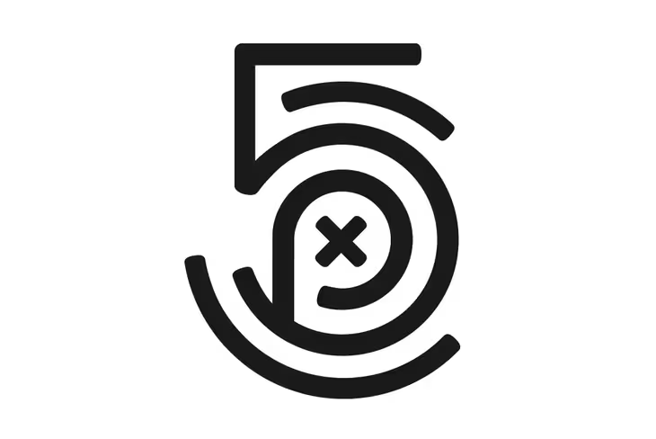
The wordmark, on the other hand, looks okay – it’s now shed the infinity symbol for a thinner, rounder type.

The 💜 of EU tech
The latest rumblings from the EU tech scene, a story from our wise ol' founder Boris, and some questionable AI art. It's free, every week, in your inbox. Sign up now!
Other than the new look, not much will change with its app or community. In a video, the team said it wanted to clarify that the pronunciation of the company is “five hundred P X,” not “pics” or “pixels.” The x in the middle also represents the camera focus, as illustrated in the GIF above.
Still, points for the creativity of putting together an interesting logo rather than slapping on a new font and calling it a day.
500px’s new look rolls out today on Android, iOS and the Web. What do you think of it?
Get the TNW newsletter
Get the most important tech news in your inbox each week.