
The heart and soul of design is making the user happy.
In order to satisfy users, you must design beyond the page. You need to understand the entire journey, especially how people use your website as part of a multi-device experience.
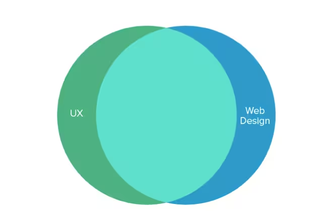
So is Web design becoming irrelevant? Or does it require us to redefine the skill set of the Web designer?
In this piece, we’ll talk about why (and how) to think beyond Web design.
The Democratization of Web UI Design
When it comes to Web design, it’s easy to focus purely on the UI.
After all, that’s what clients and stakeholders can see and touch, so that’s where you’ll probably hear the most feedback. UX design, on the other hard, is more difficult. It’s hard to know precisely what will make the user happy, especially when you can just rearrange the layout and call it “improved.”
UX design for the Web is not a new concept. But as explained in UX Design Trends 2015 & 2016, recent advancements in self-serve Web design have made UX design a true competitive advantage for designers. Certain services and algorithms might help us design visually beautiful websites, but they can’t help us design a great Web experience (not yet, at least).
In his controversial piece Why Web Design is Dead, Sergio Nouvel explains why the old ways of Web design are on their way out. While his piece takes a more extreme view of Web design, we certainly agree with his reasoning for why Web designers must evolve, and his problems seem solvable through emphasizing UX principles:
1. Commodification from templates — Anyone can create their own site in a matter of hours using templates from a service like WordPress or Templatemonster, or design a shanty site on apps like RapidWeaver. Businesses strapped for cash and time don’t need to hire a Web designer. In order to stay competitive, Web designers must now know how to sell the power of experience design.
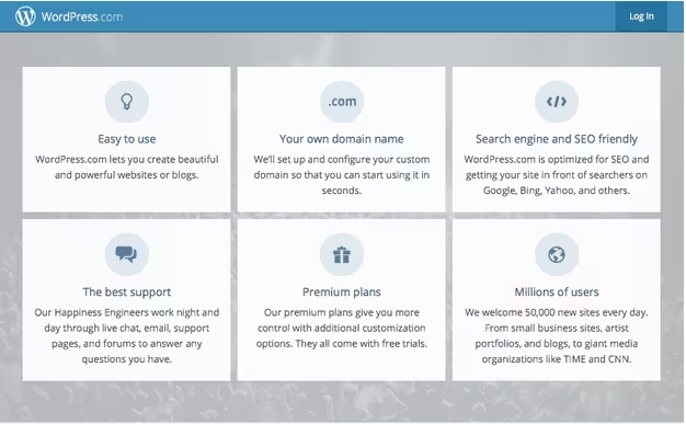
Source: WordPress
2. Automated design — Sites like The Grid use artificial intelligence to construct basic (and not-so-basic) UIs. But while this service can generate beautiful UI designs, it can’t determine if they’re appropriate for the users and business. UX design isn’t something a machine can learn (yet), so visual designers should embrace the skillset.
3. Social media homepages — Echoed by Athlon, traditional sites are sometimes overshadowed by social media pages, and small businesses can now get started with a Facebook page alone. Experience design, however, exists on a much higher plane. Designers who know UX are better able to convince companies that different channels deliver different experiences (and business benefits), which still makes websites mandatory.
4. Mobile Browsing — Mobile browsing is now the dominant form of Web usage, more evidence supporting a mobile-first process. That requires a solid grasp of UX principles since you need to design a scalable experience from the smallest device first.
5. Advanced design patterns — In the same vein as template commodification, established design patterns take a degree of guesswork out of modern Web design. For example, online shopping carts usually feature the same familiar format (i.e., page-by-page setup) so designers don’t have to “reinvent the wheel” for each new site.
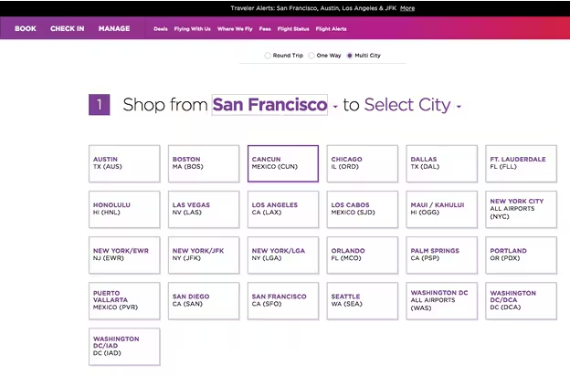
Photo credit: www.virginamerica.com/book
Instead, the tricky part is choosing (and customizing) the patterns for different sites to create the appropriate experience. The multistep-form pattern works for Virgin America since the airline must collect more information to book the right flight for users. In that case, multiple steps “chunk out” the process for users who are already motivated to buy.
However, that same multistep-form isn’t so appropriate for a political campaign site where you want to collect money as quickly as possible. To make that type of judgment call, you must know UX design.
The same point seems to keep coming up: the visual design and back-end implementation of Web design are becoming easier. While this may scare pure visual designers, it’s definitely good news to UX-focused designers. In fact, one of the reasons we included so many UI element libraries and interaction libraries in UXPin is to free up designers to focus more on crafting the end-to-end experience.
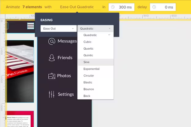
Photo credit: UXPin
Design Web Services, Not Web Pages
Perhaps because of mobile’s ascent, the way people even use the internet has changed.
The pull-based system of pages, where the user inputs what they want, is surrendering to the push-based system, where content finds the user (notifications) or the search is drastically reduced. What’s on your page matters most, not just how it’s arranged.
This makes service design more relevant than ever before. Service design is the science of optimizing how a service is provided, start-to-finish, based on what the user wants (UX). For more information on service design, Cooper covers the basics well.
What’s worked with service design before is being both self-contained and “bite-sized.” A self-contained service means it only requires the necessary information to function. Take Google Maps, whose popularity is due to its self-contained service design. Users input the relevant information, it shows their directions, and then their interaction with the site is over.
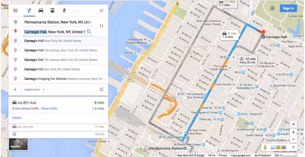
Source: Google Maps
Bite-sized services, too, are becoming more popular. Users today prefer to link their services together. Going to a concert might involve one place to find the venue, one to buy the tickets, one to plan with friends, and one to find a ride there. For this scheme to work, each service must be as quick and effortless as possible.
The services of these sites are the draw, not the sites themselves. If the UX of the service can’t help them, the UI doesn’t matter.
UX Best Practices
Here are some of the tips on UX design that we’ve found most helpful:
- Exceptional user research — Conduct thorough user tests, then translate the results into personas. Use personas to run through user scenarios and customer journey maps. These practices will allow you to understand your users and what they want from your product. For the best practices on each of these, check out the Guide to UX Design Process & Documentation.
- Prototype early and often — User testing beforehand can only tell you so much. Once you start designing, test every iteration at least once, even the wireframe. (This is precisely why UXPin enabled interaction in wireframes.) This lets you know what the user likes and doesn’t like, specific to your product.
- Every interaction counts — UX is the sum of every interaction on the site. Obvious activities like logging in, as well as smaller microinteractions like the Login button changing color, are all opportunities to improve the UX, even slightly.
- Focus on the flow — Your site pages are only as useful as the paths they create. Using either a writing-first or shorthand method, create user flows before you start designing the interface. Map out all the pages and paths required to accomplish user goals, then simplify them. This blueprint doesn’t just lay out the hierarchy of pages, but adds context by showing how people interact with them at each step of their journey.
- Personalization — Go a step further than customization (settings and preferences) and use what you know about the user to help them. For example, the traffic and navigation app Waze notices if you, leave work to go home every day around 6. The app will then automatically serve up directions for the predicted location.
- Create habit loops with rewards — While some designers have run gamification into the ground, there’s still merits of it that work. Giving users meaningful rewards for completing certain tasks (not just gimmicks like badges) creates a habit loop in which they’re more likely to repeat the action.
4 Websites with Stellar UX
Sometimes it helps to see what we mean. Let’s deconstruct a few great examples into simple takeaways.
1. Vine
Vine has reinvented the online video market. Where YouTube once had a monopoly, Vine created a new niche for itself by condensing the format into short loops of seven-second video snacks. The idea caught on because, let’s face it, appealing to shorter attention spans is the direction the internet was already moving.
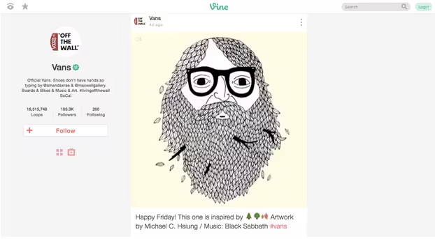
Source: Vine
The service is both self-contained and bite-sized — users can spend as much or as little time on the site or app as they want. But the service is just the ground floor. The site works equally well on desktop and mobile, and Vine’s UX driving power is not slowed down by the changing UI.

Source: Vine (mobile)
The Vine mobile app allows you connect with other users the same way as the desktop site. This seamless transition between app and site experience offers a complete package:
- As you browse the site, you’re served more of the familiar Youtube experience. Search for content, find the channels you like, then subscribe.
- All subscriptions transfer between mobile and desktop, for the user’s choice of viewing at home or on the go.
Nothing is lost by switching devices — in fact, users are only given more maneuverability to use the service as they want.
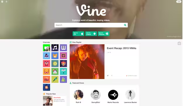
Source: Vine (website)
And the UI itself isn’t too shabby. The flat design and casual text set the tone, the long-scrolling format facilitates the appropriate multi-device experience, and the card UI pattern makes everything snackable.
2. VW
Most car sites are nothing more than “glorified car brochures,” according to VW’s project description for the 2014 UX Awards, in which it took the Gold Prize. The new VW page, however, wanted to do something completely different.
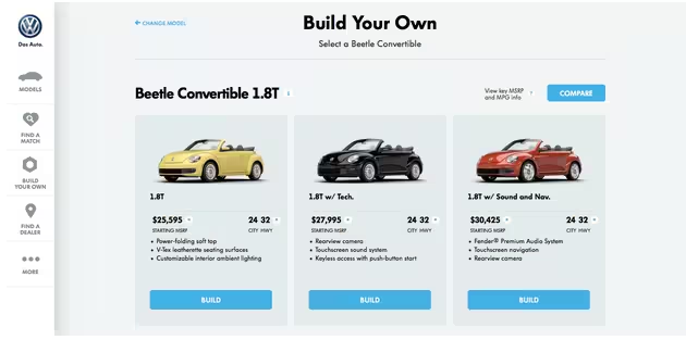
Source: VW
VW allows people to customize their VW car, inside and out, and then find a dealership where the closest match exists — even a used car. This takes full advantage of what the internet offers, as no car brochures (and even competitor sites) can match it.
Again, a new, better service is the backbone of the site, not just sharp UI design. Service is, and always will be, the cornerstone to a good UX. VW designed their site around user goals, also accounting for offline touchpoints.
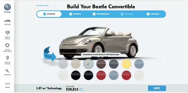
And, like Vine, the UI is quite sleek. While some car sites features only flashy car configurator widgets, VW offers something just as fun, but with real practical value.
3. Virgin America
Virgin America, too, improved the service they offered in relation to their competitors, and the notable difference was well-received.
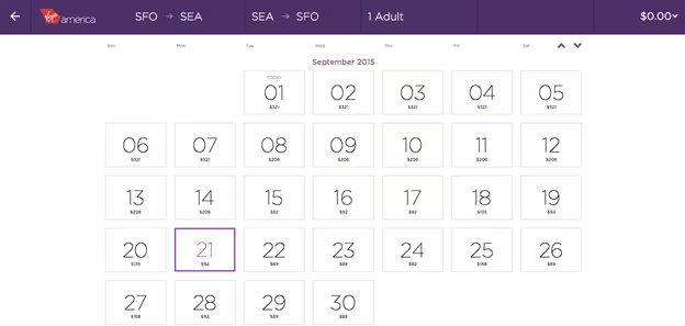
Source: Virgin America
The site — which actually won the Grand Prize at the 2014 UX Awards — was the first fully responsive major airline website, giving users the correct UX regardless of device when ordering plane tickets (an already stressful ordeal).
The CMO of Virgin America Luanne Calvert says that “the goal of the redesign was to better reflect their needs and how people book and manage travel today,” and that the changes were made based on “listening to what travelers liked and didn’t like.”
The first step in creating a good UX will always be understanding users.
4. Pelican Books
When Pelican Books redesigned their site, they followed a lot of the techniques described in Web UI Design Trends 2015 & 2016, like bright colors, flat design, and minimalism.
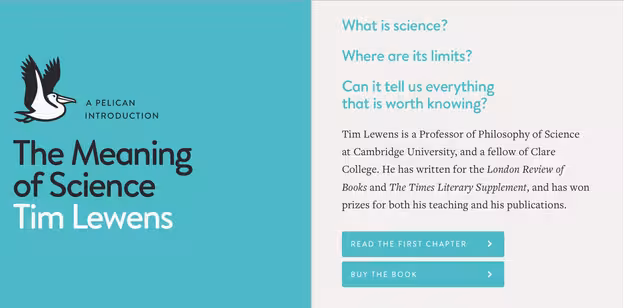
Source: Pelican Books
This made the site look and feel better, but the changes to the UX are what made the redesign the real success.
As explained in UX Design Trends 2015 & 2016, the new site allows users to preview entire chapters of books. This technique is nothing new. What’s new is transcribing the chapters directly into the site in an immersive blog format reminiscent of Medium. This makes readability much easier than, say, the print scans of Amazon’s “Look Inside” feature.
Entire books are written in this format, though you’ll have to pay to get the whole text. Still, the site is reimagining the world of online reading. Instead of just “previewing a book,” you’re experiencing the content in a format that feels personal.
We can certainly see that it’s a more persuasive method of hooking buyers.

Source: Pelican Books
Moreover, users can access the preview chapter just as easily on mobile devices. This is a UX decision that improves service and sales — users get a feel for how to read on their device of choice, further encouraging them to buy.
Takeaway
Web design is not dead. But it is certainly evolving towards a UX-focused future in which the designer must create the Web experience as part of a larger customer journey covering all touchpoints.
Let’s summarize what we discussed:
- Users prefer the product that makes them happiest, regardless of the interface
- Users choose sites and apps by the content and service, not just the interface
- Designing for UX allows more consistency between different devices
- Because template companies make it easier to design Web interfaces, designers must master UX to offer competitive value.
Remember, a site can have fantastic UI, but no one will use it if the UX is lacking.
To learn more about the current state of UX design — including expert advice, trend analysis, and deconstructed examples from 71 companies — download the free ebook UX Design Trends 2015 & 2016.
Read Next: How to survive high-definition Web design
Image credit: Shutterstock
Get the TNW newsletter
Get the most important tech news in your inbox each week.