If you’re reading this, you’re either part of the problem, or you want to know how to solve it.
Despite all the articles out there about UX myths and debunked theories, we’re all still (at least sometimes) having conversations about dead ideas — about sacred cows that have long since been tipped over but which are still trying to stand back up.
That’s the problem I’m talking about.
It’s time to kill a few of these bad boys off once and for all. (Oh, how I wish simply saying “once and for all” could make it true.) In this piece, I take a look at a few of the most obnoxiously persistent extinct beliefs about Web design, explain how they keep getting perpetuated, and how to argue against them so you can join the fight and be one of the good guys.

The 💜 of EU tech
The latest rumblings from the EU tech scene, a story from our wise ol' founder Boris, and some questionable AI art. It's free, every week, in your inbox. Sign up now!
Each one, admittedly, was chosen thanks to a recent encounter.
-
The Fold
The last time I had a conversation about “the fold” was way too recently. It was with a designer who’d just sent me a wireframe with a big red line stretched right across the center of it from left to right. “What’s that?” I asked. I hadn’t seen one of those lines in a while.
“The fold” is an imaginary line designers still sometimes think demarcates what is in view and what is out of view when a user loads a page in a Web browser. The term references printed newspapers, which literally fold in half, hiding half of the information on a given page “below the fold.”
Designers determine its position in a screen design by subtracting the height of their favorite common monitor resolution from the height of their wireframe, and then they design screens according to what will be visible when the screens load and what will not. (This works on the assumption that users keep their browsers at full-screen.)
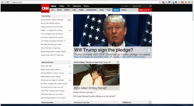
Photo credit: CNN
It started back when monitors were all 800×600, and no one resized their browser because if they did they’d only be able to see half of the Internet. Then at least one book came about “liquid design,” a method of designing adaptable interfaces that would widen and narrow according to the browser’s dimensions, Step One of the long evolution of what you now know as “responsive design.”
The fuel
The idea seems to stay alive because desktop wireframing software produces full-length wireframes that must be shown in a browser to be judged in a realistic way, but most recipients of those wireframes view them as PDFs or JPGs. Hence, designers often draw a big red line across them to show “the fold.”
Of course, now that we’re in the days of mobile browsers, giant monitors, and adjust-your-browser-any-way-you-want flexibility, we expect our websites to work at all dimensions, regardless of screen size, regardless of which device it’s showing up on. Our users expect it, too.
Hence, there is no fold. There is only smart design. Now, we need to design for visual hierarchy. Information organization. Primary tasks, secondary tasks, tertiary tasks.
The argument against
And that’s your argument: We can neither predict nor control the user’s browser dimensions. As such, we must design pages to work in all circumstances, for all browser dimensions, on all devices. Keep that in mind when you crack open your graphics or prototype editor (such as Photoshop or UXPin).
2. The 3-Click Rule
In a bizarre attempt to make websites easier to use and businesses more competitive, designers once invented “the 3-click rule.” It means that, for a website to be considered simple and effective, users should be able to complete any task or get anywhere on a site in three or clicks or less.
This is, of course, insanity. When was the last time you did anything online that required only three clicks?
This idea was debunked years ago in usability test after usability test. Designers got better at wayfinding, visual affordances, and other good design practices, and we eventually realized that mind-numbing simplicity crafted for what is apparently the stupidest user on Earth was more insulting than useful.
The fuel
This antiquated rule stays alive these days through the widespread belief that simplicity is the key to everything good in the world.
It’s not.
The argument against
Simplicity is not the most important thing. Clarity is. Slow tasks with more steps are frequently more usable and create a better user experience than quick tasks with fewer steps. Like UXPin discusses in Interaction Design Best Practices, you should strive to make each step as effortless as possible instead of obsessing over total number of steps.
Simple as that.
Next time a client or stakeholder comes at you with this false faith in clicks, drop this on them. If they put up a fight, prove your claim. You can demonstrate the reality pretty quickly by signing your boss up for a dating website, which will prominently feature a 30-page survey that is absolutely essential for the site to fulfill its purpose.
Plus, your boss will have an online dating profile, and that’s just good fun.
3. “Click here”
“Forgot password?” the link asked. And the client got nervous. How will anyone know what the question means unless we point out that they should click it?

Photo credit: Button Optimizer
“Click here” was born in the earliest days of the web. It somehow still persists. Obviously, it’s a strange attempt at compensating for what someone thinks is an unclear link. It used to be rampant. Then we all discovered its problems.
The fuel
Since I can’t remember the last time I heard a designer recommend its use, it seems that “Click here” stays alive because website designs and content updates are sometimes up to people who don’t do either professionally and therefore simply don’t know it’s bad practice. No reason to be offended by it. It’s a simple lack of knowledge.
The argument against
First, it’s bad for people who use screen readers. People using them often jump from link to link on a page to find something that will help them get closer to the thing they need. When a link says only “click here,” that user gets no insight into what happens after clicking here.
Second, it’s been shown that longer links tend to be more descriptive and therefore more effective. Since more information is communicated in the link, users are better able to tell where they will go and what will happen as a result of clicking. This creates confidence. And confidence makes for a good user experience.
For good measure: since it’s so totally out of fashion, “click here” can make you look unprofessional. Out of date. Obsolete.
Just don’t do it.
4. Homepages
No, I’m not suggesting we kill off homepages. But their relative weight and power has certainly diminished over the years. Ever since Google and the others got so good at indexing and searching and handing off great, specific results to search users, countless other pages have become just as important. Like the Features page of your product site. Like the Pricing page of your service. Like the Menu page for your restaurant.
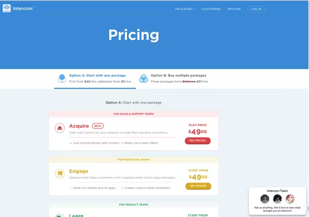
Photo credit: Intercom
And yet, clients spend an endless amount of time obsessing over the homepage alone.
The fuel
They do have a case. When people manually type in a website, it’s the top-level domain they type in. This generally takes them to a homepage. Sometimes, though, it takes them to a user homepage, like your Facebook homepage. Still, they it’s easy for clients and stakeholders to get stuck on the idea that homepages are the most seen, and therefore the most important.
The argument against
I already made it. And you can show them by doing it yourself.
Google the information a user would hunt for that should land them on your website and see what happens. Google serves up internal pages. Even when they give you the homepage, they show you a list of internal pages that will be likely be more relevant to what you need to find.
Show this to the client or stakeholder, remind them that websites frequently link to the internal pages of other sites (a reporter linking to a specific blog post, for example), and that every page on the site needs to communicate value to the user.
5. Graphical Text
This is an ugly one. It used be common that to show text in a non-standard font on a website, or to display text over an image, you had to make the text part of the image. This caused all kinds of problems for users who scaled their browser dimensions up or down, however, as the image would stay the same size, and the text inside right along with it.

Photo credit: Generated via Cooltext
And graphical text headings? Well, they weren’t searchable by search engines, or by the browser itself. This leads to usability and search ranking problems far and wide.
I came across it again recently when a client desperately wanted to keep their unusual tagline font and formatting intact on their homepage (they suffered from the previous problem as well). Mind you, this tagline included two randomly capitalized words, one of which was underlined, therefore disguising itself as a link, which is was most definitely not.
It took two hours worth of emails to talk them out of it.
The fuel
This bad habit persists today. It’s not common, but it’s hanging around. It happens when Web designers don’t know they can now use hosted fonts from sites like Typekit and Google Fonts to incorporate non-standard fonts into their designs. And when they lack the CSS chops to position and size text over the top of graphics.
The argument against
Graphical text is bad for search engine rankings. It’s bad for responsive design. It’s bad for changing the dimensions of your browser at all. It also means that in order to be consistent with your font usage, you’ll have to use it a lot—throughout your site—which means you’ll be committing all these self-destructive crimes repeatedly, and not just once.
Check Your Knowledge
There is plenty of evidence and rhetoric out there against each of these practices. Anytime you’re making a design decision that seems like it could have first been made five years ago, take a minute to check yo’self. Do some research and find out if it’s still a valid way of doing things.
If not, you’re going to be the guy perpetuating these little Web design demons.
Pro tip: If you’re fresh out of school, do this a lot. Often, professors are working from old knowledge. It won’t look so good for you to be the one 24-year-old designer who thinks these ancient methods are still valid. Be smart and do your research. Even if your current knowledge is correct, you’ll learn more and you’ll equip yourself to make good arguments against bad ideas when they come up later.
More UX design advice is available in the free e-book Interaction Design Best Practices. Across 100 pages, the book teaches by analyzing 33 examples from companies like Apple, Google, Etsy, and Behance.
Read Next: The future of UX design
Image credit: Shutterstock
Get the TNW newsletter
Get the most important tech news in your inbox each week.