Last year, designers Jesse Reed and Hamish Smyth started a project to bring the 1970s New York City Transit Authority Graphics Standards Manual back to life in the form of an elegant book. The pair set a target of $108,000 on Kickstarter and ended up blowing that out of the water and raising over $800,000.
And now, they have set their sights on another iconic book: NASA’s Graphics Standards Manual. In just two days, the Kickstarter campaign has already raised more than double its $158,000 target, with over a month left of donations.
When the campaign kicked off, there was just one backer reward – $79 for the book – now that the donations have amped up, the designers have added more tiers offering multiple copies of the book to give to fellow design nerds.
The Kickstarter video (below) features Richard Danne, the design director for the original production of the manual in the 1970s. Giving a firsthand history of the project, he shows off his personal copy and some unseen material, which includes the presentation board used to show the project to NASA at the time.
Describing the manual, Danne fondly explains how it is much more than just guidelines:
It raises design principles to another level, there’s nothing frivolous about it… It’s a design document meant for the ages.
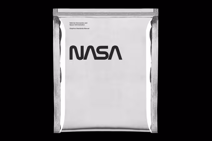
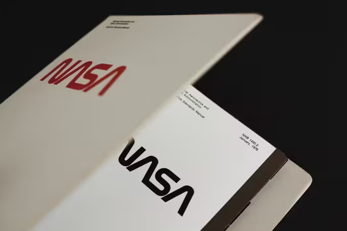
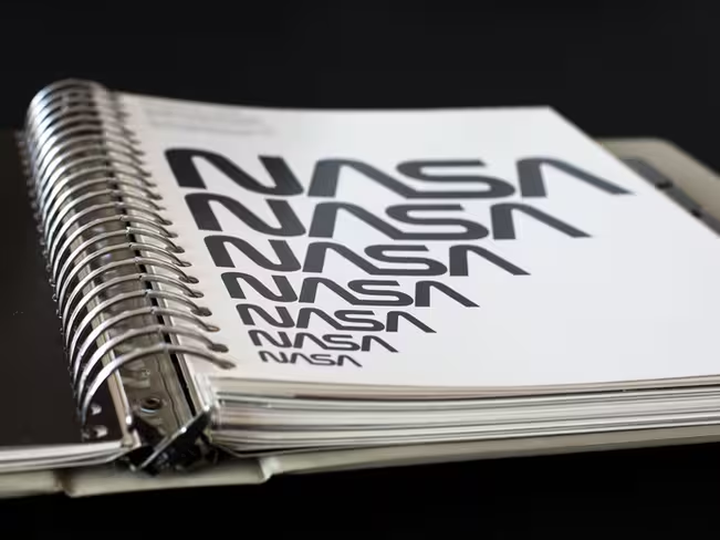
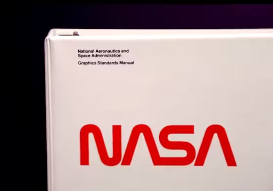
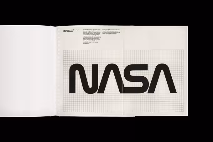
However, it’s not just what’s inside the manual that’s important, the cover features NASA’s ‘worm’ logo. The ‘worm’ logo was used for almost two decades before the space agency ditched it for the circular blue ‘meatball’ logo we’re all familiar with.
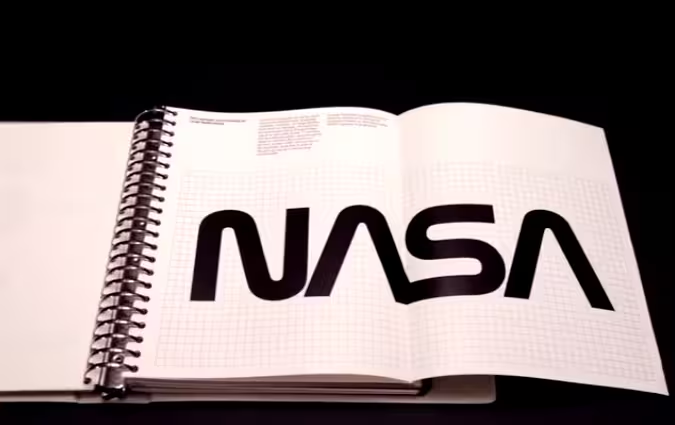

Reproducing the manual will give the ‘worm’ logo a new lease of life. When you look at how people reacted to Google changing its logo slightly this week, it’s hard to imagine the reaction of designers when NASA changed its once iconic logo completely.
Danne explains that when he and his partner, Bruce Blackburn, received a request from NASA for a proposal in 1974, they went the extra mile to ensure its success.
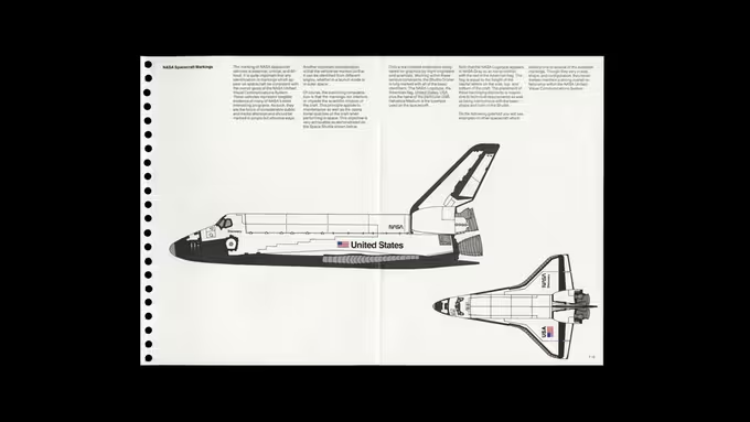
After some opposition, the designers were told it was accepted and the ‘worm’ was to become NASA’s new logo, while the design manual started out on its journey. Danne and Blackburn’s designs defined NASA’s identity from the mid 1970s until they were redacted in 1992. The ‘worm’ logo appeared on everything from official stationary to the space shuttles; even to this day, it remains etched into the exterior wall of NASA’s headquarters in Washington.
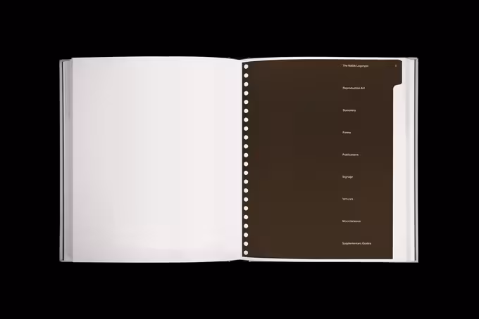
The reissue will be printed and bound as a hardcover book, using scans of Danne’s personal copy. In keeping with the style of the original ring-binder format, the standard sheets of the manual will be printed on the right side with section dividers and there will also be gate folds as per the 1975 version as well.
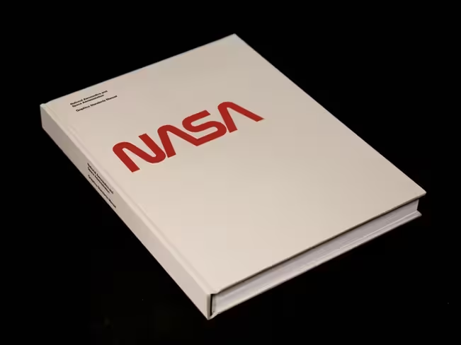
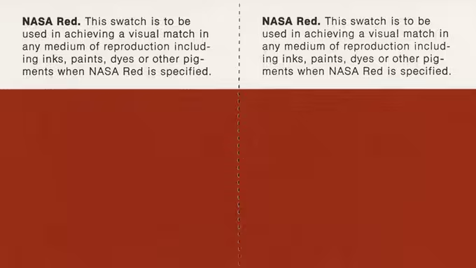

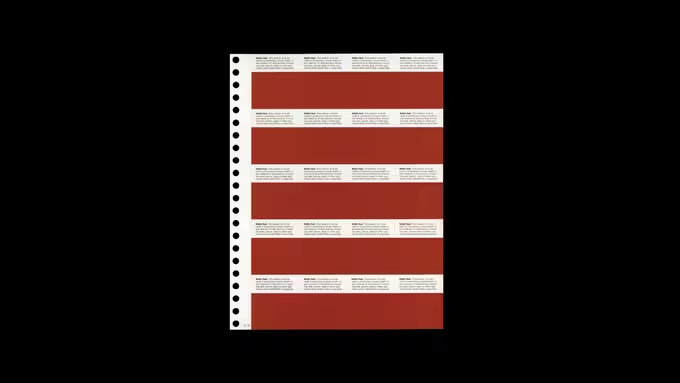
Beyond some work to reproduce the red, grey and blue color spots, the pages of the book won’t be altered in any way, so short of coming across an original, it’s as close as you’re going to get. All of the books will be individually packaged in a static shielding pouch.
When Danne and Blackburn first designed the logo and manual, they wanted them to unite NASA’s various departments and teams through a visual language; Jesse Reed and Hamish Smyth are aiming to do the same for designers and NASA fans all over the world today with its reproduction.
➤ Reissue of the 1975 NASA Graphics Standards Manual.
Get the TNW newsletter
Get the most important tech news in your inbox each week.