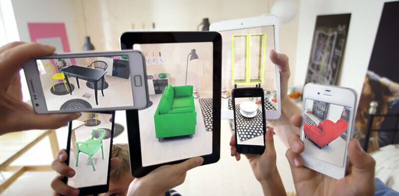
In 1992, researcher Tom Caudell coined the term Augmented Reality (AR). It’s an experience that supplements the real world with a virtual layer of information. Until recently, AR sounded like something from a cyberpunk novel. Some sort of cyborg capability that could go the way of PDAs and laser disks.
However AR doesn’t rely on wearable technology (e.g.Google Glass) – and considering the millions who’ve opted for Lasik, it’s hard to imagine people embracing a constant need to wear special eyewear. Even if the cost of Google Glass was more accessible, the fashion faux pas of unchic fashion is a major hurdle – not to mention something blocking your range of sight. That’s why there’s more to AR than just wearable devices.
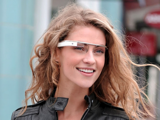
Image source: 35 Arguments Against Google Glass
In this piece, I’ll explain the benefits and challenges of designing for augmented reality, then dive into why we must start thinking of products as connected services instead of standalone items.
Getting Real About Reality
Last year I was invited by Austin’s Chief Innovation Officer to help facilitate a workshop for businesses and institutions which included public libraries, YMCA, business development centers, etc. who’d qualified to receive free Google Fiber.
Google claims it solved a common complaint of many internet users by engineering a faster, more reliable broadband network. Google Fiber boasts a download speed of a whopping 1,000 megabits per second.
The question posed during the workshop was: How might programs be improved once anyone can freely access the internet without limitation? The unfortunate answer amongst participants was that they had no idea what to do with ubiquitous high-speed broadband. They didn’t know what it meant, but were grateful to have it.

Photo credit: Google Fiber
Facilitating the workshop brought AR to mind as an important consideration for UX Designers. Once we’re no longer limited by broadband connections, it’ll be possible to design a smarter and more interactive modern world. I’m not convinced we’ll be walking around wearing special glasses or gear, but as services like Google Fiber change the broadband game, I see a modern world seamlessly enmeshed with technology.
We’re All Becoming Cyborgs
In 2012, Amber Case delivered a keynote at SXSW and spoke about AR as something valuable with a real purpose.
A cyborg anthropologist who spends most of her time thinking about AR, Amber believes mobile devices are becoming an extension of our brain. Amber contends that our phones are becoming an extremity of ourselves. She says:
“From earliest times, humans had tools like hammers that extended our physical self. Today’s technology extends our mental self. It’s changing the way we experience the world.”
Our phones already do so much more than make voice calls and send text messages. Case and other digital anthropologists track the use of technology to reveal that the tools may change but the behavior does not. As the free e-book Interaction Design Best Practices by UXPin describes in the second chapter, you must always design faster and easier way to do simple things.
Technology must fulfill that criteria of efficiency (perhaps even laziness) if it wants to survive.
The Same Devices, More Interaction
More than likely, we’ll continue to use the same devices, but objects previously passive will become interactive. Genevieve Bell is an anthropologist who works at Intel and spends a lot of time thinking about technology and culture. During her SXSW panel discussion on User Experience Design Shaping Our World she shared:
“When I think about what smartness looks like in the future, we’re going to encounter devices that have never been smart before, like your parking meter.”
Essentially, everything will eventually have some sort of computer inside it.
Honeywell has recently created a UX team in Austin focused only on building more intelligent products. Consider:
- Would you eat better if your fridge had a built in computer?
- Could clothes be washed based on their care instructions by your smart washing machine?
I don’t know what Honeywell will come up with, but smarter homes are becoming a reality for many people.
Big Companies Already Embrace Augmented Reality
Also in Austin, IBM is working on a project known as Watson. IBM describes Watson as, “a cognitive system enabling a new partnership between people and computers”.
Apple’s recent acquisition of Metaio (an augmented reality software company based in Germany) indicates that hardware companies are looking to built-in AR capabilities. The expectation is that Apple will use the Metaio software to make all Apple devices AR-compatible.
It makes sense to create AR Apps for popular products. Metaio’s showroom app for Ferrari perfectly illustrates the value that AR technology can provide. Customers can customize their ideal car in the showroom using the AR app that animates 3D images.
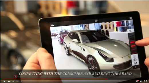
Photo credit: Youtube
Not to mention services like Wink, which enable users to connect all of their smart products to a single control system. The signals are clear: augmented reality is the future of product design.
The Internet of Things Meets Service Design
Augmented reality will rise as a layer of connected services through high speed WIFI. The design challenge isn’t creating new devices, but how existing products are connected by a single service.
Too often users are burdened by poorly designed services. Service design is an important arm of UX because as information becomes freer, our ability to access it becomes more limited. We are experiencing information overload. All of these stand-alone apps certainly aren’t helping. Many apps die a slow death because they’re so difficult to use with other things. Service design acts helps connect all these formerly unconnected things.
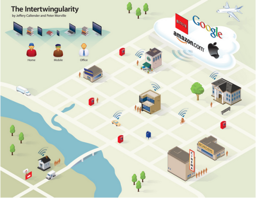
Photo credit: Peter Morville. Creative Commons.
A service needs to link different types of channels and devices, and the experience must be seamless. Many times, workarounds are required to enable a user’s ability to easily get from point A to point B. Workarounds are a short-term solution because software design has so many variables. Different languages, different browser compatibilities, different device optimisation and so on.
Service design considers all of the related touch-points across a mix of channels and devices for a user to complete a task. If the touch-points aren’t compatible, the workarounds are a short-term fix. A new version might render the workaround obsolete and that can break the service.
Siloed Product Design Is A Serious Obstacle
Large companies tend to design products in a silo.
A perfect example is AT&T. I moved into a new house last month and had Uverse installed. As a current AT&T customer, I was surprised that my cell phone account wasn’t automatically connected to my Uverse account. I’ve seen this type of disconnect before in my work as a UX consultant. Large institutions and corporations have siloed teams responsible for individual products. They don’t integrate products so the customer has to manage them as separate accounts.
It is possible to connect a Uverse account with other AT&T accounts through a single sign-on, but management of the accounts remains separated. Here’s what happens:
- If I update my address or payment option for my cell phone, it won’t be updated for any other account.
- This means a lot of unnecessary data entry and maintenance for me, as well as introducing opportunities for human error.
Photo Credit: Mike Mozart, Creative Commons 2.0
All of these silos negatively affect the opportunities for augmented reality. In order for AR to be usable, it must be quick and simple. Unlike other experiences, AR screens are layers to an existing object or device. No one will use AR apps or tools if they take just as long or longer than the conventional way of doing something.
Let’s use the AT&T example, again.
Let’s say I want to modify my account settings. I could design an augmented reality interface where I open an AT&T app on my smartphone or tablet and direct the camera at my WIFI modem. Similar to the Ferrari showroom app, the app would then show me all options for managing my WIFI service.
If my AT&T accounts are linked, I can then select an option to apply address changes to all other accounts. Most likely a customer who wants to change their address for WiFi would also want to change their address for all their other AT&T services. Using an augmented reality app makes it possible to detect the customer’s address based on GPS, verify the account holder by voice recognition, verify the device in question through camera display and essentially make our lives a whole lot easier.
This technology exists. It’s just not being used because companies have limited themselves by building their products in silos. They burden themselves and us by not recognizing the power of connected products.
An Informed Consumer is a Happy Consumer
Layar is a great example of how to design AR capabilities into formerly inactive objects like printed materials. Instead of merely creating a digital recreation of a printed magazine, AR apps bring the pages to life.
Consider producing a single source with layers of capabilities instead of recreating the same information into multiple forms of media. This allows a product team to work collaboratively on a single product instead of multiple unconnected products.
The one product is an analog format with digital layers, which provides a richer reading experience while deepening brand engagement. Engagement provides a lot of passive feedback about content and design, which in turn provides continual feedback to both the user and the product team.
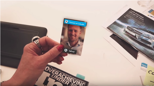
Photo credit: Layar on Youtube
Consider the process of discovering a new movie. Think about where you are when you are introduced to a new movie coming to a theater near you. Usually you’re at the cinema, or walking nearby a movie theater, sitting on the bus reading, in a cab, or watching something contextually related on your phone.
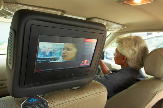
Photo Credit: India PR Wire
An AR app could allow you to scan a poster or screen so you can buy tickets, select the seats in the theater, choose your refreshments with a clear understanding of what the seats physically look like and the actual size of your popcorn. Consumers will be able to make far more informed choices with AR apps and reduce customer service complaints.
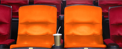
Photo Credit: Fandango
Fearing the Rise of the Machines
Some people might worry that this kind of technology will eliminate jobs or that relying too heavily on technology is risky.
AR is not the same as AI and isn’t about designing intelligent services that eliminate the need for human thinking. AR is really about designing layers of added value that reduce the time to complete simple tasks. AR apps should reduce human error by removing room for interpretation because you’re presented with a realistic rendering of something. As the collaborative design app UXPin first explained in their free e-book Interaction Design Best Practices, task efficiency is the core of every great product.
Vernor Vinge is a science-fiction writer and retired San Diego State University Professor of Mathematics. Vinge authored a pivotal paper during his time at San Diego State called The Coming Technological Singularity: How to Survive in the Post-Human Era. He is quoted widely on his theories about intelligent technology and has pointed out, “Reality can be whatever the software people choose to make it, and the people operating in the outside, real world choose it to be.”

Photo Credit: Wikipedia
Well designed services include contingency plans for technology failures in case of an outage. These services all have some sort of analog component to ground them in reality. And although reality can be whatever our minds allow us to believe in order for people to collectively perceive something as useful there has to be a shared mental model of reality.
The First Step Is Designing a Service Blueprint
When designing augmented reality apps, you first need to research the time and place in which the service will be used. The environment affects AR design significantly because there’s always an object that becomes the background to display the layers upon.
Successful AR apps are grounded in reality. Consider real tools that solve real problems at a particular location and time.
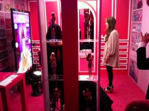
Photo Credit: MHSzymczyk, Creative Commons 3.0
Look at the internet of things. How does adding interactive elements add value? Technology just for the sake of technology might be interesting as a gimmick but it won’t change behavior. Augmented reality apps need to be based off an existing behavior. Figure out what tasks people already perform and map the touch-points involved.
The best way to do this is by creating a service blueprint.
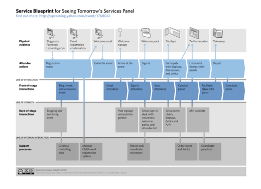
Image source: Brandon Schauer, Creative Commons 2.0
A great resource is ServiceDesignTools.org. There are all kinds of activities and templates to use for designing services that work well and add value.
Real Services for a Real World
Through the capabilities of our smart phones, the internet of things, and WiFi everywhere, we are all slowly becoming cyborgs.
Augmented reality is a valuable added layer empowering us to make more informed decisions. As consumers experiencing information overload, we are desperate for advanced customer service. Augmented reality is like our own personal assistant providing us with an easy way to customize our world. Designing for an augmented world requires an understanding of how to design services that solve problems.
To learn more about designing for human behavior, I recommend checking out the two free e-books below. Across over 200 pages, both ebooks boil down complex topics like psychology and design principles into simple tips for everyday design.
- Interaction Design Best Practices: Words, Visuals, Space
- Interaction Design Best Practices: Time, Responsiveness, Behavior
I’ve also started playing around with the UXPin app and found it quite helpful for approaching design from a service rather than product standpoint. With thousands of built-in elements for different devices (like mobile, tablet, and wearables), you can quickly design for many digital touchpoints in a single project. It certainly helps keep everything in the right perspective throughout the UX process.
Read Next: The future of typography in Web design
Image credit: Shutterstock
Get the TNW newsletter
Get the most important tech news in your inbox each week.


