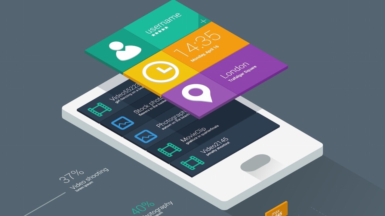
Despite its sudden popularity, flat design is not just some fly-by-night trend. It’s a substantial approach to Web design that’s rooted in practicality, and necessity. The balance between aesthetics and usability reflected in flat design 2.0 demonstrates that the principles behind the philosophy have true staying power.

Photo credit: Reebok
But how does it work? What gives it its magic? In this piece, we’re going to crack the face of flat design and see what makes it tick. We’ll analyze the core techniques and explore which techniques will carry over into the future.
What’s Inside the Flat Design Toolbox
The roots of flat design can be traced to a number of different influences. From Swiss or international design to minimalism, flat design borrows old techniques from a number of different styles while simultaneously creating new ones.
We’ve isolated five tools or techniques that have been closely connected to flat design principles – individual trends birthed from the greater trend.
1. Long Shadows
Most commonly used on smaller UI elements such as buttons, long shadows are created with a color tone that extends beyond a graphic illustration inside of a box.
Image credit: http://www.razvangarofeanu.com/#the-g
The shadow is often wide and positioned at a 45-degree angle with hard edges that are easy to identify. Applied in moderation, long shadows add depth and emphasis to otherwise flat elements.
However, this long shadow trend is lately starting to fade away in favor of subtler shadows. Keep an eye out for shorter shadows in the future.
2. Bright Color Palettes
One of the more fun things that has come from flat design is a re-emergence of color, specifically bright and bold color. Designers are using fun, vibrant hues in more ways than ever before.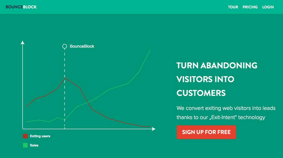
Image credit: http://www.bounceblock.com/
In fact, some designers have even created a set of websites of their own devoted to these visual patterns.
3. Simple Typography
Flat typography is not just the use of Helvetica.
Rather, it is the idea of a typeface that is simple and easy to read, which means commonly sans serif and contains a uniform stroke width. What’s great about flat typography is that it really brought the focus on lettering back into the reading experience.
Photo credits: http://icon-works.com/
While type is an artform in itself, the purpose for most designers is to create something that users can read. Flat typography encourages designers to think more carefully about any and all type selections. Even serif typefaces have evolved with simpler letterforms becoming the norm.
4. Ghost Buttons
Designed as a transparent, yet clickable, element, ghost buttons provide a visual interaction cue without obstructing the UI design.
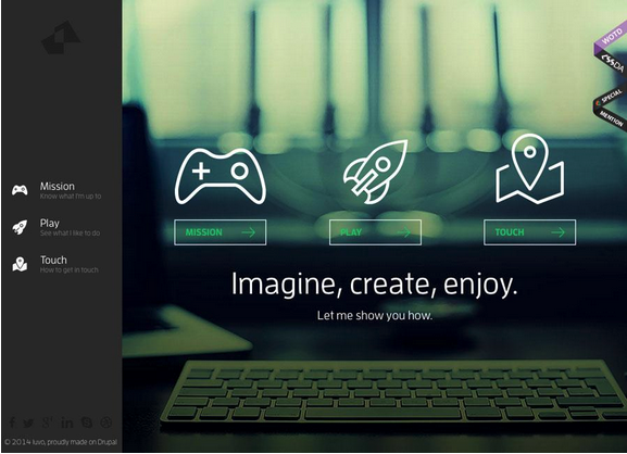
Image credit: http://www.iuvo.si/
Because a ghost button is essentially an outline and does not look like an obvious button, it allows the background to share the focus. The ghost button first emerged against design patterns with high-color backgrounds, and has since evolved to work with images and a number of other elements. These simple buttons often include crisp typography that fits the flat aesthetic, which works particularly well when paired with minimalism.
5. Minimalism
Flat design is innately minimal. After all, when the design isn’t meant to resemble a real-life counterpart (e.g., a notebook app looking like a notebook), you strip away a lot of extraneous texture.
All that’s left is the content framed by colors, gradients, shadows, shapes, and other visual subtleties. Flat design, in essence, forces designers to be more creative by saying less – designing from the content outward, instead of fitting the content inside of a photorealistic framework.
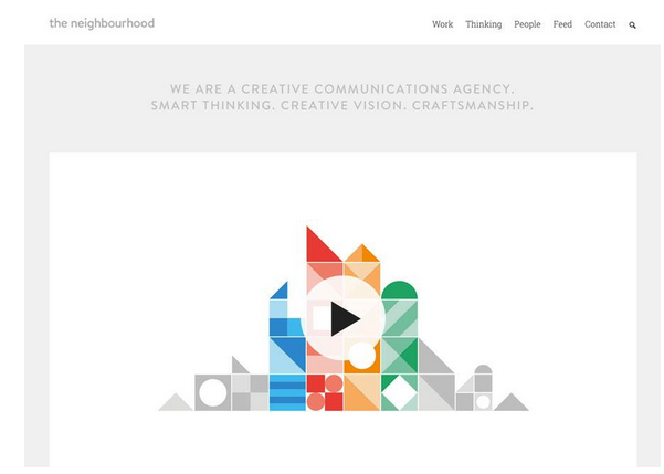
Image credit: http://www.the-neighbourhood.com/
The concept of minimalism isn’t new, but it’s become popular recently for its clean aesthetic and site performance benefits (such as reduction in page load times). This rebirth started with flat design and the use of a bright-colored background with a simple design and evolved into a more simple design surrounded by plenty of white space.
Thinking Beyond the Present
The earliest flat design concepts fit into a very distinct box that was clearly identifiable and lacked many characteristics of other trends or design concepts. But that’s changing rapidly as designers are mixing flat concepts with other trendy interfaces and design languages.
While flat design seemed to almost take the design community overnight, it’s certainly taken some time to evolve. Early showcases of flat design were incredibly flat with a desire to lose all of the skin of the previous skeumorphic era, but today’s flat design is starting to include more touches of flair and ornamentation (and not just for the sake of aesthetics).
Enter “Almost Flat” or “Flat 2.0,” (also known as almost-flat) as coined by designer Ryan Allen.
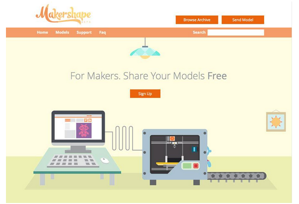
Image credit: http://www.makershape.com/en/
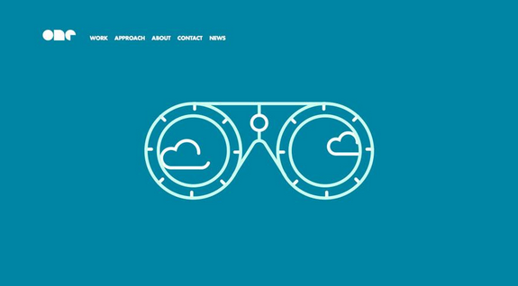
Image credit: http://onedesigncompany.com/
Some of the most beautiful examples of almost-flat design work within the scope of websites that use parallax scrolling to help users navigate from idea to idea one “screen” at a time.
Canal TP does a great job of mixing concepts in an almost-flat aesthetic that uses simple features such as type and color with animation and parallax scrolling. This mix of design tactics helps remove some of the over-simplicity of flat design to make it more practical and usable for sites with more complex content.
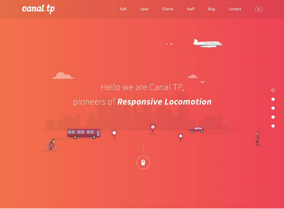
Image credit: http://www.canaltp.fr/
In the future, flat design won’t die, it will just become more advanced as new animations and interactions help it adapt to content-heavy sites. We know that content-first design is gaining traction (as it rightfully should), and flat design is the perfect canvas for its expression
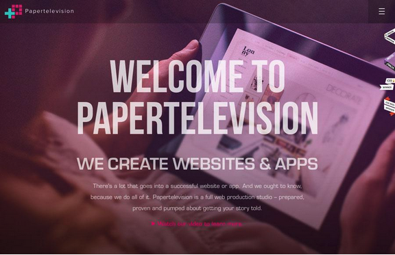
Image credit: http://www.papertelevision.com/
Web design is following a reliable track of usability; every button, click or tap needs a purpose and a clear visual cue so that users will act (and interact) with a website. More importantly, UI tools and elements need an almost universal visual, so that a user knows what to do regardless of device or page. These minute design elements will become even more streamlined in look and feel as designers refine flat design’s icon aesthetic.
Just look at the emergence of the hamburger icon for collapsible navigation – whether you agree with its use or not, there’s no doubt that the simple set of lines now lives as a familiar symbol for across-the-board submenu interaction.
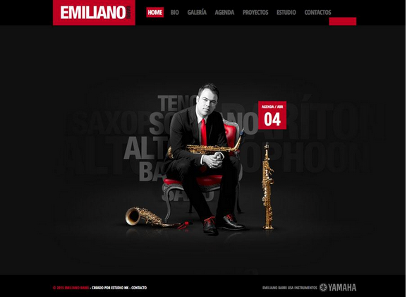
Image credit: http://www.emilianobarri.com/
Flat will also continue to evolve to incorporate more images.
Many of the flat or almost flat sites hitting the web today include photos, something very few early flat sites had. Flat-style colors and typography paired with great images reflect hints of a flat aesthetic that is comfortable with itself – it doesn’t need to replace photos with clever icons purely for the sake of looking creatively modern.
For example, the almost-flat style for Emiliano Barri, above, uses depth and images for the main visual in concert with flat elements, navigation and typography. The result is a visual hybrid that is simple, modern, and very usable.
As designer Wells Riley suggests, remember to always look at your design through the lens of usefulness and usability. Aesthetics are just another tool in design, whose real purpose is solving user problems.
Conclusion
Flat design is not an all-or-nothing practice. Its individual components can be used as well on their own as they can part of the greater system. Flat design lends itself to merging and complementing other methods, so flat hybrids are not only feasible, they’re sometimes recommended (for example, a site with too much content to fit in a traditional flat design scheme).
To learn more about flat design, check out our free e-book The Curated Collection of Design Techniques: Colors & Flat Design. The book includes 70 pages of advice explaining how to create card-style and minimalist web designs with 43 examples from Google, Microsoft, Squarespace, and more.
Read Next: How cards are taking over Web design
Image credit: Shutterstock
Get the TNW newsletter
Get the most important tech news in your inbox each week.