
Designers are racing against each other to design something new, something better, something groundbreaking. This is the soul of innovation and one of the driving forces behind capitalism. But, with moderation in all things, at what point does “new” and “advanced” become “frustrating” and “annoying”?
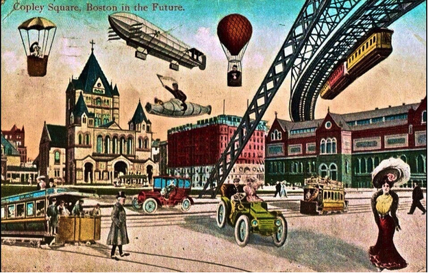
Source: “Boston Future.” Infrogmation of New Orleans. Creative Commons.
Contrary to popular belief, the most advanced products are not always the best.

The 💜 of EU tech
The latest rumblings from the EU tech scene, a story from our wise ol' founder Boris, and some questionable AI art. It's free, every week, in your inbox. Sign up now!
As described in the free e-book Web UI Best Practices, there are more factors involved: learnability, practicality, and the user’s desire to stick with what they know. History is full of advanced failures that the audiences at the time weren’t ready for: the segway, Nintendo’s Virtual Boy, Apple’s Newton tablet (the “ancient” ancestor of the iPad).
Think of the boiling frog analogy. While we shy away from comparing our users to “frogs” and giving them a satisfying experience “boiling them to death,” the core of the metaphor is apt: users must become accustomed to new technology only gradually.
Throwing something that’s revolutionary but un-relatable at users risks confusing them and scaring them off into the arms of something more comfortable. But at the same time, in a competitive market you need to set yourself ahead somehow, and there’s always room for improvement in existing systems.
So how do you strike that perfect balance? Let’s take a look.
The MAYA Principle
The 50s saw an era of looking ahead to the future, and this ideology was written into the aesthetics of the time, which featured that iconic cylindrical and smooth look. Things functioned the same – even archaically, by modern standards – but they had that futuristic feel to them.
And one of the people most responsible for that look, industrial designer Raymond Loewy, is also the man who derived the MAYA Principle.
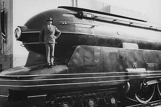
Source: Wikipedia
Most Advanced Yet Acceptable was the code of Loewy, the designer behind some of the most recognizable cars of the 40s, 50s, and 60s, including the Greyhound bus. Here was a man who knew that sweet spot directly between familiarity and innovation. He understood that humans are not always as logical as we claim to be, and even though a product offers a logical solution to a problem, if it’s too radical it will not be accepted.
With the MAYA principle in mind, we can say that too advanced is anything that the user is unwilling to accept. This could be something that looks too different, features a controls that are too different, or simply “doesn’t feel right,” (talk about a logical species). But how do we apply the MAYA principle to web design to help separate us from our competition without ostracizing ourselves from our users?
Application to Web Design
Loewy was a master of locomotives and automobiles, but he never had to deal with an iPhone touch screen. The MAYA principle itself is timeless, but given the current technological landscape, it needs to be clarified a little in order to be helpful.
For starters, a website needs to appeal to a user’s emotions – if you can’t convince them with logic, you have to essentially “trick” them into doing what’s best for them anyway. This involves a mixture of giving them what they want and what they need.
Don’t underestimate the power of visuals. Sometimes releasing the same interface or system in a prettier package can make the difference between success and failure, and giving an unconventional feature either a seductive or familiar look can alleviate some user concerns.

Source: “Radio app UI – flat/skeuomorphism.” Alan Klim. Creative Commons.
In an article for UX Booth, Jim O’Neill gives three tips for how to present an advanced design in an acceptable manner. His entire article is worth a read, but we found the following advice the most helpful:
Create backup options – If you make the advanced aspect of your design an option, users are free to explore and grow accustomed to it at their own pace (or not at all, sometimes). They can still do things the old-fashioned way, but may experiment and come to see the advantage of the new element. For example, Google Drive offers the option to toggle between the “Old” and “New” versions.
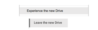
Photo credit: Google Drive
- Gradually introduce change – Redesign bits and pieces at a time, as opposed to releasing a whole new site all at once. For example, you might change the categorization of a few site pages, A/B test it with some users, and then a few months later introduce a new system for navigating between those pages based on learnings. Doing both at the same time will probably confuse and irritate users.
- Rely on familiar visuals – Referring back to our earlier point, familiar reminders help anchor users. This concept was taken to the extreme during the skeuomorphic movement of the early 2010s, but we see it maturing through Flat Design 2.0 which now embraces just enough realism to improve usability. For everyday design, make sure you use clear signifiers so users never confuse form and function.
If you apply these rules correctly, you’ll be able to make designs more acceptable, regardless of their level of advancement.
Manufacturing Familiarity
It may seem counter-intuitive to bury your groundbreaking, state-of-the-art design in visuals that are “the same as what everyone else is doing,” but you’ll need to reach some compromise if you want to keep users on board.
Think of familiarity as the link between advancement and acceptability. If you can present your unorthodox new ideas in a familiar way, the users will be more likely to accept them – even if they’re actually unfamiliar. The trick is to know what to make familiar, and what to push forward as innovative.
UI patterns and common signifiers are the best way to stay anchored in the acceptable while still pioneering new ground. Retain a few of these familiar aspects on your site, and your users will be more tolerant of your more outlandish choices.
While we discuss these in detail in Interaction Design Best Practices, we’ll give a brief summary here. Basically, UI patterns and signifiers are practices and visual cues (respectively) used so frequently on sites across the Internet, they’ve become instantly recognizable by the average user.
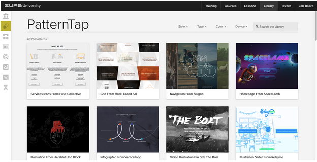
Source: ZURB: Pattern Tap
An example of a UI pattern is clicking a site’s logo to return to the Home page (as well as placing the logo in the upper left corner).
There no written instructions that clicking the logo will return you to the Home page, nor that the logo is even clickable at all – but users will now instinctively do it when they want to return Home. This pattern has become so popular, that the failure to comply will seem strange to the user.
Similarly, a signifier is a visual cue indicating how an element will function. For example, blue underlined text signifies a link and has become so popular that the typographic treatment is also a UI pattern. Upon seeing such text, users have enough experience from other sites to know that clicking the words will activate the link (a principle known as external consistency).
Implementing patterns and signifiers into otherwise alien designs softens the impact of a radical new system and give the users the confidence to experiment. But these familiar elements also offer the additional benefit of bypassing one of the worst drawbacks to an advanced design: the learning curve.
Learnability
The golden rule of web design is don’t make the user think, as popularized by Steve Krug. The more you burden your user with cognitive load – anything that requires effort to remember, figure out, or otherwise think about – the less they’ll enjoy the experience on your site. And one of the most notorious strains on your users’ fragile brains is learning a new system.
The inherent fault in advanced systems, aside from the users’ predilection towards the familiar, is having to learn a new set of controls. This is not always the case, if, for example, you’ve already gotten your users excited about the new system. However, that doesn’t always happen and redesigns usually are sprung on users by surprise.
The patterns and signifiers mentioned above can go a long way in improving the usability of your system. What they are, deep down, are universal controls that the user doesn’t have to think about. If you incorporate them in a clever manner, they can give a new and advanced system a familiar feel and allow the user to control it “intuitively.”
Let’s say, for example, you invented a new way to showcase video on your site that’s far better than the traditional methods around today. If you integrate just a few familiar functionalities from traditional methods, the new feature won’t seem so extreme.

Source: Digg
In this example, you might still use the right-facing triangle to indicate to the user how to play the video. This simple icon – a signifier for “play” since the days of VHS tapes – not only gives the new features a familiar look, it also offers a shortcut around learning a new system.
The user draws on their existing knowledge, and doesn’t have to think so much.
Conclusion
Good UI and UX designers push boundaries and challenge conventions…but there’s a difference between bending the lines of acceptability and breaking them outright.
Being new and innovative is an admirable and effective business strategy, but only when done correctly. It’s not enough to simply stumble blindly into any technological affordance available to you. Those last two letters of MAYA are the most important – you want to make your designs as advanced as possible, but only as long as you follow the steps to make them acceptable as well.
If you’d like to learn more about balancing creativity with familiarity based on real examples, check out our free e-books Interaction Design Best Practices Book 1 & Book 2 (over 200 pages total). Over 50 deconstructed examples are included across both books.
Read Next: The changing face of animation & interaction design
Image credit: Shutterstock
Get the TNW newsletter
Get the most important tech news in your inbox each week.