
Consistency in design is advisable most, but not all, of the time.
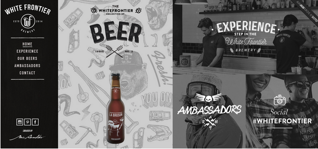
Source: White Frontier Beer via awwwards
Absolute consistency is repetitive to the point of boredom. In order to mine its benefits without putting your users to sleep, you need to know when to break the monotony. For example, you can see above how the light graphic background immediately draws attention to the beer compared to the black-and-white photo backgrounds in the other grid blocks.
In this piece, we’ll point out the circumstances around when inconsistency can work for your designs, then show you some real-world examples.
When to be Inconsistent
Don’t get us wrong: we stand by the significance of consistency. As described in the free ebook Consistency in UI Design, you should generally strive for consistency within your site (internal consistency) and according to widespread design patterns (external consistency).
What we’re saying is that, when applying consistency in interaction design, it’s important to break up the tedium occasionally. There are specific times to do this, and don’t misconstrue this as a license to break the rules whenever you’d like. In other words, be consistent with when to be inconsistent.
Draw Attention
The most common and effective way to use inconsistency is to draw attention to a single, specific element. Imagine a man wearing black pants, black shoes, a black shirt, a black jacket, a black hat… and a white tie. Where are people’s eyes going to be drawn? If you want something particular in your interface to stand out, make it different. If the stylish man wanted people to notice his head instead, he’d wear a black tie and a white hat.
The golden rule with inconsistency is moderation.
The reason it works so well is its exceptionality. Every other element within your design creates a pattern (consistency) so that, when the pattern is broken (inconsistency), it stands out. If you implement too much inconsistency, all patterns dissolve into chaos.
Overall, the more inconsistency you apply, the less each individual occurrence draws attention. Save inconsistency for when you really need it so that it delivers the strongest punch.
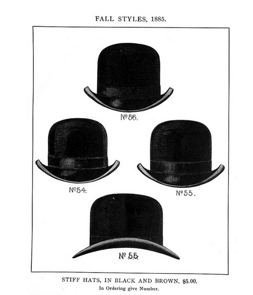
Source: “A short treatise on head wear, ancient and modern (1885).” CircaSassy. Creative Commons.
If our stylish man wore black pants, a black shirt, and a black jacket, but a white hat, white shoes, and a white tie, then none of those in particular would stand out. He’d be a walking fashion nightmare.
As a UI designer, the use of inconsistency can be a great tool. This can be used to lure your users’ eyes where you want, whether a call-to-action, a new feature, or even a product that could be selling better.
2. The Sake of Usability
Another less common but nonetheless appropriate scenario for inconsistency is simple usability concerns – if maintaining consistency will get in the way of usability, break the rule for that one instance (or, if it happens too often, change the rule).
Brendon Cornwell, UX Designer at Captech Consulting, points out a perfect example of this in Making and Breaking UX Best Practices.
Like most companies, US Airways states that its logo should appear in the upper lefthand corner of its site. This was fine, until it came time to design their mobile app. Their logo, which consists of a series of horizontal gray bars mimicking the American flag, looked like the hamburger icon when shrunk down and placed in an upper corner, confusing the users.
The problem was solved by removing the logo on their secondary screens, inconsistent to the styling format, but a smart choice for usability.
Use common sense about it – as beneficial as consistency is, you shouldn’t force it at the cost of the user experience.
Inconsistency With a Purpose
Let’s take a look at inconsistency done right. The following examples know when to conform, and when to break the mold.
1. Jawbone
Jawbone is a consumer tech company that specializes in wearable devices and wireless speakers. Their website showcases many of their products, though some pages tend to deviate in consistency – but for the right reasons.
Below are two screenshots for two different products:

Source: Jawbone UP3
The UP3 is a fairly straightforward fitness device, so the copy on the page and three tabs at the top are enough. Users wear the bracelet constantly, and as a result, get updates that form a complete picture of their health. Once the users understand this benefit, they’ll likely want to play around with some features, which is easily accessible through the tabbed layout.
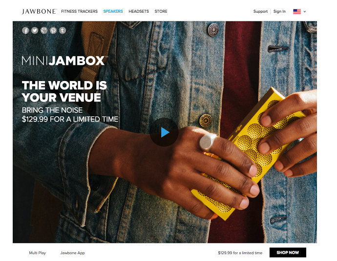
Source: Jawbone Jambox
On the other hand, the Jambox page is more experimental, showcasing a video as the default image, and foregoing the typical descriptions to promote the limited time offer. Because the Jambox is a livelier product, with a different set of user benefits, this inconsistency makes sense.
The important thing is that Jawbone maintains consistency where it counts.
The top navigation bar remains the same, including the upper righthand Support/Sign In/Language options. Navigation is one area that should be consistent throughout the entire site or app, as orientation is a top priority in interaction design and making the user comfortable.
Likewise, the bottom right-hand corner is consistently occupied by the price and a call-to-action, both important pieces of information that shouldn’t demand too much thought.
2. Miranda July
Now let’s take a look at a more surreal and unconventional website, brought to our attention by Visual Swirl’s excellent article on rule-breaking websites. Author Miranda July’s website for her book No One Belongs Here More Than You is totally linear (like the book it promotes), yet strangely addictive and fun.

Source: No One Belongs Here More Than You via Visual Swirl
The website is externally inconsistent compared to similar sites and user expectations. After all, not many of us have encountered a site with only a forward or backward navigation option, where the narrative is told purely on a stove-top in black marker.
But the design works because the purpose is pure storytelling. The author wants to tell a whimsical story about the book, so the form matches function. Each page remains engaging because it feels like a conversation. As you click forward, the site loads a new stovetop message, which feels like it’s talking to you.
The trick to making this work, however, is keeping the content simple and bite-sized. Chunking out content reduces cognitive strain and creates a snappier experience. Imagine how the interaction design on the page would work if all the messages were connected in a scroll, and flanked by a navigation menu and sidebar. The site would feel tedious instead of lighthearted and enticing.
While the site refuses to be externally inconsistent, it dutifully remains internally consistent. The navigation arrows appear on the same location on each page, and the primary content is always the stovetop message. If they broke internal consistency by having some pages in a standard layout, the design would collapse.
As we’ve mentioned before, success lies in moderation.
3. Dolce & Gabbana
Another example of external inconsistency, Dolce & Gabbana deviates from the norm not to be showy, but for the sake of usability. We came across this site after reading Jason Gross’ interesting article on breaking design principles on purpose.
As explained in the free ebook Interaction Design Best Practices, related actions should be placed close together to communicate similarity, in accordance to Fitts’s Law. But as Jason Gross explains, when you reach the shopping cart, the links for Back to Shopping and Proceed with Order are on opposite ends of the page.
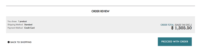
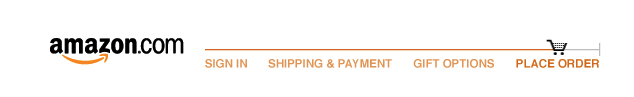
Source: Dolce & Gabbana
Why put such distance between them?
Having the two options side-by-side increases the likelihood of the user accidentally hitting the one when they wanted the other. Dolce & Gabbana’s slight increase in friction is worth preventing a couple of unintentional (and bad) experiences. The design choice does not totally abandon the best practices of interaction design, though. Because the two options are on the same horizontal plane, the user understands the two choices are related.
4. Amazon
So far we’ve outlined two fundamental UX design principles:
- Usability trumps consistency.
- Consistency in navigation is essential for orientation.
But what happens if these two come into conflict? Amazon – and many others – enter the gray zone of UI patterns with their disappearing navigation bar.
When you’re ready to check out, the standard navigation is suddenly replaced with a progress bar indicating your location in the purchase process. You could argue they did this to increase friction in backing out of a purchase, or they’re simply stripping away any interface objects that don’t assist the user in finishing the purchase. With less distractions, the checkout process can be completed faster, which is good for business.
Inconsistency That Requires Improvement
Now that you’ve seen a few examples of acceptable inconsistency, let’s look at the other end of the spectrum.
1. Xfinity
Xfinity’s navigation design is a shining example of bad internal inconsistency. The secondary navigation on the main Xfinity pages is inconsistent with the secondary navigation on the Xfinity TV pages.
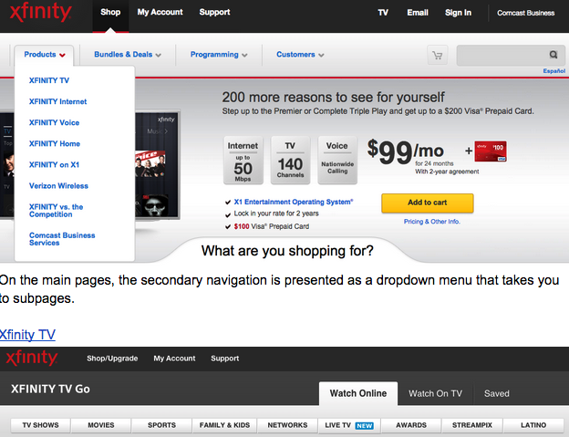
Source: Xfinity TV
On the Xfinity TV page, however, the secondary navigation is tabbed. If Xfinity TV existed as a separate site (or even a subdomain), such a departure could be acceptable because users might expect different navigation on different properties. But since the TV page is on the same property as the main pages, users expect consistent navigation.
Because the Xfinity TV navigation tabs also look similar to the main page dropdown, you might at first glance think they function the same. Since they don’t, this similarity only deepens the confusion.
Jawbone is a much better example of the right approach to inconsistency: either use drastically different navigation for different content types, or keep the navigation identical. Anywhere in between will only result in confusion.
But there’s more that needs fixing. Notice how the labelling of the tabbed categories is also internally inconsistent. TV Shows and Family & Kids are not perceived as the same level of information architecture, yet here they are presented as similar.
Source: Xfinity TV
Ultimately, these nuanced mistakes all stack up against the user, especially if they need to browse between the main pages and the Xfinity TV page.
2. Adobe
Adobe is a subtler example of internal inconsistency between icons in the navigation. After you click the hamburger icon, the following overlay menu appears.
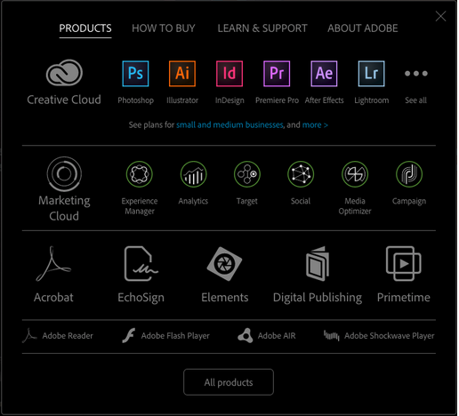
Source: Adobe
At first glance, the menu doesn’t look too bad. But look closely at the categorical meaning of the icon types. We are lead to believe that:
- Large grey icons – These represent product suite (like Creative Cloud)
- Colored icons – These represent individual products (like Photoshop)
Yet the design breaks this internal consistency by also making products like Acrobot and Echosign display as large gray icons. Because these products don’t fall into any particular suite, perhaps a better treatment would be displaying them in a style different from colored icons or gray icons.
If we gave these “other” products their own icon style, we could immediately communicate the distinction. Otherwise, this interface breaks the rules it just established.
It may sound nitpicky, but think about the usability implications: the user may click on an “other” product icon thinking it leads to a suite of products, finds out that’s not true, and now needs to resort to other menus or the search bar to find what they need.
Takeaway
Because of its powerful side effects, inconsistency is best used delicately. Keeping in mind the necessity of moderation, first isolate which elements you’d like to stand out most, then apply inconsistency only to them.
Take another glance at the examples of inconsistency done right – Jawbone, Miranda July, Dolce & Gabbana – if you are still confused about when to use it. Think about inconsistency as a very potent spice: just a pinch could mean the difference between a good and a great meal: too much (or the wrong spice) ruins the food completely.
To learn more about balancing consistency and inconsistency in design, check out the free e-books Consistency in UI Design and Principles of Visual Consistency. Both books are written in a practical format driven by visual case studies of over a dozen top companies.
Read Next: 7 pillars of minimalist Web design
Image credit: Shutterstock
Get the TNW newsletter
Get the most important tech news in your inbox each week.