
In Web design, white space, or negative space, makes the difference between an ordered layout that’s easy to comprehend, and a chaotic, cluttered mess. Buttons, links, text, and other media all need room to breath. The spacing between them improves the overall composition and is often seen as a “big picture” concept.
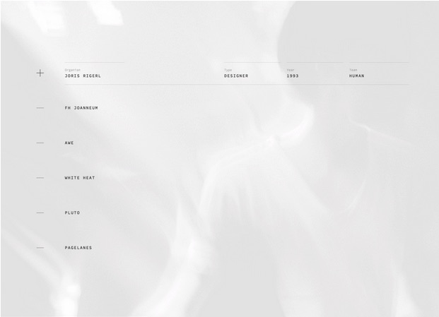
Photo credit: Joris Rigerl
But white space can also be used between smaller objects like text or image thumbnails. Space will often speak more about individual elements rather than the page as a whole. It’s all one big microcosm of a macrocosm: the little things always affect the big picture.

The 💜 of EU tech
The latest rumblings from the EU tech scene, a story from our wise ol' founder Boris, and some questionable AI art. It's free, every week, in your inbox. Sign up now!
In this piece, we’ll dissect white space and explain the fundamentals. We’ll start with the aesthetic properties, then discuss the different categories and how they’re applied.
Aesthetic Properties of White Space
Delving more into the design side of white space requires other fundamental UI design principles. These often relate to similar principles found in graphic design, all of which tie into the overall composition.
White space plays an important role in the final composition because it exists in every layout style, whether it’s for a minimalist design agency or a global e-commerce retailer. Of course it’s okay to follow a style of minimalism, but this isn’t always the best choice for all web projects. Treat white space as a thankless design element, because you can gauge its success by how much people don’t recognize it.
Some visually sensitive visitors may notice that a website’s design is especially roomy, but they won’t often be able to put their finger on the reason why. So a beautifully-crafted website still needs great features like typography, colors, and symmetry to balance with the space.

Source: Campaign Monitor
Campaign Monitor has an interesting homepage with generous amounts of white space. The whole layout flows very naturally and moves in a rhythmic vertical pattern. While scrolling through the website, you definitely feel compelled to move down further.
By combining white space with its unique color scheme of greens, whites, and greys, the design creates a natural visual storytelling effect. Page sections are also created at full-width so they take up all of the horizontal space, further immersing the user. The “chunking” effect appears when scrolling because the different background colors create the illusion of different blocks on the page.
White space amplifies this effect because it forces visitors to focus on each area with a high degree of attention, isolating each “chunk” from the others. So not only is there a lot of space between page blocks, there’s also plenty of space between icons and text. While Campaign Monitor could be considered somewhat minimal, it most definitely uses other design features like vibrant images to draw attention.

Source: Exposure
You’ll find a similar effect on the homepage of Exposure. Their layout focuses more on typography with unique typefaces and oversized text. In this design, it’s apparent that content dominates the creative theme.
But what’s interesting is that contrast also plays a large role in the text’s design. You’ll notice right away that most text on the page is clearly readable, recognizable, and stands out from a distance. The crisp contrast between the typographic styles (like bolding and cursive) and sparse background easily distinguishes white space from content.
Contrasted color is a powerful tool when used in conjunction with other design fundamentals. Like we discussed in Web Design for the Human Eye, contrast is the use of two colors which compliment each other in a vibrant yet satisfying manner. By contrasting text or content sections, the white space on Exposure’s homepage feels twice as loud. The elements are crisp so you notice when they’re on screen — and you notice when they’re not.
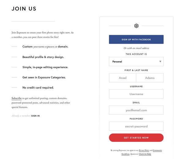
Source: Exposure
You’ll also notice this effect on Exposure’s web form and photos lower in the homepage. These elements are designed in a way as to clearly stand out and be recognized while scrolling. Studies have shown that unimpressed users can leave a site after 10-20 seconds, but the design and content structure often changes people’s minds.
Three Main Types of White Space
We can categorize white space into three different types based on how it’s used:
- Compositional White Space – Space for margins, padding, and general composition.
- Visual White Space — Space for graphics, icons, buttons, or form elements.
- Textual White Space — Space between headers/paragraphs and lines of text.
For example, let’s consider the generic image carousel. The carousel itself needs compositional white space above and below to separate it from other elements on the page.
Inside the carousel is an image or multiple image thumbnails. Padding is used between thumbnails and between the primary image to create a visual distance. We call this “visual white space” because visual elements are a mid-way between the macro composition design and the micro content style (which we’ll explain below). Regardless of carousel size, textual white space should be used between internal elements to alleviate clutter and offer some visual breathing room.
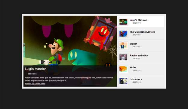
Source: DesignM.ag via Jake Rocheleau.
The screenshot above is from a Designm.ag image carousel tutorial that integrates these various styles of white space. The carousel itself is centered on the page to draw attention using compositional white space. Inside the carousel, all of the thumbnails use visual white space to create a grouped list of carousel content. Similarly the larger preview image takes up a majority of the carousel so as to immediately catch your eye.
Digging even further, you’ll notice textual white space between text in the black image description box. The header text “Luigi’s Mansion” uses plenty of space above and below, while the paragraph text acts as more of a block element. Also, notice how textual white space is used between thumbnail images and their titles (like “Waiter”) in the right-hand column.
As you can imagine, it’s pretty common to find a hierarchy of white space even within simple page elements. Granted, not every element on the page will use all styles of space, but almost every page will incorporate all of these styles somewhere in the layout.
Macro & Micro White Space
All three types of white space described above can be further broken down into two categories: micro white space and macro white space. Great websites incorporate both categories into a layout design.
Macro white space is found when looking at the whole design from a macroscopic level. This may be colloquially referred to as “the big picture,” where compositional white space takes a leading focus. Designers usually start a new web project by first creating a wireframe or prototype that visually demonstrates macro white space on the page.
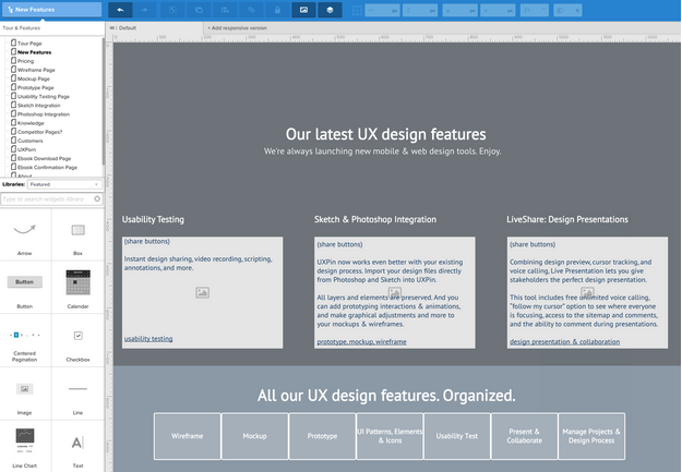
Source: UXPin
In the above wireframe from our site redesign project, each section is denoted by separate background colors. It’s easy to see where page elements are located and how much white space should be used between them. Macro white space is visible on every single website, but it can be hard to see without looking at the full layout.
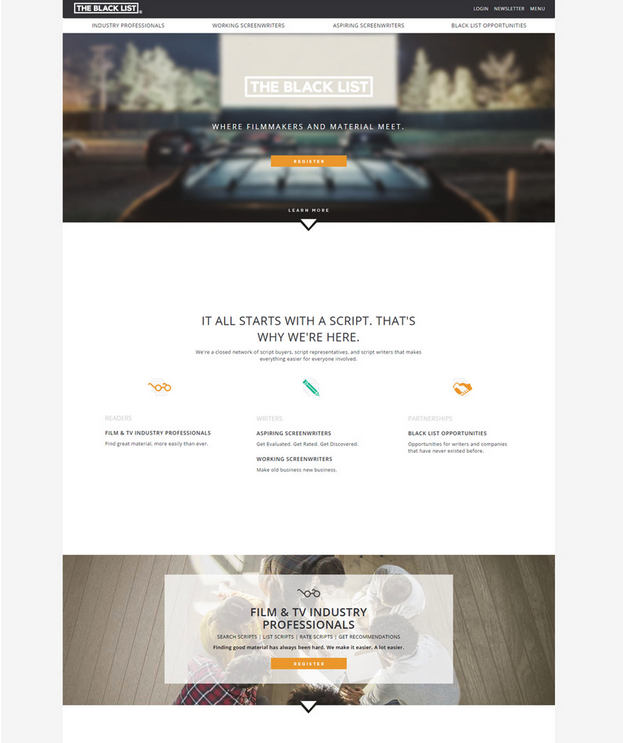
Source: The Black List
The Black List uses a long and well-spaced homepage design. If you take a look at the whole composition, you’ll begin to recognize major sections of the page. These different sections use macro white space to create distance from other areas, and micro white space to create internal relationships between content.
Micro white space is what handles space between all the little page elements. These elements include navigation links, image galleries, unordered lists, and page headers. Micro white space can be used with media like images/icons (visual white space) or with text like headers/paragraphs (textual white space).

Source: Ersin Çelik
Like most detailed layouts, the above wireframe showcases both macro and micro white space together. Macro white space exists between each of the large page sections, while micro white space is found between the internal page content.
For example, micro white space is used for margins between the headers and paragraph text. It’s also used to create padding around the wireframe’s logo and to create space between the buttons in the header section.
Conclusion
Applying white space correctly starts with understanding it.
Don’t forget the aesthetic properties of white space, and how it makes your site look. Remember the different divisions of white space – the three main types, as well as the differentiation between micro and macro. With these in mind, you’ll be able to create an eye-catching and comprehensive site, and avoid having to clean up a cluttered mess later.
To learn more, check out the free e-book Zen of White Space in Web Design: Balance, Contrast, Hierarchy. The book includes 60 pages of advice with 14 analyzed examples from Google, Wanderlust, Sketchapp, Lever, and others.
Read Next: New Web trends: immersive interaction design
Image credit: Shutterstock
Get the TNW newsletter
Get the most important tech news in your inbox each week.