Design is all about pushing the boundaries of technology and creativity to better solve problems. At its core, design is about people.
When we talk about people, we mean team members as well as users. In the Web and mobile app space, successful digital designers must be able to work with different people to create targeted experiences for people they might never even meet in their lifetime. It’s an extremely difficult balance between logic, cognitive science, fearless creativity, and plain human empathy.
There’s been a lot of trial-and-error over the years, and from the wreckage (some of it our own, admittedly), some common best practices survive. We’d love to share what we’ve learned from our own experiences (and from excellent designers we’ve worked with).
Without further delay, let’s begin.
1. Design for Emotional Connections
What a world it would be if everyone behaved logically and users flocked to the sites and apps with only the best functionalities. But this utopia (or dystopia, depending on how you look at it) is far from the world we live and design in, and studies have shown that users generally prefer products that create emotional connections over those that just work well.
Source: Frames Collection
Don Norman links this to human evolution – thanks to the life-or-death situations of mankind’s prehistory, we’ve adapted to make split-second decisions based on our emotions, or “gut reactions.” User research studies have proven the power of emotional connections in design: users determine how trustworthy and credible a site is based on looks and users perceive pleasing products as being more usable, even under identical conditions.
Effective designers recognize this, and design specifically to create this emotional connection, whether through aesthetics, gifts, discoverables, and feedback conversation (which we’ll discuss below). Because perception is reality in user experience design, we can say that emotional design techniques like powerful images and smooth animations makes a product’s usability more memorable.
2. Proactively Work with Developers
Of course, all designers will work with developers at some point, but the key word here is “proactively.”
Handing off fully formed designs to the next link in the chain is the bare minimum of collaboration, if you can even call it that. What’s best for everyone is forming a deep relationship with all members of the design team, especially designers and developers. Designers aren’t just pixel pushers, and developers definitely aren’t WYSIWIG machines.
Source: Damian Rees, via Smashing Magazine
Get developers involved in the design process as early as possible. Invite them to meetings, user research tests, brainstorming sessions, etc. Their input, after all, determines whether your vision actually comes to life. At the very least, they can warn you if your ideas are a technical nightmare, a diagnosis that saves you time if caught early enough.
Try to understand the developer’s perspective, and watch how you phrase things. Instead of asking, “What’s not doable?” try, “What’s too difficult?” The framing of the question demands less upfront commitment, and creates a more casual atmosphere for honest feedback.
Whether you’d like to admit it or not, you both share the ultimate goal of creating something that makes user’s lives better. Developers can’t do it without someone to ensure everything is human-friendly, and you certainly won’t get far if your idea never gets built.
Never forget that developers are simply designers of code. Get together, think out loud, criticize each other’s ideas. Ask hard questions, and give straightforward answers. Whatever you do, just don’t assume anything.
3. Focus on the Right Idea, Not the Best One
We hate to burst your bubble, but digital design is not art. It’s artistic, and there’s a a lot of creativity involved, but as long as the greater purpose it serves is business-related, it can never be a pure art form.
Let’s say you come up with an idea for the most brilliant, ground-breaking design for an ecommerce site that will change the way people interact with websites forever. If prior research has shown that your older user base prefers the comfort of existing interfaces as seen on Target or Macy’s, then you’ll have to shelf the work of genius until another day and create something that fits the mold of the Most Acceptable Yet Advanced principle. That’s not to say that you need to crush all your creative urges.
Source: UXPin.
Effective designers create for the needs of the project, not their own. They’re able to set aside their personal tastes and build a design that fulfills its purpose, even if they themselves wouldn’t use it. Every designer knows what it’s like to kowtow to finicky clients and stakeholders – but the exceptional ones do it for the right reasons. That’s not to say they don’t stand up for their ideas (or walk away), but that they understand the business aspects of the design industry come first, especially ahead of their own egos.
How do they know how to fulfill specific needs outside of their own tastes? One of the best strategies is to reference user data. Researching how your users act and what they like will give you solid footing so that you don’t have to rely on guesswork or subjective opinions. Building user personas from reliable data will keep you on track to designing what’s right for the project, regardless of whether you (or other stakeholders) think it’s best.
4. Treat Interface Feedback as Human Conversation
As described in Interaction Design Best Practices, the goal of interaction design is to create the most lifelike and human interaction possible, between a person you’ve never met and a machine. That’s no easy task, so effective designers rely on every tool available, especially feedback.
Feedback is the system’s side of the two-way dialogue, making it a unique emotional channel for breaking the “black box” feeling for new experiences with technology. That’s why every bit of feedback, from pop-up messages to account creation confirmations, are an opportunity for conveying humanity. You should always pay attention to these opportunities, because even if you don’t, you user will.
There’s no one right way to talk to you user. The only thing that really matters is that your tone suits the personality of your product – it is, after all, the product’s voice. Think about whom you’re talking to – would a casual tone put them at ease, or would they prefer more formal language that promotes professionalism?
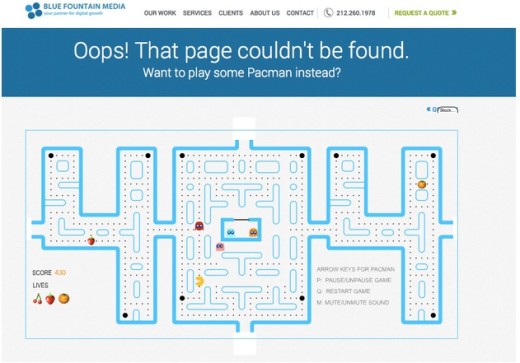
Source: Blue Fountain Media
The best example of how feedback can change the tide is the 404 page.
A dry, humorless “page not found” message will exacerbate an already annoying situation, whereas using the opportunity to make the user laugh (echoing our first point about emotional connections) or give them a fun distraction like Pacman (as with Blue Fountain Media above) could turn a negative experience into a positive one. Users may be glad they encountered a 404 error, and that page may be what they remember most about the experience.
5. Design the Right Details at the Right Time
Different stages of the design process call for different levels of detail.
Being too concerned with the visual details too soon will distract from the matter at hand. Putting them off too long will either delay the project or force a rushed job. Effective designers can pinpoint the right fidelity, then present them in a way that encourages accurate feedback.
Each designer values the freedom of forming their own unique process, making it individual to them.
However, there are some general milestones to hit. The first stages, like wireframing, should be lo-fi, in order to focus more on layout and structure – decisions here are subject to change, so delving into details like button bevels and background gradients can be a waste of time. Once you’ve gathered stakeholder and user feedback on the early design, then you can start hammering out the fine points of the visuals.
Source: UXPin
That said, we’d like to recommend a process that’s worked well for us.
We start with a lo-fi wireframe that allows us to focus on the broader structure and overall picture – however we give it limited interactivity by building it in our UXPin. This allows us to test usability very early on, but without having to build something hi-fi that will inevitably be scrapped. Our lo-fi prototypes give us valuable research data going forward, and because they’re lo-fi, there’s minimal waste in throwing them out and starting over with what we learned.
6. Balance the Amount of Choices
Freedom of choice is a bit of a paradox when it comes to UX design.
Users want the freedom to choose multiple options and available actions. At the same time, users want simplicity, a clear path, and as few distractions as possible. But somewhere in between those two, there exists a perfect balance, and effective designers know how to find it.
While Hick’s Law may have originated in the 50s, it has since been modified to fit modern design in defense of simplicity. This classic psychology principle states, in simplified turns, the amount of time it takes someone to make a decision increases with the more options they have. In digital design, this amounts to reducing the number of on-screen choices to improve the UX.
In order to avoid the choice paralysis we advised against in Interaction Design Best Practices, Hick’s Law can be applied to your interface in a few different ways. First, and most obvious, is to trim the fat. Getting rid of unnecessary secondary content will focus more attention on your primary content. Never forget that overloading your interface just ends up watering down everything.
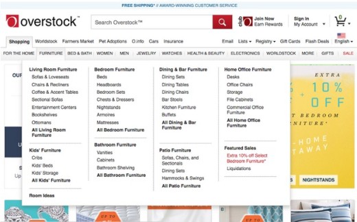
Source: Overstock.com
Spend more time chiseling your layout and content hierarchy. By cleverly structuring your content, you can still offer your users plenty of options, but present them in a way that doesn’t overwhelm them. Elements like size, color, location on the screen, and white space can all influence what gets seen and what doesn’t.
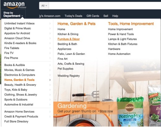
Just compare Overstock’s dropdown menu to Amazon’s slideout menu. By saving tertiary information like “Bedroom Furniture” for the actual page, Amazon’s slideout menu is less overwhelming. Oftentimes, good UX design is about leading users on a path that feels the most natural, revealing more information only when necessary.
Source: Amazon
UI patterns work great as shortcuts to creating order out of chaos. Applying pre-existing patterns that your users already know how to use (such as the cards layout described in Web UI Patterns for presenting many content choices) can help you preserve features through better layout and discoverability. The pattern of hover controls (having optional features appear only when the cursor is over a certain areas) was designed for this purpose in particular – until they’re needed, extra options remain out of sight and out of mind.
7. Think Beyond the 3-Click Rule
For starters, let’s take away some of it’s power by not calling it a “rule.”
The 3-Click Theory states that users should be able to find what they’re looking for within three clicks. The theory hinges on the idea that the more a user has to click, the less they’ll like the site, and after three clicks they’ll give up and go to an “easier” interface.
The fact is, this is an idea that’s been proven wrong. Joshua Porter conducted a series of tests that showed no correlation between user dissatisfaction and the number of clicks, and that users were no more likely to give up after three clicks than they were after twelve.
Photo credit: “Magic Mouse”. Yutaka Tsutano. Creative Commons.
So how did the 3-Click Theory sneak itself into design canon? The heart and intention of the idea is sound. It’s the rigid application of limiting oneself to three clicks that went awry. What the three-click rule does right is promote simplicity and convenience. However, these things are not always synonymous with “fewer clicks.”
In order to follow the 3-Click Theory, interfaces will have to overload their menus with options to ensure everything is covered – which, as we explained above, would do more harm than good. Instead, good UI design strives to make each click count, as opposed to obsessing about staying under three clicks.
The best methodology is to design each click to bring the user one step closer to their goal, while simultaneously eliminating some of the other destinations irrelevant to the user. Chas Grundy calls this the “One-Click Rule,” and explains it in more detail on his blog.
Conclusion
We know that what makes an effective designer can’t be listed in seven simple steps.
Rather, this article aims to pinpoint some of the strategies successful designers commonly use – the ones that separate them from the rest of the crowd. These aren’t, by any means, the only habits that great designers have – but taking them to heart will bring you one step closer to being as effective as you deserve to be.
If you’d like to explore more skills and techniques of great Web designers, check out our free 109-page e-book Web Design Best Practices. The book explores techniques spanning UX design, visual design, and interaction design. Examples are analyzed from 33 companies including Apple, Spotify, Skullcandy, and others.
Read Next: The 5 pillars of visual hierarchy in Web design
Image credit: Unsplash
Get the TNW newsletter
Get the most important tech news in your inbox each week.


