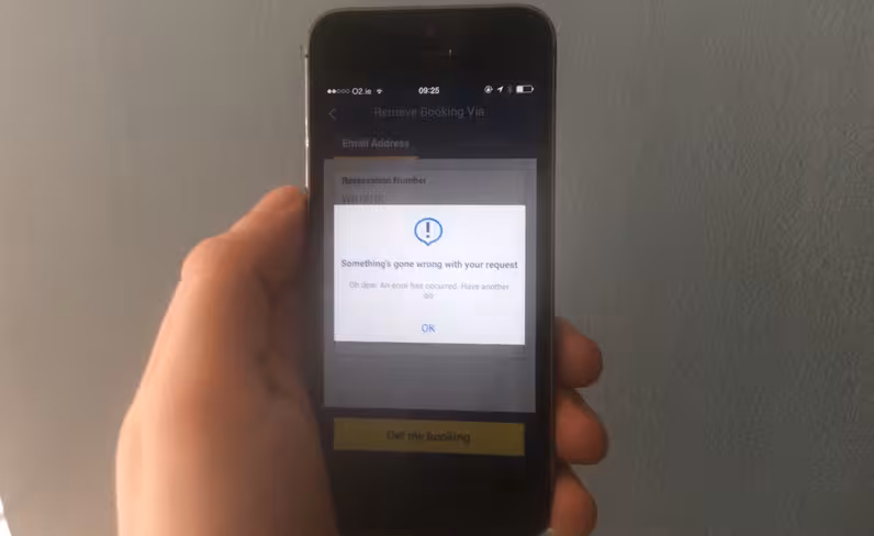
Attempting to check-in for a Ryanair flight this morning reminded me why faux-friendly error messages in apps are terrible:
https://twitter.com/brokenbottleboy/status/595867186129960963
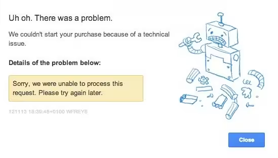
The dominance of chirpy ‘oh dear’-style messages when something goes wrong with an app or service can probably be traced back to Google, which has popularized the quirky apology.

The 💜 of EU tech
The latest rumblings from the EU tech scene, a story from our wise ol' founder Boris, and some questionable AI art. It's free, every week, in your inbox. Sign up now!
While there’s obviously an argument for making error messages human and understandable, as opposed to a incomprehensible code and some bloodless language, the over-familiar approach often ends up making users even more frustrated.
In the case of the Ryanair example, how does that message help? It leaves you with more questions than answers.
Share your examples of awful error messages in the comments…
Read next: How to apply optical illusions to Web UI design
Get the TNW newsletter
Get the most important tech news in your inbox each week.