
Jerry Cao is a content strategist at UXPin — the wireframing and prototyping app — where he develops in-app and online content for the wireframing and prototyping platform.
As creatures of habit, we humans behave predictably. We avoid interactions that make us feel bad, and seek out interactions that make us feel good.
The most human of the 5 interaction dimensions, behavior therefore refers to how users respond to your interface — what is happening on their side of this interaction. Effective interaction design doesn’t just anticipate standard user behavior, but also shapes it.
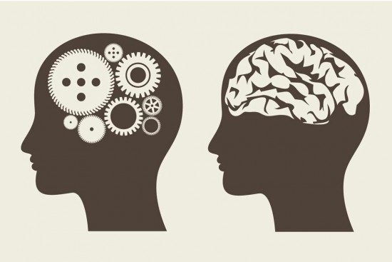
Source: Human Behavior
In order to design for behavior, you must first know how habits form, how they can be used, and how feedback plays into each step.
Use Habits to Your Advantage
“We are, all of us, creatures of habit, and when the seeming necessity for schooling ourselves in new ways ceases to exist, we fall naturally and easily into the manner and customs which long usage has implanted ineradicably within us.”
Edgar Rice Burroughs, The Beasts of Tarzan
Studies have verified that we spend more than 40 percent of our time engaged in habitual action. Our brains seem to prefer being on auto-pilot, as the mechanisms for creating habits are so deeply ingrained. By knowing the finer points of habit development, you can design interactions that:
Create helpful habits — Know how to entice your users to form the habits you want.
Don’t harm existing habits when redesigning — If your users already formed habits with your product, don’t destroy them because of a few careless tweaks.
Catriona Cornett, UX Designer for RelateIQ, explains in general terms how to apply the study of habits to IxD. We’ll dive into more specific detail below on how habits are formed, how to identify habits, and how to change user habits.
Forming Habits
Obviously, habits are formed when people perform the same actions repeatedly, but how can you streamline the process? The first step is knowing the 3 parts that make up a habit, which Charles Duhigg explained in an interview with NPR:
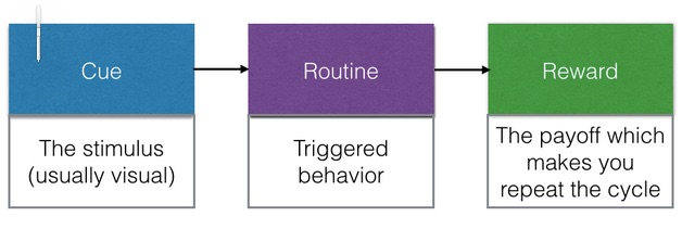
Let’s look at an example of a digital habit, logging in to your email from your phone. The cue is feeling the vibration, the routine is opening the message, and the reward is staying updated (or distracted).

Source: Habit Cycle
Interaction design strives to elevate these functional rewards to emotional rewards by crafting memorable micromoments. Over time, these micromoments add up to promote deeper engagement — and thus a better overall user experience.
The key here is the reward.
If you want a user to perform a certain action, offer them a reward for doing so. If you want them to perform it repeatedly, offer them a reward repeatedly. Make sure the reward is strictly voluntary, as the user will resent having to complete additional actions for one of your product’s necessary features. You don’t have to get so Pavlovian about it, but your users won’t complain if you’re offering them more rewards.
A good example of a voluntary reward is Netflix. They exploit innate human curiosity by dangling a reward in front of users in exchange for a small action.
The company values user ratings — the more ratings, the more accurate their suggestion system works. In order to incentivize users to rate previously watched movies, they offer a reward for doing so: two personalized suggestions. They even tease the reward by showing two mysterious placeholders where your suggestions will appear.
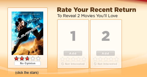
Source: Curiosity & Interaction Design
Users watching movies repeatedly creates the need to rate them repeatedly. If after every viewing they see the same rating window (cue), they will rate the movie they just saw (routine) because they know if they do, their suggestions will appear (reward).
Revealing Behavior Patterns
To uncover user habits, conduct qualitative and quantitative analysis.
Like we described in The Guide to Usability Testing, qualitative analysis can be accomplished through informal hallway tests or formal lab tests. You could also encourage them to keep a user diary, logging their behavioral patterns for common tasks. In doing so, you’ll better uncover their cues and routines.
Source: An Intro to Website Usability Testing
Evan Williams, co-founder of Twitter, actually found great value in watching how early adopters used Twitter. Twitter was originally intended as a broadcast tool, but then users started using it more for conversations. For example, neither the @ handle or hashtag were part of the original design. They were later implemented based on close observance of early use habits.
In terms of quantitative analysis, our team at UXPin create events in KISSMetrics that track when someone completes key actions like creating wireframes, turning wireframes into prototypes, and sharing those prototypes. When aggregated and mapped out, this product data helps reveal the most common action paths and routines.
Once you know how users are currently behaving, you’ll be able to take the next step into tweaking or redesigning your interface to affect those habits.
For example, we saw that our Layers functionality was one of the most used features between January to July 2014. Because layers were so important, we used this data to support our decision to integrate layered prototyping with Photoshop & Sketch. Two months after the integration, we saw decreased usage of layers, but a drastic rise in integrations.
3. Changing User Behavior
But since it’s human behavior to resist change, users do not want to lose their old habits. Forcing users into new habits will only hurt the UX, so you need to be delicate with redesigning new user paths.
 Source: Debugging The Brain
As Duhigg suggests, here’s a simple framework for designing new habits:
- Find the cue and the reward
- Don’t modify the cue or reward. Create a new routine.
For example, let’s look at Groupon as an example. Before the company came along, if users saw a product they liked (cue), they would need to scour the Internet (routine) in order to find a killer deal (reward).
Groupon succeeded because they simplified the routine. Instead of scouring the web, users can just check a single site for aggregated deals. The cue is the same, and the reward is the same (if not slightly better).
If you’re making changes to an existing design, try implementing the updates piecemeal (recall the anecdote of the boiling frog) and make sure you provide plenty of tutorial materials. Just like you used analytics to uncover habits, you also want to use them to track user behavior in light of redesigns.
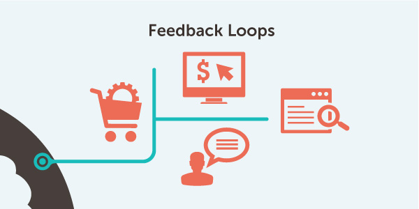
Focus on Feedback Loops
Feedback — what it says, when it comes, how it looks — is your part in the human-computer interaction. The goal is to make the computer as “human” as possible so the interaction feels more natural. This is especially important for feedback loops, which are essentially conversations between the user and the product.
Source: How to Design for the Gut
According to Jeff Gothelf, UX designer and writer, feedback loops take the same dominance in interaction design as communication does in visual design. Handling feedback loops with care humanized the experience and the company behind it, and they can also mitigate user frustrations.
As direct interactions with your users, feedback loops go a long way in affecting your user’s behavior. That’s why we’ve summarized these helpful tips from Gothelf for designing your feedback interactions:
Communicate right and wrong — Don’t save all your feedback for errors. Keep your users posted on the good as well as the bad so they also receive positive reinforcement.
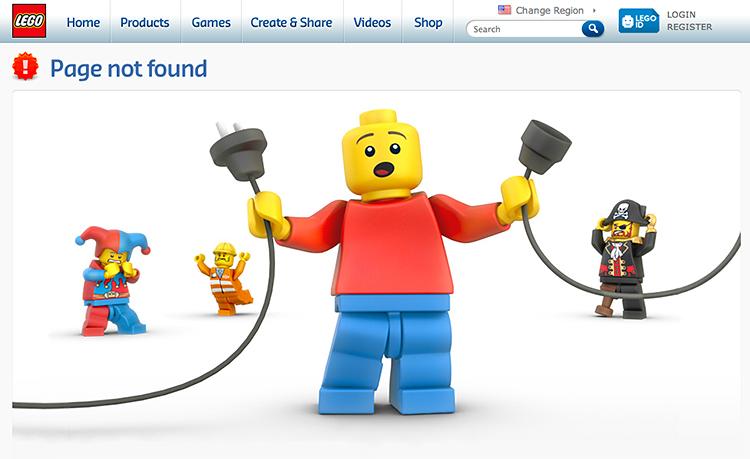
Match visuals to the dialogue — A warning message should look different than an update message, for example. Proper visuals indicate of what the message means before users read it — as in the example from Lego below. Not only does the unplugged cable indicate error, but the use of red in the foreground character and background icon all play into our cultural understanding of red as a warning color.
Source: 7 of the Best Error Messages on the Internet
Be consistent — While you should vary your feedback styles based on the purpose, it’s important to have some kind of consistency between all types of messages, as well as all feedback in general (to establish a “voice” of the product).
Don’t be oppressive — Be communicative, but don’t overdo it. Make feedback optional by having it appear only when the user hovers over a relevant items, and fade away if ignored (unless immediate action is required).
Let’s look at Gmail. Take for example the message that appears when deleting an email:
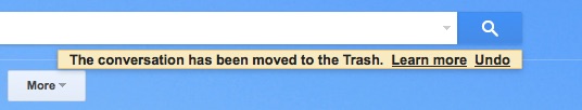
The feedback is simple (and not particularly innovative), but it does everything right. For starters, it isn’t completely necessary, but it is helpful, so its mere presence as part of the interface is a plus. Because it’s not necessary, it requires no activity; it’s there just as a notification. It appears in a noticeable place without getting in the way of other interactions, and will fade away on its own if ignored.
Delving further, the message is a great tool in communicating with the user. It explains what exactly happened, with details (mentioning the message is in the Trash). Then, it gives the user options for more interaction with “Learn more,” or the opportunity to undo the action (a forgiving format described in Web UI Patterns 2014). Both of these options provide a greater sense of control.
For a more clever example, let’s look at MailChimp. It can feel nerve-wracking the first time you’re about to email an entire user base. MailChimp understands the nervousness, and rewards users with humor.
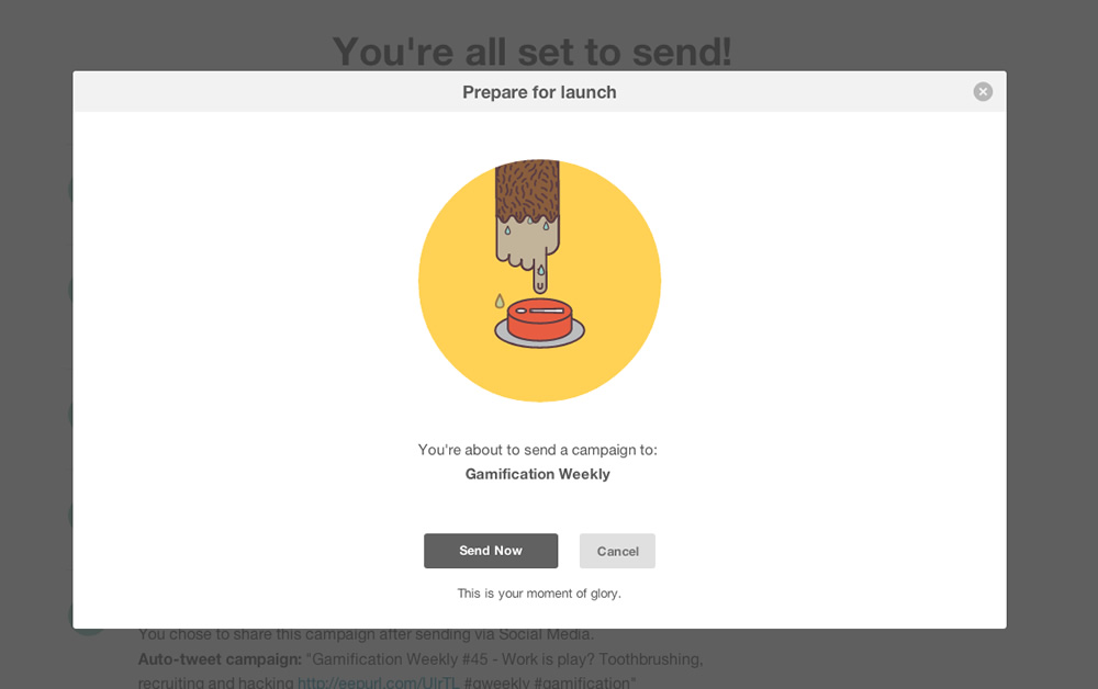 Source: MailChimp Launch
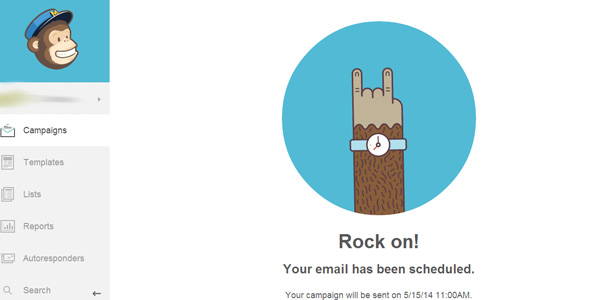
Once the email campaign is queued, Mailchimp again uses humor to lighten up an otherwise tense situation.

Source: MailChimp Mail Merge
Finally, when the emails are actually sent, Mailchimp encourages you once more. You can see that these three microinteractions combine to make sending email campaigns a more fun experience. In doing so, sending emails with MailChimp becomes more than just another marketing routine — it’s actually kind of fun.
Source: The Emotional Side of UX
Morgan Brown and Chuck Longanecker of digital-telepathy state that these types of emotional feedback loops are the key to “visceral design” — creating that gut feeling that something “clicks” in your user. The best place to start are the core user flows: registration, ordering, conversion points, exploration, etc. As these are the most common interactions, they will benefit the most from a behavior-focused tuneup.
Takeaway
Both you and users want a design that facilitates habit-forming; you for the benefits it has on your product/company, your user for the convenience it provides in using the interface. By keeping in mind the three parts of a habit (cue, routine, reward) at each point of interaction — or if you’re forced into a necessary redesign — then you can guide the user behavior that will most help you both. On the same note, proper feedback throughout the interaction will also promote the right behavior, with you maintaining control of which behaviors are “right.”
Read Next: The 5 pillars of interactive design
Get the TNW newsletter
Get the most important tech news in your inbox each week.