
Jerry Cao is a content strategist at UXPin — the wireframing and prototyping app — where he develops in-app and online content for the wireframing and prototyping platform.
After getting really useful insights from our previous Yelp usability test, we wanted to analyze the information architecture in greater detail.
So we ran a first-click test on Yelp’s homepage using Chalkmark, which gave us insights into the aspects of the information architecture that worked, and which aspects confused users. And we ran a closed card sort on Yelp’s feature search filters using OptimalSort to find out which search filters were the most popular, and if there were any filters that could be removed to reduce clutter.
The quantitative methods we used were all time and cost-efficient, demonstrating that user research doesn’t require thousands of dollars, a team of researchers, and endless time.
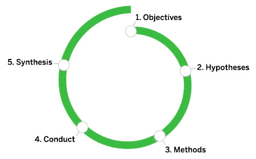 Source: 5-Step Process to User Research

The 💜 of EU tech
The latest rumblings from the EU tech scene, a story from our wise ol' founder Boris, and some questionable AI art. It's free, every week, in your inbox. Sign up now!
As discussed in The Guide to Usability Testing, regardless of the method you choose, just remember that user research is not about writing reports — it’s about asking and answering the right questions and gathering data so that you can make evidence-based decisions in your designs.
Choosing our users
We recruited participants through Optimal Workshop’s recruitment panel, and kept our demographic to people based in the US (as that is where Yelp is widely used).
Instead of filtering by age, gender, income, or computer experience in the recruitment stage, we asked pre-activity questions designed to deepen our understanding of participant responses. This is because while demographics are important, what users know and how they use similar products is likely more important.
 Source: Remote Usability Testing
For the closed card sort on Yelp’s homepage, we asked participants how often they used Yelp, and how often they used the search filters, so that we could filter our data based on users with more or less experience. Knowing how many people used search filters would also give us an insight into how important search filters actually are for Yelp’s users.
For the first-click test, we asked participants how often they used Yelp, and their likelihood and frequency of writing Yelp reviews. We wanted to know how often they wrote reviews so that we could establish their level of comfort with the site.
Since we sought quantitative data, we wanted to recruit a minimum of 30 participants for each study (NNGroup Principal Jakob Nielsen recommends a minimum of 20). We ended up testing 40 people for the closed card sort, and 38 for the first-click test.
If you’d like to learn more about screening and recruiting users, check out the NNGroup’s helpful and free e-book with 234 tips.
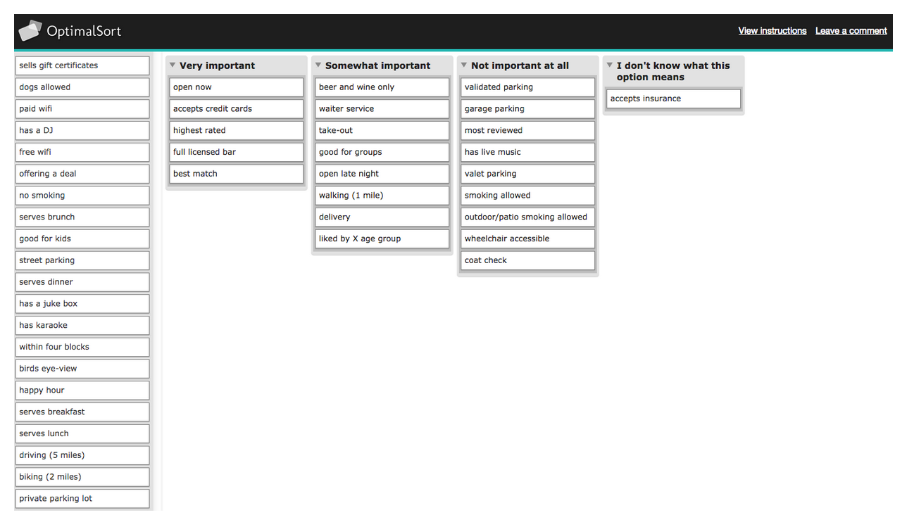
We ran a closed card sort using OptimalSort
Closed card sorting involves presenting participants with labelled cards, and asking them to put them into pre-defined categories. As Donna Spencer says, closed card sorting is a ‘content-centric technique’ and can be useful ‘when adding new content to an existing structure.’
When it comes to naming the cards, simpler is better. Avoid big words (many syllables) and jargon. This advice is essential for card sorting since unnecessarily complex labeling will disrupt natural thought processes.
Pierre Croft, IA and UX expert for Decibel Digital believes that card sorting can even help defend against the bad ideas of HIPPOS (highest paid people in the room) who usually aren’t the Web usability experts. Card sorting is cheap, useful, and quick, so we’ve included a few pointers which apply to closed and open card sorting:
- Don’t mix parent and child categories — In other words, use categories from the same level, or else you will confuse your participants.
- Provide open forms for additional feedback after the test— While this is standard procedure for open card sorting, it’s also quite useful for closed card sorting. Provide a couple blank forms (or blank cards) for participants to write down additional categories. While the information might be “off-the-record,” it could bring useful insights.
- Don’t intervene too much— After giving the instructions, try your best to just sit back. Intervention can obscure the data. Luckily, this is not an issue in remote card sorting.
- Accept that sometimes users don’t group everything — A lack of grouping can be just as telling as a structured sorting. If this happens, make sure you ask the user why. If you’re running a closed sort and not everything is sorted, you can also provide blank forms (or blank cards) to see why the existing categories weren’t chosen.
Instead of testing the top level navigation labels of Yelp’s website, we decided to use closed card sorting to find out which features search filters were most important to users, and which were ignored. This analysis might help simplify the search filter options, as ‘visual clutter’ was mentioned by participants as an issue.
 Source: User Testing & Design
Our closed card sort had three simple objectives:
- Determine how often people use search filters on Yelp (or a similar site)
- Determine which filters are most important to users
- Determine which filters are least important to users
In total, we had 47 cards representing all of Yelp’s 47 search filters (price, distance, etc). We then asked participants to sort them into categories of importance: very important, somewhat important, not important, and unsure.
A first-click test using Chalkmark
First-click testing records the users’ first click in response to a task. Participants only click once, and then move on to the next task. First-click testing is becoming increasingly important: studies have shown that if a user gets their first click right, they’re 87 percent likely to complete the task they came to the website to do.
First-click testing can be done on a live website, early prototype, or even just a wireframe. Jeff Sauro, Founding Principal of MeasuringU, recommends conducting first-click testing after each major iteration. Here are some guidelines to follow:
- Write clear tasks — Just like you would for a scripted usability test, make sure the participant is thinking about how to solve a problem instead of just where to click. Detail isn’t required, but clarity is.
- Define the best paths to success — Start from the homepage and plot all possible paths that will correctly accomplish each task. First-click testing is even more relevant if your site gets a large volume of search traffic (like Yelp). Because your homepage probably won’t be the first page users find, first-click testing should ideally be done across your entire site.
- Time each task — A 90 percent first-click rate on the correct label might deceptively indicate that your navigation is effective, unless you timed the test and saw it took an average of three minutes to make that first click.
 Source: User Testing & Design
Our first-click test had two objectives:
- Determine if the information architecture enabled users to complete tasks quickly
- Determine if the navigation labels are clear
We asked users to accomplish certain tasks (such as finding a good nightclub after dinner in San Francisco), provided them screenshots of Yelp pages, and recorded where they clicked. We then analyzed the heatmap results, and the speed with which participants completed the tasks they were presented with.
These two remote research techniques are two among many
As user researchers and UX designers, you have an almost endless number of techniques and tools to choose from when you embark on a design or redesign project. For us, closed card sorting and first-click testing provided the best balance of data, cost, and speed. We knew that these techniques would provide us with quick data to support our qualitative research, and results that would be easy to analyze and draw design recommendations from.
For details and visuals on how to make the most of usability testing for design, check out the free e-book User Testing & Design.
Read next: Practical tips for Web and mobile usability tests
Get the TNW newsletter
Get the most important tech news in your inbox each week.