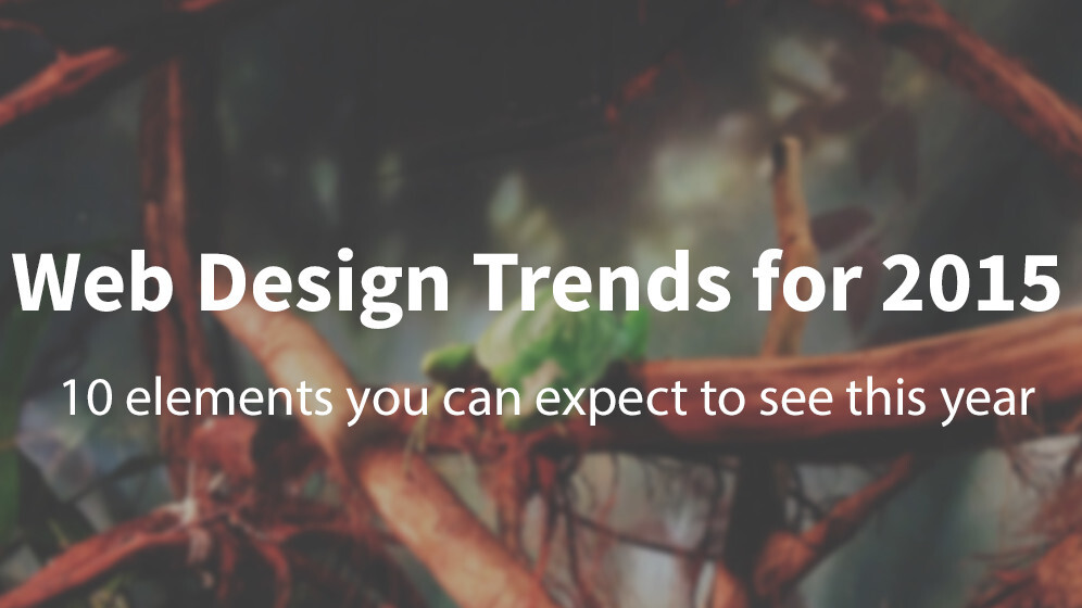
Every year, Web design grows and so many awesome things are being published daily. I can only imagine that the best is yet to come in 2015, including many of the trends we predicted for 2014.
While many of those ideas and trends will still be around in 2015 (and probably 2016), it’s time to see what new trends are likely to emerge in 2015.
While everyone is reflecting on the year that was and looking ahead to the year that will be, let’s take a look at some of the best website design trends we will likely see when we turn the calendar to 2015. You can view them all on one page here.
Next: First up…
1. Longer scrolling sites
It hasn’t gone unnoticed that most new site designs published today tend to be longer in length when scrolling through the page. As mobile devices become more popular, it’s becoming more commonplace for sites to opt for scrolling instead of linking as a means to display content, especially on their home pages.
It is easier for users to simply scroll through a page to get their information than it is to constantly click to find information.
Homepages aren’t the only place where the long scrolling trend can be spotted. While long scrolling sites have been popular for a while (hello, one-page websites), the benefits of scrolling have multiplied and found themselves in other places other than the home page, such as about pages and even product pages as a means to elegantly display a wide variety of content.
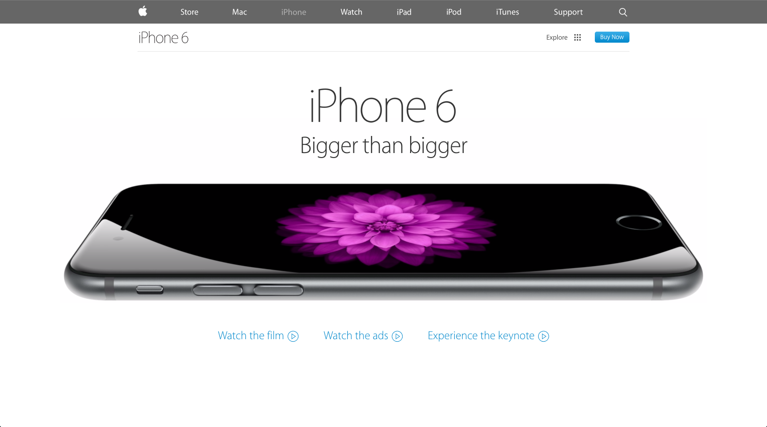
For example, Apple’s page for its iPhone 6 showcases the long scrolling page trend outside of the home page. It’s designed the main iPhone 6 page to be a long scrolling site, showcasing all of the product’s specs and features.
In addition, the site added some slick animations to make the scrolling experience visually attentive.
2. Storytelling and interaction
While having amazing content is always crucial for your website, being able to tell a story through your content is a big plus. Web design in 2015 will likely focus around helping tell a story for users.
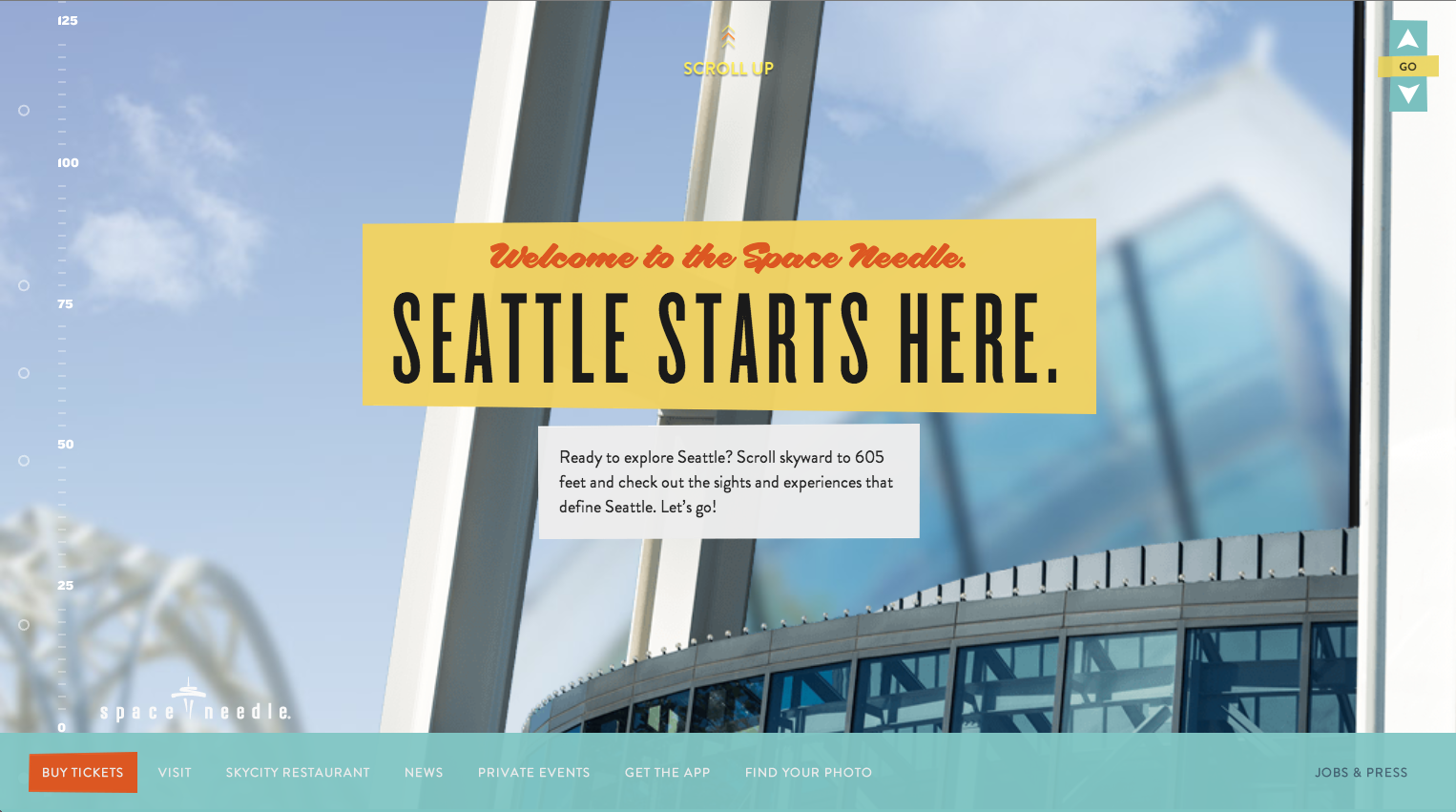
For example, the Space Needle’s website beautifully tells the facts of the Space Needle through the use of storytelling and a design that helps support it (it also goes in line with the long scrolling trend discussed above).
The Space Needle website also demonstrates another trend for 2015 – interaction. Web designs are becoming more interactive and animated to help present content in a unique and appealing way.
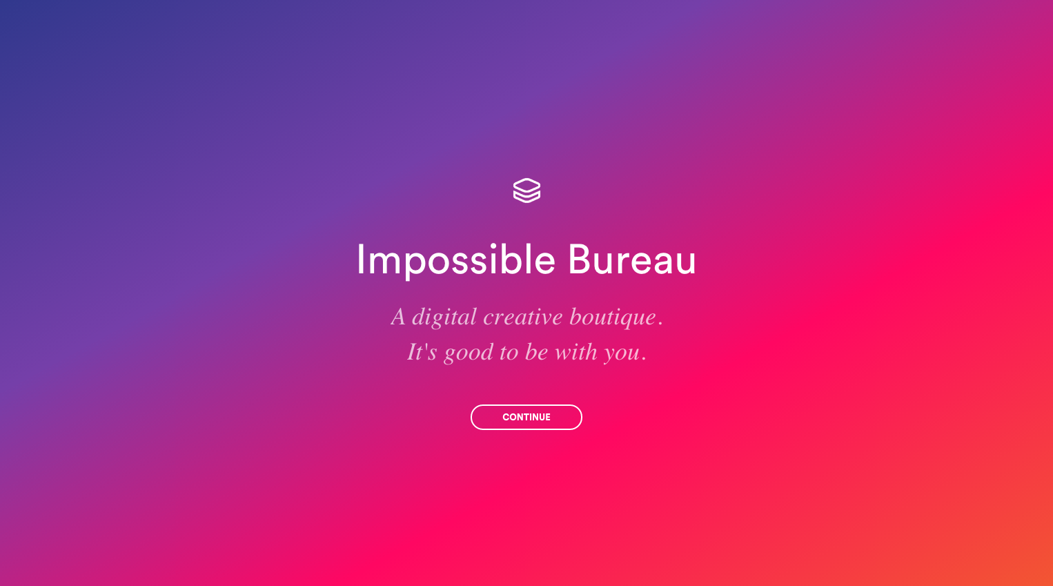
Interaction paired with animation used in website design – when tastefully done – can bring the wow factor to your site. For example, the Impossible Bureau’s website is very interactive in that it responds to your scrolling and hovering over different elements (instead of the normal clicking).
3. Absence of large header background images
The trend over the last few years have been large header background images, often with text on top, and it is the first thing most visitors see when they come to a site. So how can you stand out from the crowd that has embraced the large-header-background-image trend? By doing the opposite.
Some recent site designs have decided to buck this trend by keeping their large headers, but making them background-image free. My guess is that not only do they want to not follow a trend, but they are also looking at the performance and speed of their site (see trend #10 later in this article) as a reason to ditch the large images.
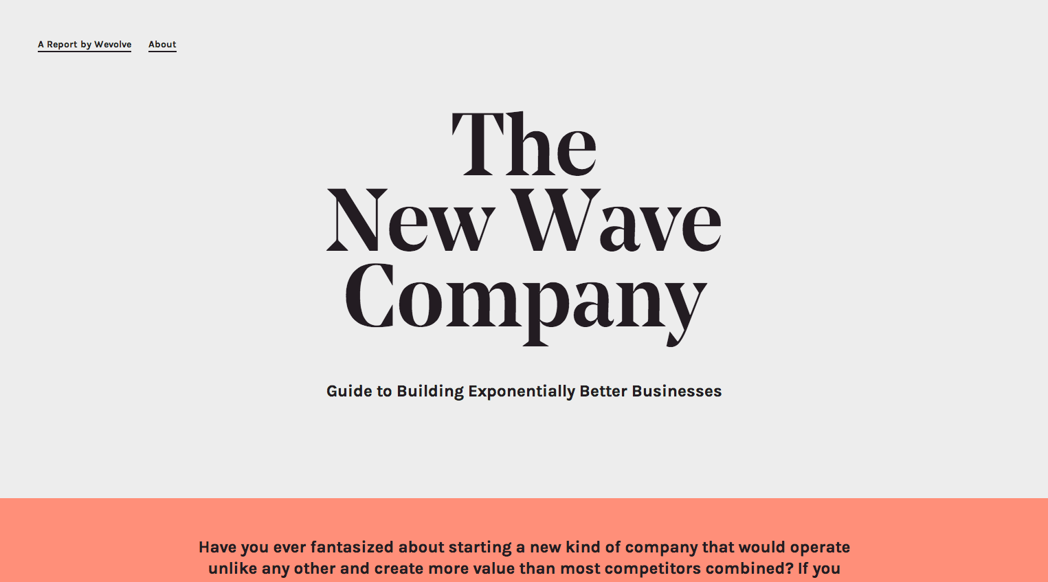
The New Wave Company’s site showcases this well. It has a large header welcoming visitors to the site and large typography centered in the page. What it doesn’t have is a large background image behind that heading.
This is tastefully done and doesn’t fall in line with other trendy site designs using large background imagery.
4. Removing non-essential design elements in favor of simplicity
There is an idea in design that a design is complete when all of the non-essential elements have been removed. In 2015, I believe we could be seeing more of this idea come into fruition as sites look to find ways to simply their designs by removing non-essential design elements.
The New Wave Company’s site mentioned in trend #3 above did this with opting for not having a large background image in its header.
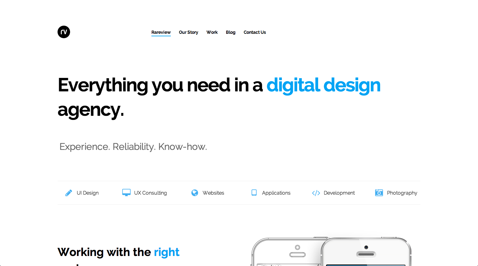
Another great example of removing non-essential design elements to keep its site simple is the new Rareview Digital Agency website. It also doesn’t have a large background image header to greet visitors with.
Designers have practically eliminated many design decisions that most current websites have (i.e. background colors, lots of images, sophisticated layouts, etc.). Instead, the team opted for a clean and simple site design, and it stands out among the crowd of design-heavy, image-heavy, and color-heavy sites.
5. Fix width centered site layout
Most websites over the last few years have used the “banding” or width: 100 percent design element so that things like images and sections visually stretch the full width of a browser’s viewport. Before this trend became popular, most sites were fix-width and centered in the page. You could tell where the site ended on either side.
That fix-width trend seems to be trying to come back in a more modern way. Instead of sites and their content sections going all the way to either side of the viewport, some sites are opting for a max-width to keep their content centered in the viewport.
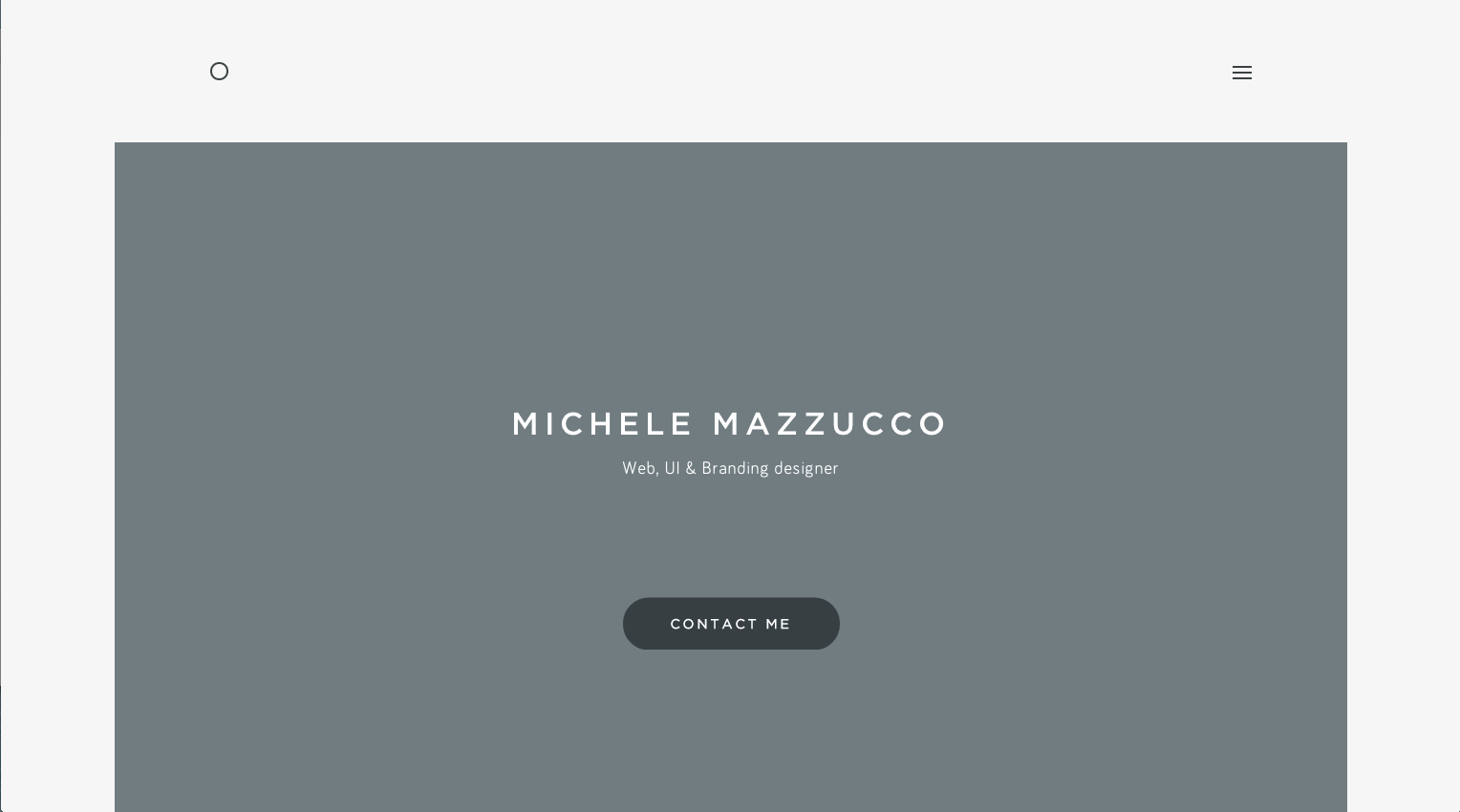
Michele Mazzucco’s site showcases this well. When viewed in a viewport wider than about 1350px wide, you can see that her content (and the background colors for those sections) end on the left and right side of each section.
It provides a nice focus for the site content and bucks the width: 100 percent trend with sophistication.
6. Professional high quality custom photography
Stock imagery still has its place in design, but for most new websites these days, stock imagery has taken a back seat to professional photography of high quality and unique and custom to the site and purpose.
Using custom photography takes the design step a bit further than just picking stock imagery, and it makes you unique in that no one else will have those same pictures on their site.
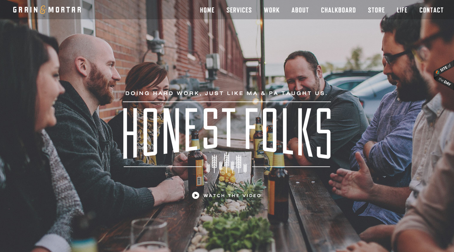
For instance, Grain and Mortar shows off this trend very well. Its site features custom photography used in the main header of the site. This gives a personable effect because they are of the real people behind Grain and Mortar.
Its about page is even more engrained (pun intended) with high quality and professional photography taken of themselves and the office space. No stock imagery of fake office spaces here!
7. Flyout/slideout app-like menus
Responsive Web design has been around for a while. Up until recently, most design emphasis was placed on making the site look great on desktop devices, and just ok on mobile and tablet devices. RWD has moved toward making every experience look great no matter the device.
With this move, we are starting to see design elements that take what works on mobile devices and implementing it site wide.

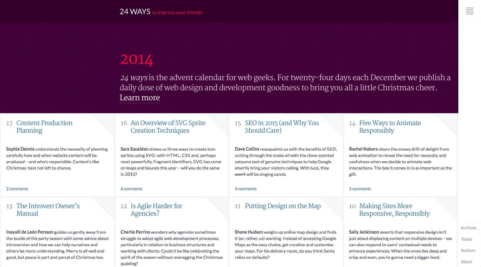
For example, 24ways and Rawnet both showcase this idea of bringing an app-like and responsive menu to their entire site, and not just on devices with smaller viewports.
In the case of these two sites, they’ve opted for a vertical menu on either the left or right side of the page (instead of the typical horizontal menu at the top of the page) that acts more like a flyout/slideout menu – a technique carried over from web apps and responsive design on smaller viewports.
8. Hidden main menus

Much like flyout/slideout menus discussed above, I anticipate seeing more sites hiding their main menus all together when visitors first visit the site. These hidden menus will only become visible when the visitor is ready to move on and clicks the appropriate icon.
This is also a technique of responsive design that is starting to be carried over into all of a site’s design instead of just small viewports.
Brian Hoff Design’s new site is a great example of this. He uses the hamburger icon in the top right of his site to hide the main navigation until the visitor clicks on it. This behavior has been conditioned over the last couple of years with visitors using web apps and apps on their phone and tablets, as many of these apps use this same behavior.
He took this approach and used it for his site no matter the viewport size to help keep the design of the site clean and functional.
9. Very large typography
For 2014, typography was very important in many site designs, and I don’t see that changing any time soon. For 2015, however, I see large headings and typography getting even larger. I mean large enough a plane can see it on the ground (ok, not that big, but you get the idea).
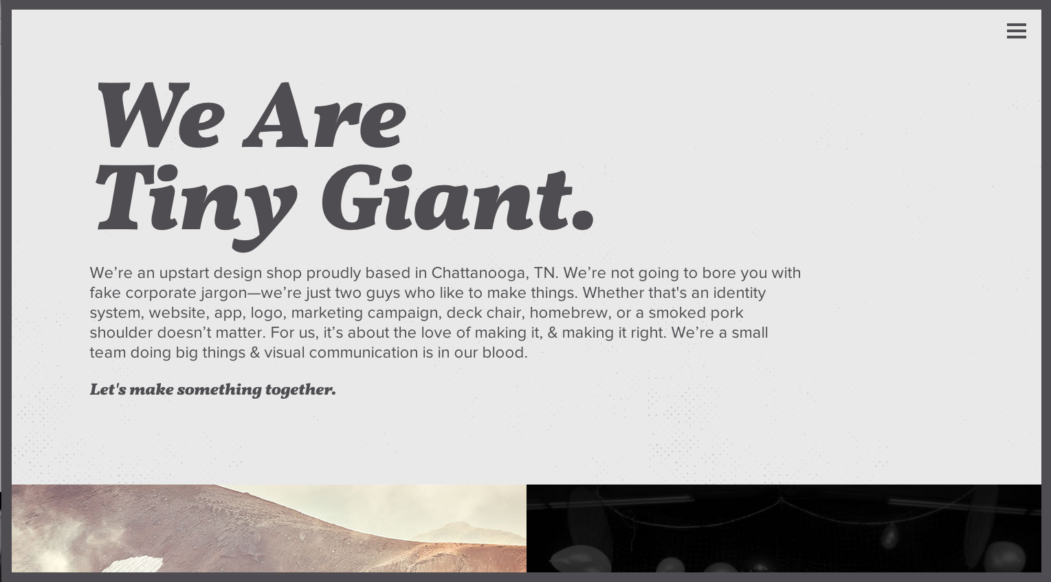
Tiny Giant’s website showcases very large typography right when you visit the page. It makes a visual statement that isn’t likely to be missed.
Large typography is likely going to be key in 2015 as a way to enhance the visual hierarchy of the page by ensuring visitors read the largest type on the page first, because that is what grabs our attention first. Tiny Giant does that extremely well.
10. Performance and speed
Some design trends have been motivated by the need to make sites load faster and consume less bandwidth. Most of the trends discussed in this article more than likely came out of the need to reduce the size of the site and find ways to quickly load the site for those using mobile or tablet devices or those on slower networks.
Site designers and developers are becoming more keenly aware of the weight of their sites and how their users interact with them. Responsive Web design has helped bring to light these concerns. Things like slow network speed (either on mobile networks or home ISPs) and device type have forced designers and developers alike to pay close attention to the size of their files and sites, how fast those sites load on different speed networks, and mindful of users and their situations such as limited data plans.
It will be no surprise that the need to be faster and perform flawlessly with no lag time will drive design decisions on many new websites launching in 2015.
What other design trends do you think will rock the Web in 2015? Let’s discuss in the comments below.
Previously: Web design trends you can expect to see in 2014
Get the TNW newsletter
Get the most important tech news in your inbox each week.