
This post originally appeared on the Buffer blog.
You can audit your content in many ways—be it a quick-and-simple social media audit or a full-scale blog review. You can take the time to run the numbers yourself (a useful exercise!), or you can plug a URL into
I’m the type to always plug our Buffer blog URL into a tool to get feedback. If it’s free and simple, count me in.
I’ve bookmarked several of my favorites and dug up a handful of other useful graders and tools to come up with the 12 website graders, content scores, and social media ratings that you see below. Take them for a spin, and let me know which ones are most beneficial for you and your content!
1. Hubspot’s Marketing Grader
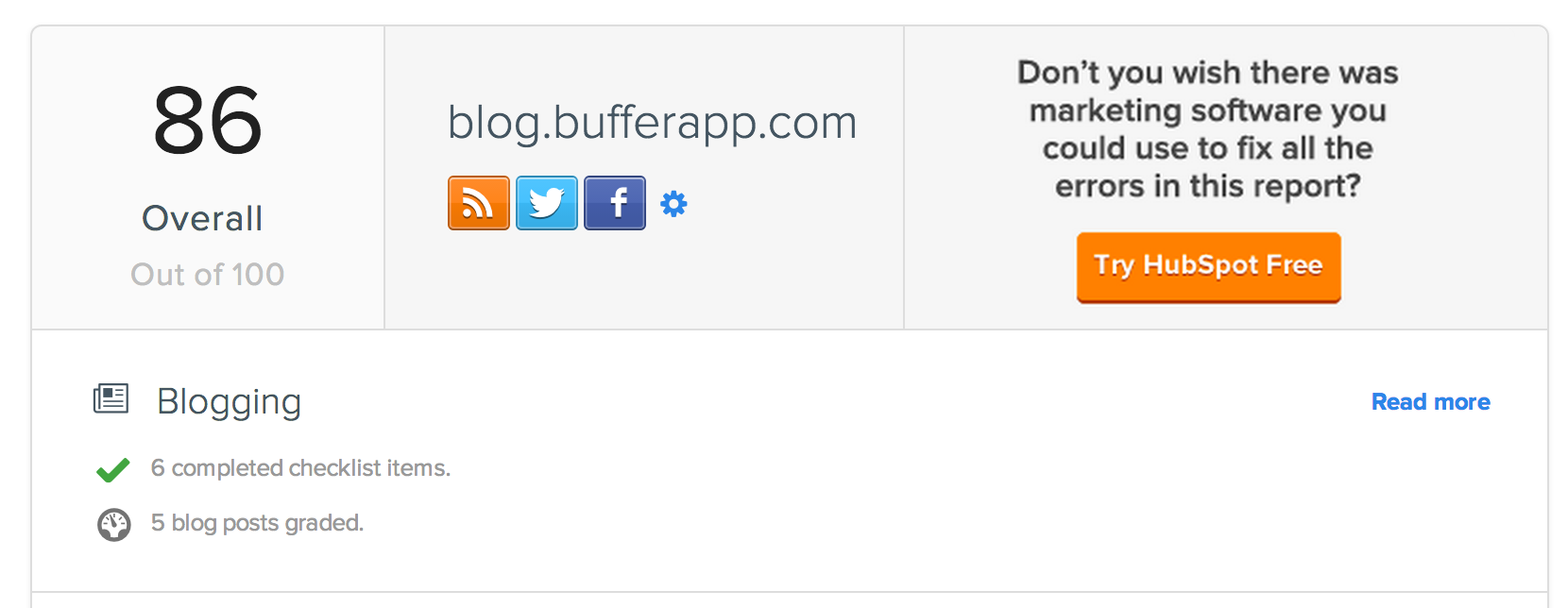
Enter your blog’s URL and your email address, and press go. Marketing Grader will give you an overall score for your website, based on five categories:
- Blogging
- Social Media
- SEO
- Lead Generation
- Mobile
Each section has a checklist of items as well as grades for individual aspects of the category. For instance, Marketing Grader will check your blog for social share buttons, an email signup form, and an RSS feed, then it will grade the most recent five posts according to social shares.
Useful takeaway:
As part of its lead generation score, Marketing Grader measures blogposts and tweets that link to forms. The thinking is that the more opportunities you give a reader to clickthrough to an optimized landing page, the better off you’ll be for growing your list and collecting leads.
Recommendations for the Buffer blog:
- Use @media queries or a mobile stylesheet
- Set up marketing automation
2. Nibbler
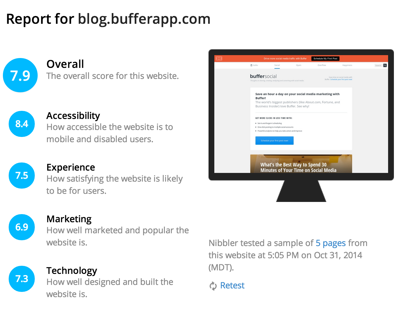
The free Nibbler test looks at a laundry list of site and blog characteristics—more than 24 high-level items—spitting out an overall score (on a scale of 1 to 10) and a list of improvements ordered by priority.
Useful takeaway:
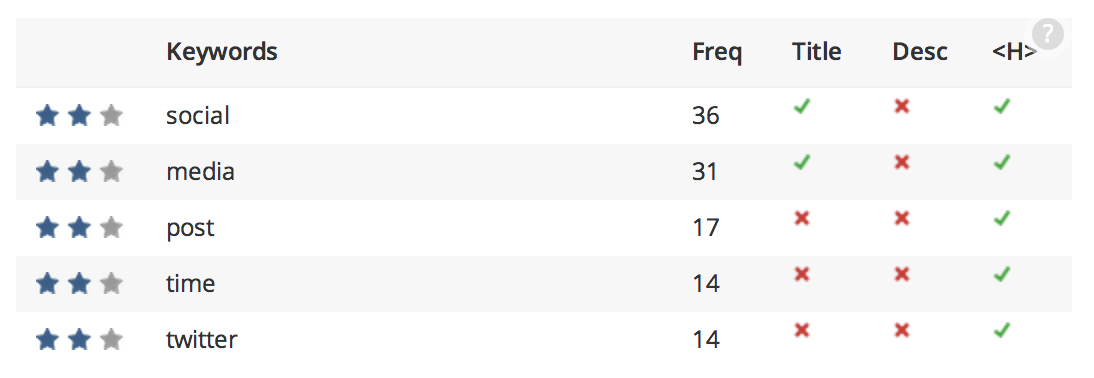
The heading word cloud at Nibbler shows exactly which words we’ve been using most often in our headings and titles. We’re aiming to be a blog about social media tips, so it’s great to see “social” and “media” rank so highly.
It’s also neat to see what other words we’ve been getting mileage out of without even knowing it (“minutes” and “good-looking” come to mind!).

Recommendations for the Buffer blog:
- Make our Facebook page and Google+ page visible from the blog
- Offer an easy-to-print option
- Provide a local presence by submitting the blog to local web directories
- Fix code validation errors
- Choose descriptive anchor text
3. Woorank

WooRank’s free tool tests seven aspects of your site—SEO, mobile, usability, technologies, social, local, and traffic. They’ve got just about everything covered here. The final result is a score on a scale of 1 to 100 and a report that you can download as a pdf or slides to share with your team.
Useful takeaway:
WooRank analyzes the keywords on your site and whether or not they appear in important places. The top five keywords are checked for appearing in the site title, site description, and heading tag. It’s useful to see at-a-glance the opportunities for quick wins with optimizing your most important keywords.
Recommendations for the Buffer blog:
- Connect the Buffer Twitter account to the page
- Fix the code errors
- Hide email addresses to avoid being spammed
- Customize the 404 error page
- Redirect non-www to www
4. Quick Sprout Website Analyzer
The free Quick Sprout tool lets you pull a little competitor research while grading your website, social media, and content. When you begin your test, you can add up to three other sites/blogs from your industry.
The report will score all four sites (yours, plus three competitors) and rank them from first to last, with a breakdown of traffic score, SEO score, speed score, and social share score.
Here’s how Buffer compares to some of the sites we most admire:
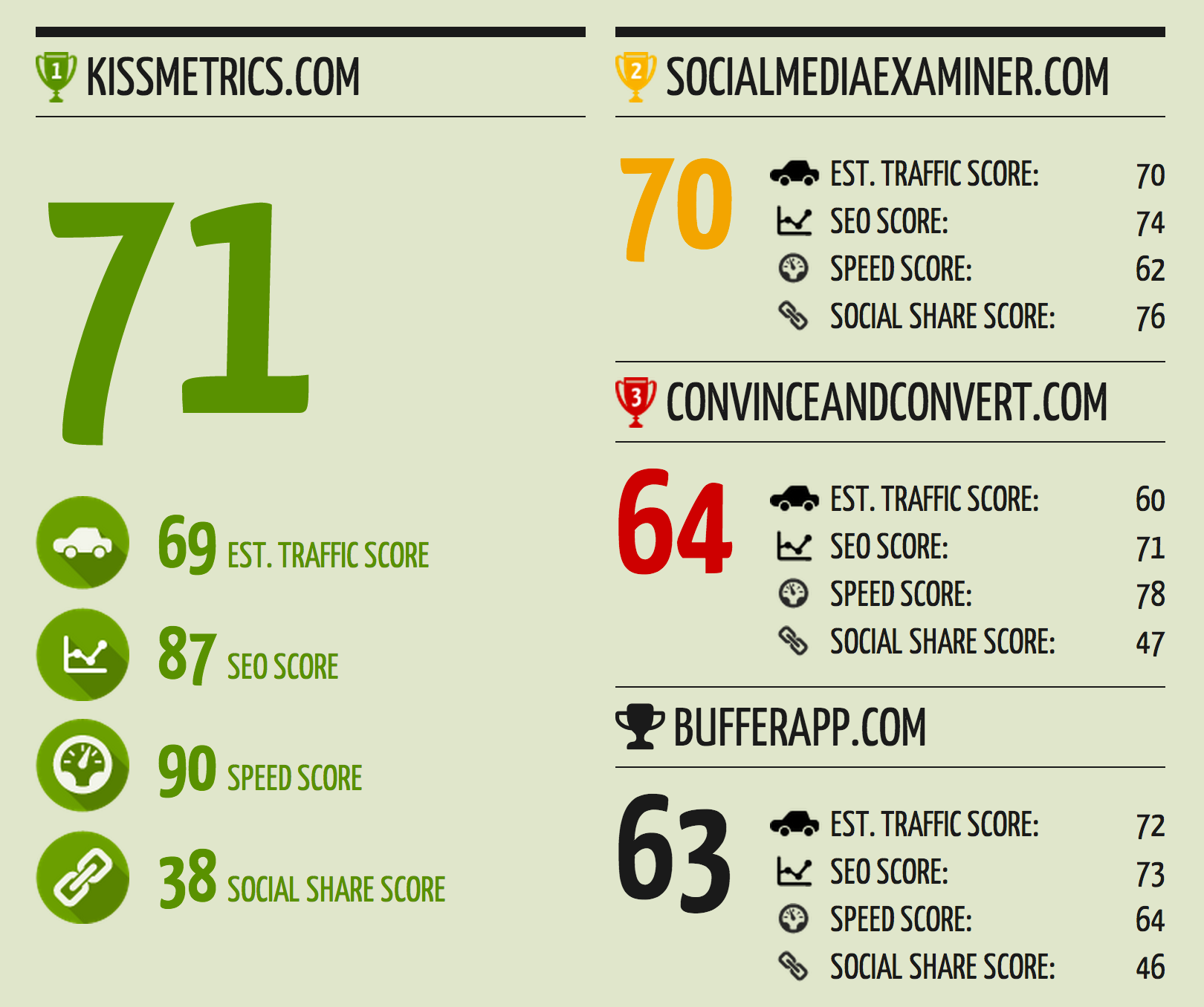
Beyond the comparison scores, you also get a breakdown of your most popular content, and you can run the test for other websites, too, in order to see which content has been most highly shared on other blogs.
Useful takeaway:
Inside Quick Sprout’s main report, you can drill down into details on each factor. SEO, for instance, shows you recommendations on what to fix. Specifically, Quick Sprout recommends that h1m headings are between 15 and 65 characters and that all images have descriptive alt tags.
Recommendations for the Buffer blog:
- Use top keywords in title tags
- Improve the load time on the page
- Add a meta description to the blog homepage
5. W3C validator
The previous graders on this list have been full of helpful, high-level marketing tips. The W3C Validator gives you straight-up fixes to make.
Run your site through W3C Validator, and see exactly which code errors appear on your website. The validator tool tells you the specific line of code in which the error appears. After the must-fix items, you also receive a series of warnings that could be worth checking into also.
Useful takeaway:
Many of of W3C’s warnings come across as helpful guidance. For instance, W3C recommends that each page have only one h1 tag. This will typically be the headline of a blogpost or title of a page, and then other information—like calls-to-action or email signup forms—can take h2 or h3 headings instead.
Recommendations for the Buffer blog:
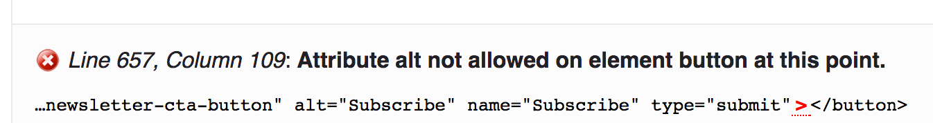
- Double-check the way we add utm parameters to links
- Fix an alt tag in our email signup form
6. Shopify’s Ecommerce Store Grader

Ecommerce sites can get quick feedback on SEO, store usability, content, social, and technical aspects by running the store URL through Shopify’s grader (you don’t have to have a Shopify store to run the free test).
As you scroll down the results page, you can see all the areas where you succeeded or failed, how to fix the parts that are missing, and why each is important.
Useful takeaways:
Two items that Shopify identifies in its report are free shipping and a phone number. Free shipping, according to Shopify, can increase conversion rates. A phone number helps with phone orders and increasing customer trust.
Sample recommendations:
- Add an XML sitemap to the store
- Add alt tags to images
- Include a privacy policy
- Place a link to your Pinterest page on your homepage
7. Clarity Grader
Most of the above tools look at various marketing and technical aspects of your site. Clarity Grader checks the words themselves.
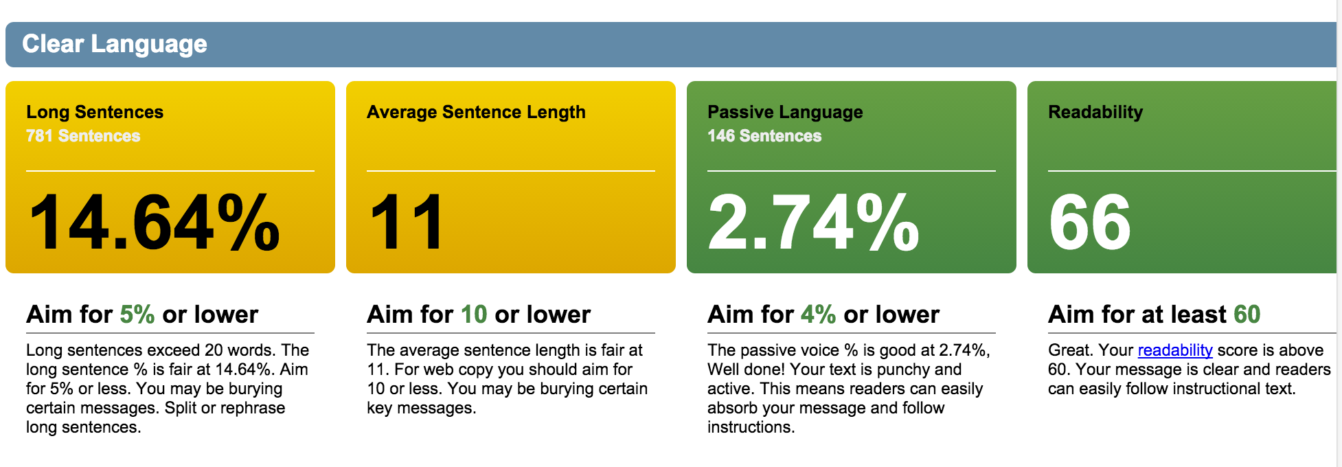
The report details the language you use on the site, analyzing 20 pages to come up with some incredibly sharp linguistic insights.
- Percent use of passive language
- Readability score
- Spelling mistakes
- Cliches and jargon
(Note: When you run the tool, you also sign up for a free seven-day trial of Clarity Grader.)
Useful takeaway:
The “cliches and jargon” test at Clarity Grader has a ton of interesting insights. It’s amazing how often I’m tempted to use words that appear in this list.
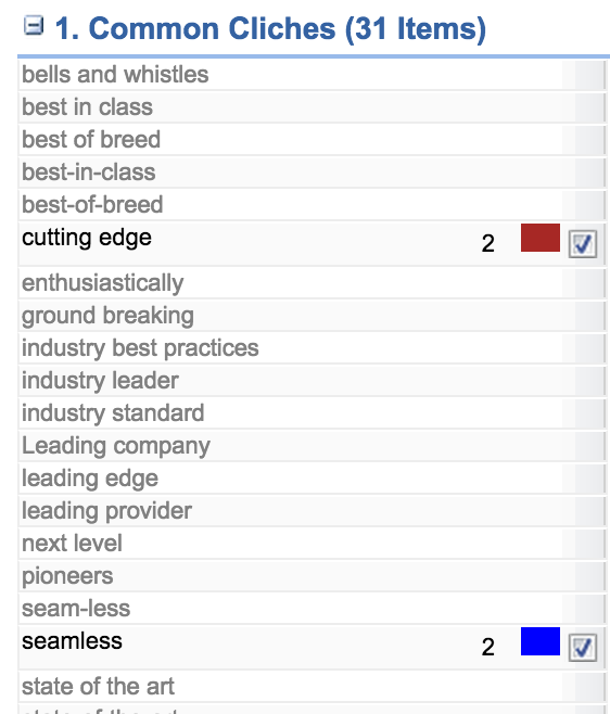
In addition to the cliches and jargon, you can change the “bad language” dictionary to show your score versus Complex Words, Legal Jargon, and Sexist terms.
Recommendations for the Buffer blog:
- More sentences of fewer than 20 words
- An average sentence length of 10 words
Next: How 6 major brands and website grade their content
Do-it-yourself content scoring
How 6 major brands and websites grade their content
This next series of scores go a bit beyond simply typing your website URL and pressing Enter. Some of these are part of premium products or require a free account or ask you to be pretty proficient with spreadsheets.
If you’re wanting to keep things free and easy, you can try the do-it-yourself route, and take inspiration from the way these tools score content.
1. Google’s Content Quality Score
Primary factors:
- Quality and quantity of main content
- Level of E.A.T. – Expertise, Authority, Trust
- Reputation
Secondary factors:
- Website information
- Helpful supplemental content
- Functional page design
- Website maintenance
Terence Mace of Mace Dynamics wrote a detailed post about the signals of Google’s content quality score, a direct influence on how Google ranks pages in search results. Google does not promote the specifics of the score, so Terence did some digging, testing, and experimenting to come up with his list of factors.
Here’s a little more on three intriguing ones.
Quality and quantity of the main content depends on how well the content meets the purpose of the page. One interesting factor that Google may consider is dwell time, i.e. how long a person spends on a site after clicking a search result and before clicking back to the results page. The more dwell time, the better.
E.A.T. can include author rank, page rank, and a number of specific ways to measure trust (like the very untrustworthy footer text “domain is for sale”)
Reputation includes what others say about your or your company/brand online. These are some of the sources considered:
- News articles
- Wikipedia articles
- Blog posts
- Magazine articles
- Forum discussions
2. LinkedIn’s Content Marketing Score
Factors:
- Impressions and views from those within your LinkedIn target audience
- Impressions and views of competitor content
- Engagement in LinkedIn Groups, updates, and posts

Available to its Marketing Solutions customers, the LinkedIn Content Marketing Score is a much-talked about system of measuring the impact of content. The end result is a three-part report.
- Quantifies your impact by measuring your engagement with your audience.
- Benchmarks your performance versus your peer set.
- Provides recommendations for improvement.
The score comes with filtering options, too, so you can see the score based on region, seniority, company size, job function, and industry.
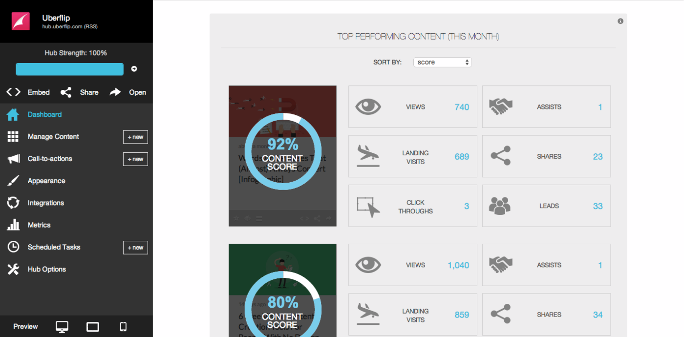
3. Uberflip’s Content Score
Factors:
- Page views
- Shares
- Landing visits
- Call-to-action clickthroughs
- Leads generated
Uberflip provides a way to collect your content into hubs that you can share on your website or blog. As part of their product, Uberflip offers a Content Score, which takes the five ingredients above, weighs them, aggregates them, and comes up with a score from 0 to 100 percent.
4. Moz’s One Metric
Factors:
- Unique visits
- Thumbs up on a story
- Comments
- Facebook likes
- Tweets
- Google+ Plus Ones
The Moz One Metric combines the above factors to compare blogposts and score new content based on its performance relative to the average. So if a new blogpost gets more uniques, comments, and tweets than normal, its One Metric score will soar.

Moz outlined their entire process, and you can copy and edit your own version of the One Metric, customized with the stats and weights that are important to you. We’ve been using a Buffer version of the One Metric that also includes Time on Page, LinkedIn Shares, and syndication as part of the final score. (We built one for our social media content, too.)
5. BuzzFeed’s Viral Lift
Factors:
- Social shares
- Clicks
- Views
BuzzFeed editors can see a simple overlay on all stories on the homepage. One of these stats is viral lift, a measurement of the number of times a story is shared (and clicked) per view from the website or an ad.
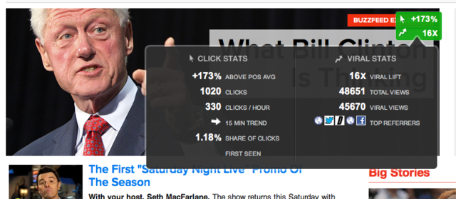
The Contently blog followed up with some added context to some of the other factors that BuzzFeed considers. One of these factors is engaged time, specifically the percentage of the page that the reader has scrolled/read. BuzzFeed’s Ky Harlin explained how this metric impacts the content.
We treat each individual item in a list almost like its own article. So we’ll try to really figure out what people are engaging with and turn a list of 45 items to a list of 25 items without the duds, reordered to make it most likely to share.
6. Kapost’s Content Score
Factors:
- All the steps taken by a user, from first interaction with the company to becoming a customer
Kapost has a great explanation for the way to score content in terms of generating leads. They assign a score to each step in the buyer journey—each piece of content that a future customer has engaged with.
The first step in the journey and the last step in the journey receive more weight than the steps in between.
The total score for the customer is 1, and each step gets a percentage of that number. For instance, if you were to assign the first and last steps 30 percent each, an example score might look like this:
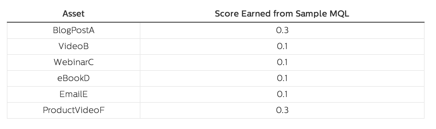
Where things get really interesting is when you begin to add up the scores for a large volume of customers. You can see a complete picture of the content that drives the most leads and has the biggest impact on customers. Also, you can split the score into campaigns (seeing the impact of various ads) and even blogpost authors.
Conclusion
What insights can you find about your website or blog? Do you have a system in place for scoring and tracking the performance of your content?
I’d love to hear what you learn from these tools and what you do for your website and blog. Please leave any thoughts you might have in the comments!
Read next: Landing pages for dummies: A how-to guide
Get the TNW newsletter
Get the most important tech news in your inbox each week.