If you arrived at Amazon today and noticed things look a little different, well, you’re not the only one.
It seems the internet giant is now rolling out its design refresh to many more e-shoppers after a testing phase that kicked off last month, though it looks like it’s still only available on its .com domain for now.
The most immediate and obvious change is the large carousel gallery that takes up the full-width of the screen, and the dark grey backdrop across the top. Click on the second image in the gallery below to see the ‘before’ design.
Looking a little closer, and you’ll also note that the ‘Departments’ drop-down box is no longer open by default. You now have to hover your mouse over the button to surface the innumerable Amazon categories.
‘Fire & Kindle’
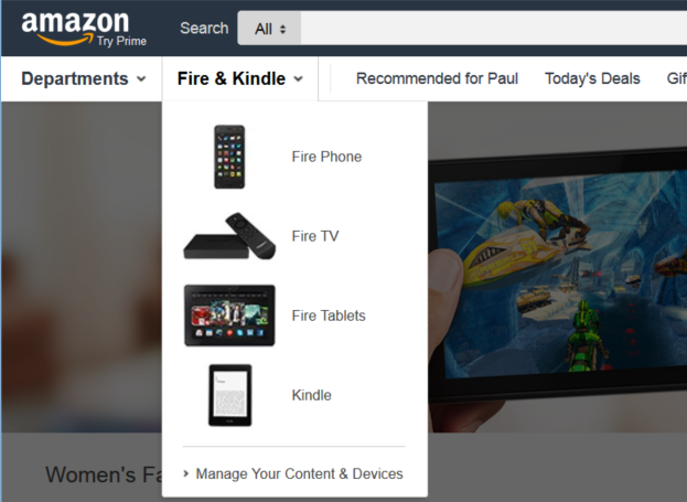
Over and above all this, you’ll see that the menu items have been shifted around a little. A new ‘Fire & Kindle’ drop-down box appears next to the ‘Departments’ option at the top-left, as Amazon looks to shine a spotlight on its growing own-brand hardware range, and the associated content. This was buried within the ‘Your Account’ section before.

It seems as though Amazon is striving to bring a little more order and tidiness to its homepage, as it has typically been a rather cluttered affair. But hot on the heels of the much-discussed Fire Phone failure, which Amazon has taken a $170 million writedown on and was a factor in its Q3 operating loss, it seems the e-commerce titan is also making moves to bring its devices to the wider public’s attention.
The verdict of the Twitterati is largely positive, and although the refresh is subtle in many ways, it definitely brings a cleaner look to the table.
Get the TNW newsletter
Get the most important tech news in your inbox each week.


