Sean Mitchell is an interactive designer based in Vancouver, British Columbia, and the editor of Type Release.
Time to count down another month of beautiful typefaces. What do you think of our picks from September?
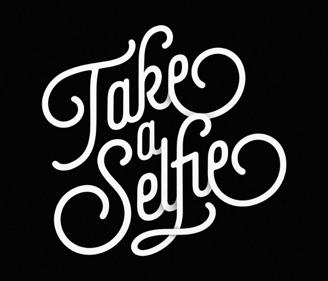
Lián Types: Selfie
Selfie is a connected sans based on vintage signage scripts.
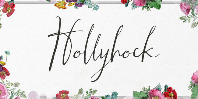
Angie Makes: Hollyhock
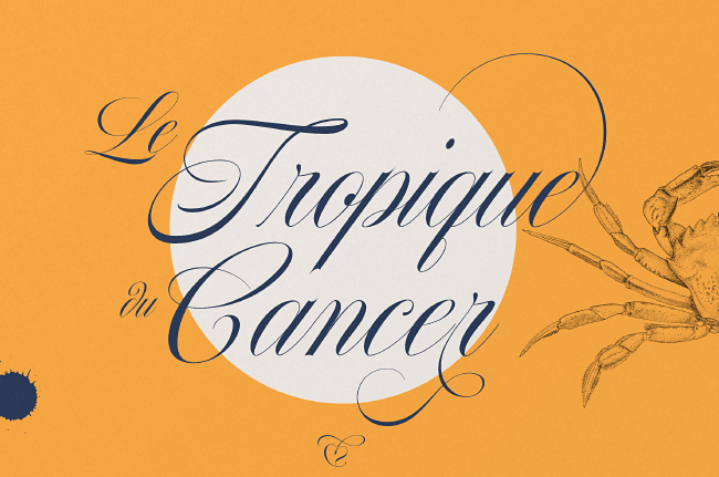
Hollyhock is a modern and messy calligraphy font with wild, tall letterforms that refuse to be tamed.
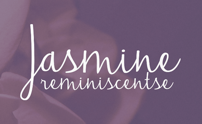
Brittney Murphy: Jasmine
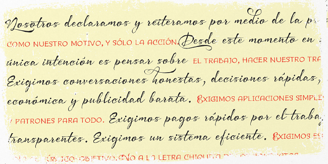
Jasmine a flowing script font that works well for text, headlines or quotes.
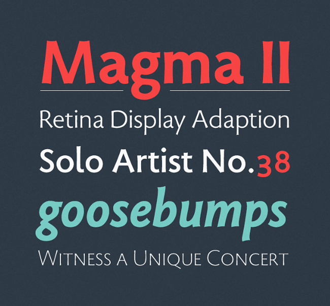
Stone Type Foundry: Magma
Magma is a rare sans serif typeface family designed explicitly for use in both text and display applications.
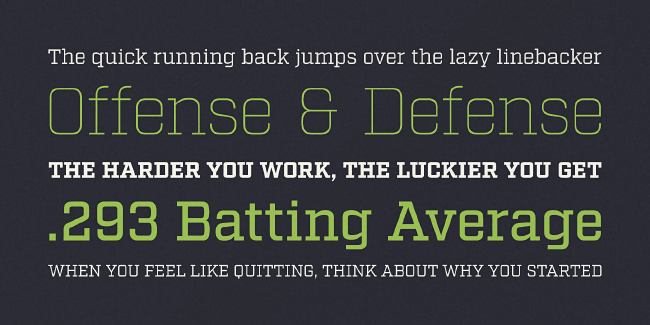
Fort Foundry: Factoria
Factoria is a hardworking, geometric, square slab family.
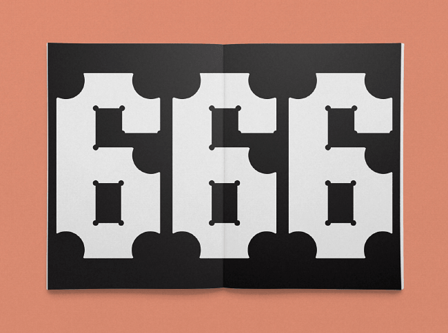
TDF: Hardy
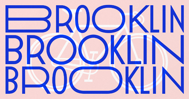
A display typeface whose circular cuts replace each angled intersection.
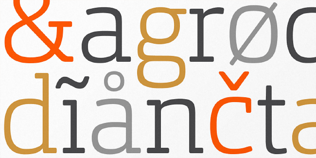
Hoftype: Orgon Slab
Orgon Slab complements the Orgon family with its clear, unexcited appearance.
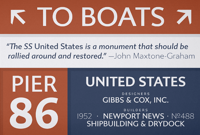
Typetanic: Gibbs
Gibbs is a tough, sophisticated sans that is both stylish and comfortable to read.
Latinotype: Uomo
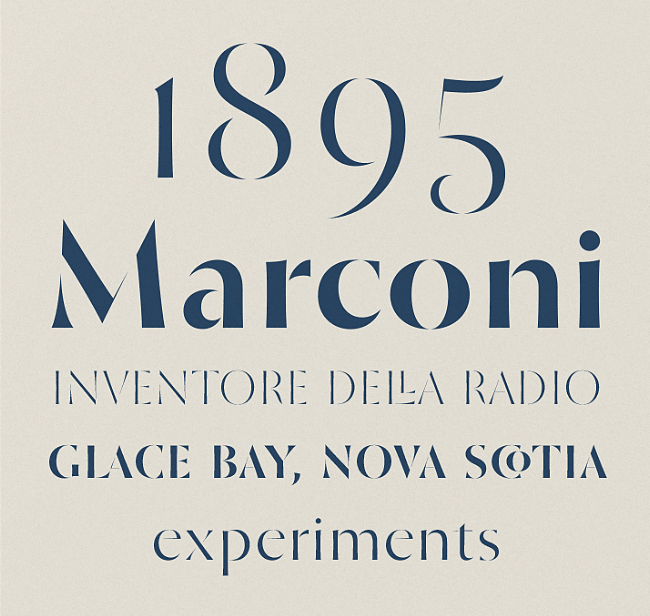
Uomo is a contemporary typographic system that explores geometric style and Italian art deco.
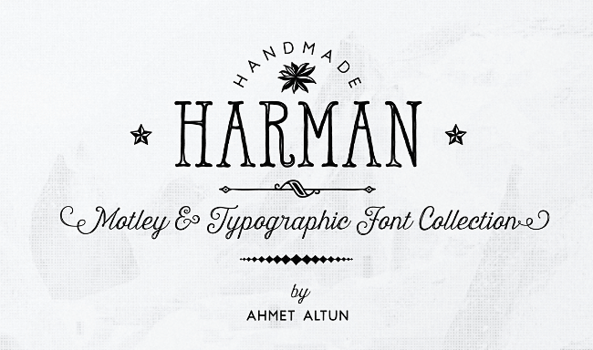
Ahmet Altun: Harman
Harman includes seven fonts and their inline forms.
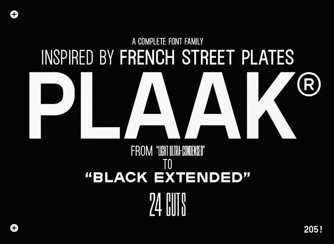
Editions 205: Plaak
Inspired by the characters on french street plates.
Andinistas: Bemol
Bemol features craftsman style, worn edges and highly spontaneous look.
Storm: Pepone
Pepone is a contemporary, discreet book serif.
Binnenland: Korpus Grotesk
Korpus Grotesk imitates the technical characteristics of phototypesetting.
S-Core: Core Escher
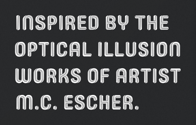
Core Escher is an optical illusion type family inspired by the works of M.C. Escher.
Nils Types: Conto
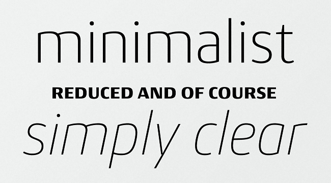
Conto is a clear and reduced sans serif typeface in eight weights.
Resistenza: Nautica
Nautica is a script typeface inspired by brush pen strokes.
Fontfabric: Nexa Rust
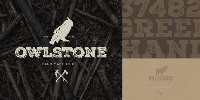
Nexa Rust is a multifaceted font system with a warm, rough look.
Storm: St. Croce
St. Croce is based on worn out lettering on tombstones in the St. Croce Basilica in Florence.
Corradine Fonts: Whisky
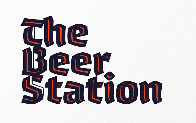
Whisky is a blackletter font family with a casual touch.
Latinotype: Estandar Rounded
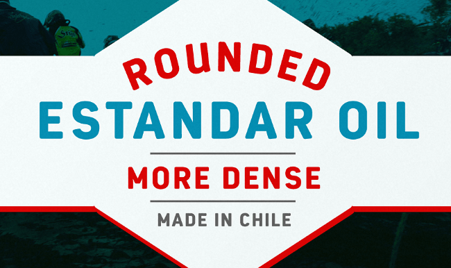
Estandar Rounded is a retro and vintage wayfinding sans serif.
The Northern Block: Schar
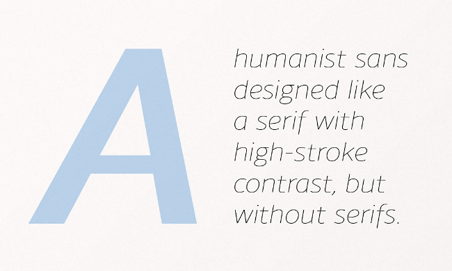
Schar is a humanist sans designed like a serif with high stroke contrast, but without serifs.
PintassilgoPrints: Marker Aid
Marker Aid was drawn with a dry chisel felt tip marker, resulting in two striking, detail rich fonts.
Read next: The best typefaces from August 2014
Get the TNW newsletter
Get the most important tech news in your inbox each week.
