
This post originally appeared on the LinkedIn Talent blog.
It’s hard to imagine that iPhone and Android devices are less than a decade old. In a few short years, smartphones have transformed how digital audiences communicate, stay productive and access information — but mobile recruiting experiences are lagging behind.
In a recent survey of talent acquisition leaders across 19 countries, only 20 percent of respondents felt that their career sites were mobile-optimized, and 13 percent felt confident enough to call their mobile recruiting strategies ‘adequate.’
The challenge that many talent acquisition leaders face is that they’re not sure how to build mobile-optimized career portals. That’s why we wrote this blog post — to empower recruiters with a clear guide for building a functional, easy to use mobile recruiting website. Let’s get started.
1. Keep the job seeker action flows as simple, efficient, and focused as possible
Distractions and mobile go hand-in-hand. When candidates visit your careers site from a phone or tablet, they’re likely to be in distracting, public environments.
Mobile career sites should be useful and extremely easy to navigate through a process of very few clicks, taps, and swipes. Recruiters should be extremely selective in choosing content for their mobile careers sites. Keep the copy short, use lots of images, don’t offer too many stories, and make the call-to-action (CTA) clear, easy to engage with, and simple.
“You have to ask yourself, ‘What is the intent of the job seeker at this particular point in time?’” says Laura Klein, a user experience consultant who has been building consumer-facing technology products since the mid-’90s.
“By understanding the answers to this question, you’ll know what your primary call to action should be. You’ll also know that you should get rid of everything that might distract the candidate from that action — to ‘learn more’ or ‘apply for a job.’”
It’s unlikely that candidates have a resume on file on their phones — the process of uploading a resume and cover letter will be cumbersome. The best processes allow job seekers to quickly import data from existing online profiles (like LinkedIn).
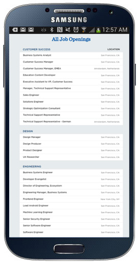
For inspiration, check out the Optimizely career site, a company that powers online commenting platforms. Prospective candidates can scan open opportunities, read through job descriptions, and apply to roles with a series of simple taps and swipes.
Step 1: Make it easy for candidates to browse openings by function and location
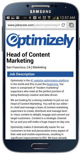
Step 2: Create to-the-point, mobile-friendly job descriptions
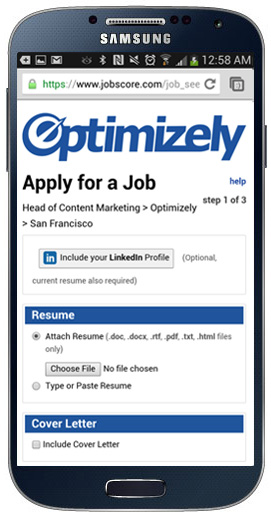
Step 3: Reduce the friction of uploading resumes, by offering the option to use a social media profile
“The best mobile recruiting sites are the ones that have very clear calls to action for the most important things – finding a job and applying for a job,” says Klein.
“Anything that distracts from these two very clear objectives can be confusing and frustrating for job seekers.”
2. Use location data to create custom-tailored content
Job seekers who are researching opportunities are likely to be focused on specific geographies — often beginning with opportunities that are close to home. Talent acquisition leaders can make this process easier by making it easy to browse nearby open roles.
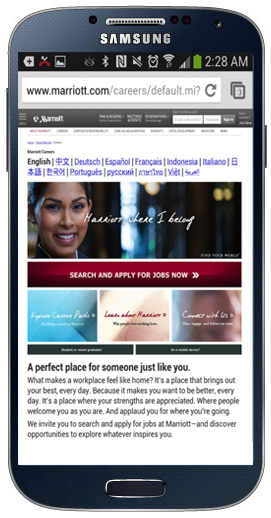
Marriott International exemplifies this concept and relies on mobile location data to quickly connect with candidates in multiple countries.
“The process of recruiting someone in the United States is different from recruiting someone in Saudi Arabia,” explains Joseph Drambarean, director of strategy at mobile UX agency Punchkick Interactive — the firm that designed Marriott’s career portal.
“We wanted to make it easy for Marriott to appeal to candidates from all over the world with one simple interface. It was a complex challenge that we tackled a basic feature of smartphones — the ability to locate where mobile website visitors are likely to be based.”
With an extensive worldwide presence; however, it’s impossible to create a customized experience for each and every type of applicant. Marriott’s career portal accomplishes this goal with location data and tailors its content to a global audience in two simple steps:
Step 1: Displaying content in the candidate’s language
Step 2: Automatically display to candidates nearby open roles — as opposed to requiring them to search by zip code or city
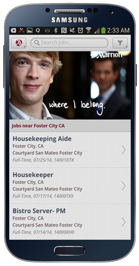
Marriott’s career site is designed to accommodate audiences from all over the world and was built with the understanding that in some countries, candidates are more likely to have smartphones than computers at home.
“We designed the site so that candidates never have to rely on a computer, which is especially important for countries like India and Pakistan, where computers are less prevalent than smartphones,” says Drambarean.
Potential applicants can quickly browse open roles near them, learn about specific opportunities and apply for roles by connecting their job applications to their LinkedIn profiles.

“In building the Marriott site, we aimed to strike a balance between ease of use and personalization,” says Drambarean. “By automating these goals with social profile integration and geo-location data, we made the application process as easy as possible for applicants.
3. Make it easy for candidates to transition between devices
Drambarean explains that mobile is only one part of the candidate experience equation. He encourages recruiting leads to build sites that allow candidates to seamlessly transition between devices.
“Some of the most mind-blowing things that we’ve been researching is that candidates are very open to working on multiple devices,” says Drambarean. “They’ll save an in-progress application on the computer and then work on it on a mobile device on the way to the office.”
Recruiting leads should make it possible for candidates to transition between their phones and computers seamlessly. Applicant flows unify each and every step between discovery of a job to the opportunity to learn more and apply.
“The idea that optimizing for just one platform will solve your challenges is obsolete,” says Drambarean.
Final thoughts
The biggest challenge that talent acquisition leaders face when building a mobile recruiting website is the fact that applicants will be facing a range of distractions. The best mobile websites account for this fact by keeping processes extremely simple and to-the-point.
Do make it easy for candidates to conduct their research — and make it even easier for candidates to submit their applications, either immediately on the phones (by enabling integrations with social profiles, for instance) or later on the computer (by allowing candidates to quickly save job postings and in-progress applications).
A few simple optimizations — clear CTAs, geo-location capabilities, and LinkedIn integration capabilities — have the potential to radically transform how candidates engage with your mobile site.
Make the most out of every swipe, tap, and click, allowing candidates to complete tasks with the least number of steps possible.
Read next: The beginner’s guide to organizing content on mobile-friendly designs
Get the TNW newsletter
Get the most important tech news in your inbox each week.