
Shannon Byrne is the Content & PR Manager at Mention, where she crafts words, creates strategies, and recruits loyal advocates. This post originally appeared on the Geckoboard blog.
Whether your startup is a SaaS company, a product, or a more traditional service, you’ve likely been collecting a multitude of data on your clients and how they use your offering from day one.
Of course you can use this information to create buyer personas, segment communications, and get to know the needs of your customers better, and hopefully you do. But it doesn’t have to stop there. In a world of big (and small or micro) data, the options are nearly endless.
1. Distill large amounts of data with infographics

The 💜 of EU tech
The latest rumblings from the EU tech scene, a story from our wise ol' founder Boris, and some questionable AI art. It's free, every week, in your inbox. Sign up now!
Depending on what your product focuses on, you might be collecting data on how customers also use any external platform(s). Ask yourself: How can we use this information for communications purposes?
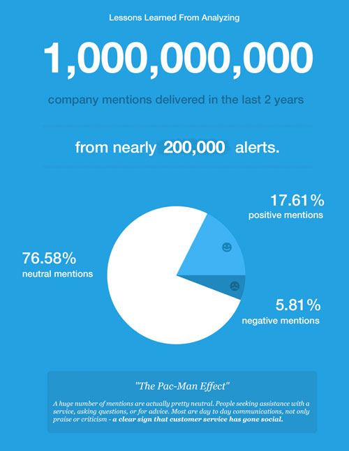
For example, being a social media and Web monitoring app, the team at Mention is able to gather information on how people communicate with companies online. With this in mind, we analyzed over one billion company mentions to determine the “what, where, when, and how” of communicating online to get more mentions.
Since this was valuable information for companies for all sizes, we turned the data into an easily digestible infographic free for anyone to check out.
Our main goal with the infographic was to make our data accessible so that anyone could use it to improve their marketing strategies. But it also gave us the opportunity to build further brand awareness.
We made the infographic very shareable and discoverable, and sent it to some relevant publications who also ended up publishing it. And we received a lot of great feedback. It continues to be one of our most popular blog posts.

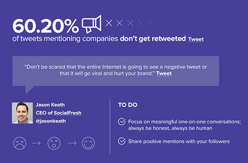
One of the findings in this data set inspired us to produce another infographic. Because the majority of company mentions (67 percent) took place on Twitter, we crunched the numbers again, focusing soley on Twitter, to find “5 Surprising Figures You Need to Know to Improve Your Twitter Strategy.”
This time, we went a step further and included Click to Tweets of the main data points directly in the infographic. We also included tweetable quotes and analysis from social media experts. This added credibility to our findings and created an opportunity to reach the experts’ communities, while allowing them to reach ours.
Like our first one, this follow-up infographic has also become a major source of blog traffic — the second most visited piece of blog content over the last three months.
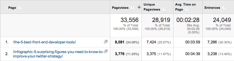
Check out the Avg. Time on Page for the infographic. Data content like this sees very high engagement.
This approach could work in almost any industry. For example, a health-oriented startup could produce a graphic on trends in health, health spending, etc.
How to make your data visualizations work for you:
- Mine data that’s helpful to your audience: Mine user behavior data to answer questions such as: What are customers interested in? Why do they read your content? What’s going to make them want to use your product or service even more?
- Make it actionable: We found five figures that surprised us about company mentions on Twitter, but what did this mean for our audience? We asked the experts for helpful analysis and created actionable to-dos that readers could execute ASAP.
- Make it visually pleasing and easy to understand: This is possibly the number one overlooked tip, yet most important detail when creating a data visualization. The whole point of an infographic is to make your data easy to understand and consume in an instant. Keep the design simple, uncluttered, and easy to scan. It’s understandable to want to pack everything in, but try to only include the most valuable facts for your audience.
Here are some great best practices for creating infographics from Marketing Land.
2. Get interactive with data maps
In addition to an infographic, a health startup could produce a map with the most and least healthy cities, or where colds occur the most, for example. They could even co-brand this with a travel agency or CVB for increased reach.
An HR or recruiting startup could use their data to map where job openings are by location, industry, field and even experience level. Indeed.com created a super basic jobs map for example, and Moody’s Analytics created an interactive jobs map that’s updated monthly.
A hospitality or travel startup such as AirBnB could create a map of where the world’s best yurts are, or where the most popular places are to stay, or the most visited cities in the world, much like it did with this “Where to Go in 2014: Travel Trends from Airbnb Travelers” infographic.
Crowdsurfing could do something similar with a map of “cities most likely to open their doors to strangers,” or something to that effect.
My personal favorite data visualization is this map of independent coffee shops in Brooklyn.
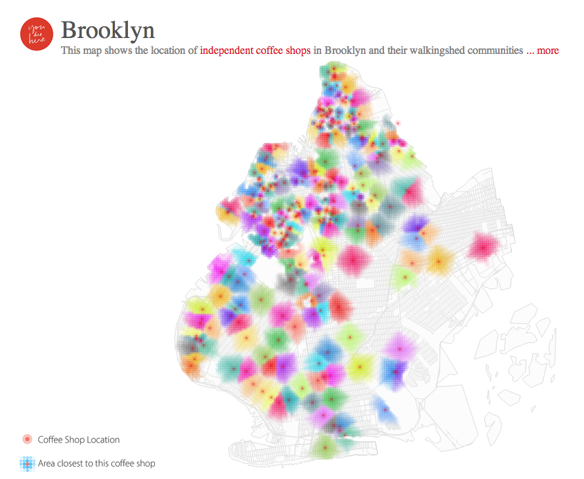
This is something we’re getting more and more excited about here at Mention, having just launched a new Geolocation feature.
How to mine your data into a map
- Work with a data scientist: If you’re only using your own data, work closely with someone on your tech team who “gets data.” Someone who can easily visualize the numbers and help you develop the best marketing concept for your audience possible.
- Or someone who knows how to tap into the right APIs: The Brooklyn coffee shop map above, for example, was created with the Google Places API and the Google Distance Matrix API. Do your research or work with a developer who knows what they’re doing.
- Leverage available tools: If you don’t have a data scientist available and your tech team is busy with other projects, use tools like Tableau Public 8.2 and Mapbox to create beautiful maps with your data.
3. Educate with white papers
Remember a minute ago when I said to only include the most important facts in your infographic? Here’s your chance to elaborate and really get into the nitty gritty of your data.
It’s also a chance to repurpose and expand upon existing content. We did this by turning our one billion mentions infographic into a white paper, in which we developed a roadmap for readers to communicate better online for increased engagement and brand awareness.
The results were more in-depth insight for our readers, additional coverage for us in relevant publications and blogs, and a piece of evergreen content that is available on the web for anyone to leverage for their own marketing strategies.
White papers can also go beyond data mining. Sometimes they are based on company lessons or experiences, like Exacttarget’s “Facebook Advertising: The Mobile Opportunity.” Or on expert tips like HubSpot’s “Inside the Boardroom: A CMO’s Guide to Impressing Investors,” where it asked six veteran venture capitalists to explain what they were looking for from CMOs.
How to create a white paper that will add value:
- Get creative: What have you not done with your existing data yet? How can you put key facts to work for your audience?
- Outline your concept: Have a solid outline and information flow before getting to work. This will save you a ton of time and frustration (trust me!).
- Work with your team (including designer from the get-go): A designer is an invaluable resource. Let them help you visualize the information before getting started. This will create working boundaries such as character limit and space for images.
- Make it actionable: Much like with infographics, readers should be able to take action on the tips included immediately. Make your tips clear and easy to understand. Include a recap of all tips or steps covered in the conclusion.
- Make it branded: Don’t forget to include elements like your logo, URL, and even Twitter handle on every page. This will help with brand recall when readers are trying to remember who provided them with that special nugget of info.
Check out these best practices for creating a compelling white paper from Content Marketing Institute.
4. Shock your readers with fun facts
OKCupid is currently winning the data marketing game. Just glancing at its trends blog, you’ll find all types of fun facts on dating and human behavior — information that’s not only helpful for online daters, but also for the companies targeting it. I wouldn’t be surprised if even competitors are tapping into OKcupid’s data.
And apparently customers don’t mind that they’re a part of one giant experiment, because OKcupid is just so darn witty and endearing.
Try collecting data that will surprise your current and potential customers. Something that will teach them something new or help them to be better at something — whether that’s dating, cleaning, teaching, scheduling, or writing emails.
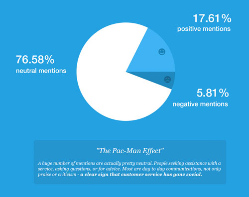
For instance, we were surprised to see that when charted, the huge amount of company mentions on Twitter looked exactly like Pac-Man. So we labeled it “The Pac-Man Effect” and had some fun with it.
How to gather facts that are shock-worthy:
- Look for what has surprised you: It may seem simple, but always be on the lookout for data that took you by surprise. If it shocked you, you’re probably not alone.
- Do your research: After finding those shocking tidbits, scour the web and social (try using media monitoring) to see if the topic has already been covered and validated.
- Look for “newsjacking” opportunities: Keep an eye out for news stories and trends related to your shocking data. If you catch something, reach out to the writer and share your facts. This could result with your data in the mainstream media.
5. Target and segment communications for decreased churn
When analyzing our data at Mention, we learned that the more features a customer activates and uses, the stickier the customer is. We identified which features were most important (most used) and then developed messaging (via Intercom and email) that motivated them to activate the features.
These included pro-tips and use cases. This approach helped us reduce our churn rate by 22 percent in one month, which is pretty significant.
How you can mine data for targeted communications:
- Pay attention to customer use patterns: How are they using your product or service? What are the most popular use cases and how many are there? What seems to interest customers about your product – what features are they using most?
- Segment into use cases: Are different industries using your product differently? If so, create pro tips and/or FAQs and emails for each. If your product is not one-size-fits-all, don’t try to treat it like it is, you’ll lose customers this way.
- Listen to your customers: Try using a media monitoring tool (like Mention) to discover what customers and potential customers are saying about your brand online and on social. Many of these people (31 percent, in fact) are talking about you, but not to you.
The most important thing to remember when working on data marketing is that doing something with it is half the work. Once you’ve mined the data, make sure to put in the legwork to package and distribute your data in an attractive way.
Read next: 10 ways to use infographics
Get the TNW newsletter
Get the most important tech news in your inbox each week.