Sean Mitchell is an interactive designer based in Vancouver, British Columbia, and the editor of TypeRelease.
As another month comes to an end, here’s a look back at all the beautiful typefaces released during the month of June. Check them out below!
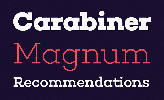
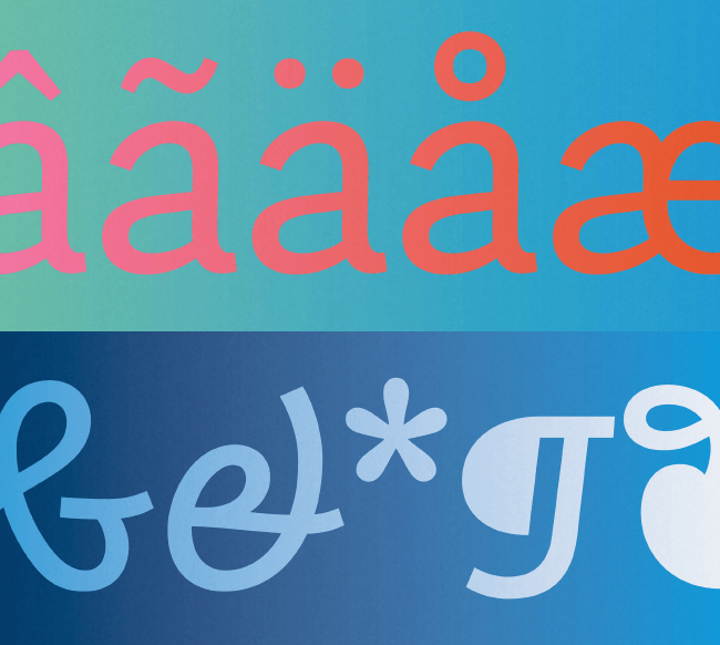
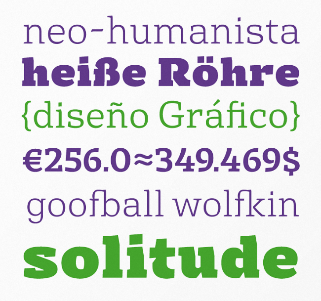
Rene Bieder: Choplin
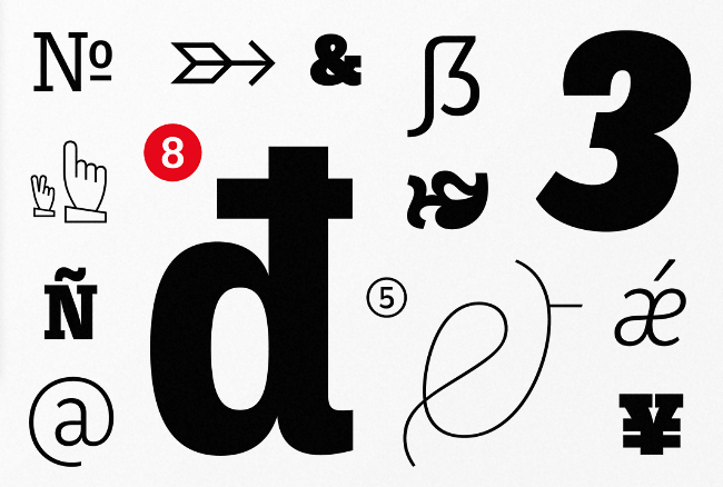
Choplin is a modern and clear geometric slab serif with a sturdy heart.
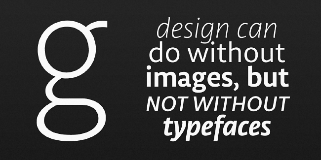
TipoType: Libertad
Libertad is a sans serif that mixes humanist and grotesk models.
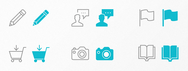
Webalys: Streamline Icons
Streamline Icons have been designed on a precise grid, to guarantee consistency and crisp display.
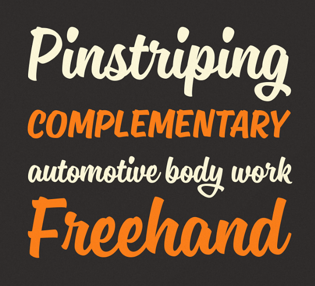
Mika Melvas: Sanelma
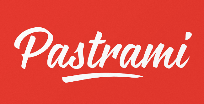
Sanelma is a brush script inspired by hot rod lettering and sign painting.
Nikola Giacintova: Rukola
Rukola is a friendly brush script that follows in the footsteps of sign painting.
Avondale Type Co: ATC Timberline
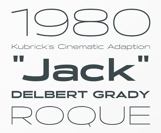
ATC Timberline is a wide display font, evoking the high class side of speed and mechanics.
Sudtipos: Abelina
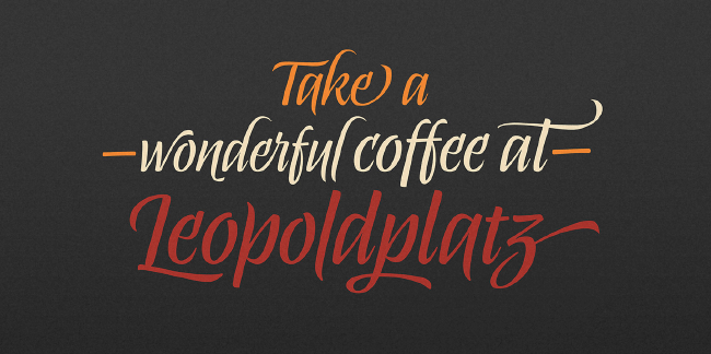
Abelina can be used in display sizes for titles where part of the central premise is to emulate certain features of gestural handwriting.
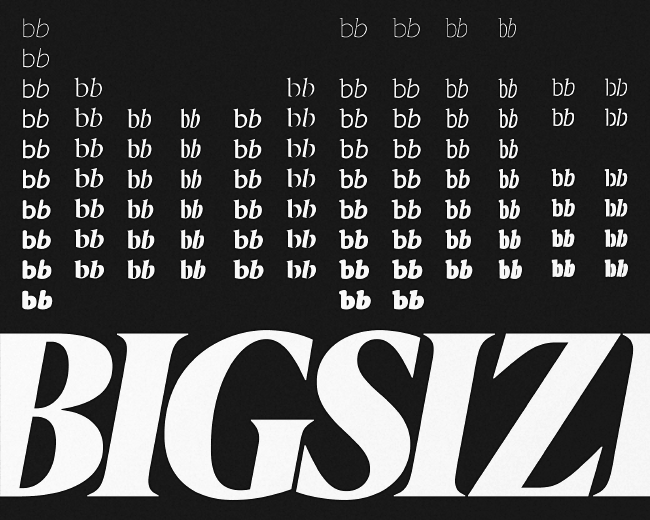
Hoefler & Co: Nitro & Turbo
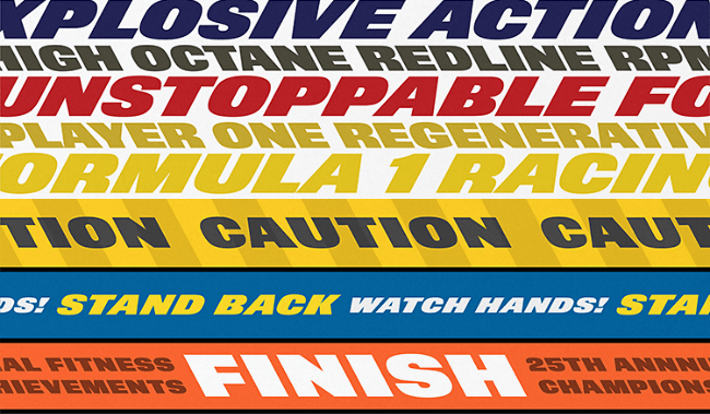
Nitro is an aggressively sloped italic of massive weight – with an equal and opposite form, a back-slanted style called Turbo.
Kyle Wayne Benson: Good News Sans
Good News Sans consists of 18 fonts with six weights and three widths to complement any of your printing needs.
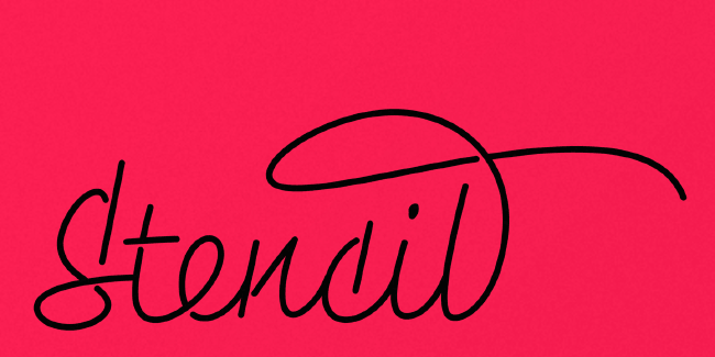
Petra Docekalova: Monolina
Monolina is a contemporary monolinear script that is based on the contrast between classical calligraphy and quickly jotted manuscript.
Playtype: Berlingske
Sleek and impressively consistent design lies in every single letter.
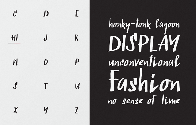
The Northern Block: Finlek
Finlek is a handmade typeface with subtle script characteristics.
Monotype: Quire Sans
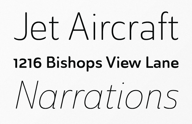
Quire Sans is highly functional and sexy at the same time.
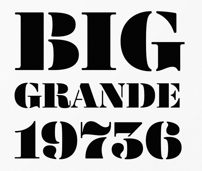
House Industries: Yorklyn Stencil
Robust curves and deceptively delicate breaks.
FontFont: FF Franziska
FF Franziska – discreet, functional and modern, but with real personality.
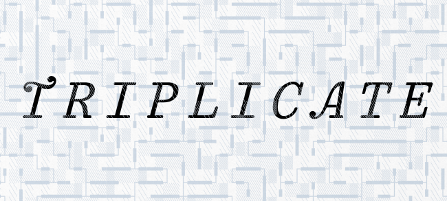
Matthew Butterick: Triplicate
A monospaced family with true italics, small caps and other geekery.
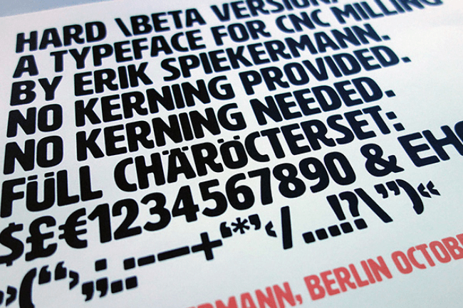
Hamilton Wood Type: HWT Artz
HWT Artz was designed by venerable type designer Erik Spiekermann.
Type Me Fonts: Muriza
Muriza combines well working normalcy with refreshing uniqueness.
Insigne: Ainslie Sans
Ainslie Sans showcases distinct geometric design and style.
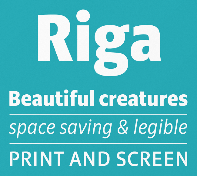
Ludwig Type: Riga
Riga is clear and practical, yet warm and polite.
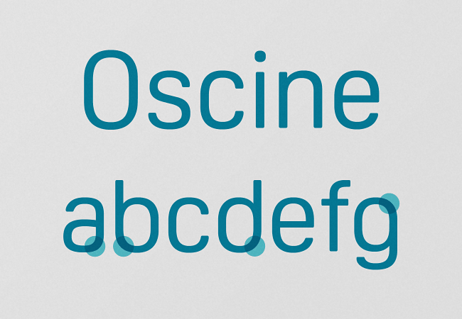
Dalton Maag: Oscine
Oscine has a condensed feel and a geometrical design expression.
Karandash: Basil
Basil is a mix between tradition and innovation.
Want more? Check out the best typefaces from May 2014.
Get the TNW newsletter
Get the most important tech news in your inbox each week.
