Over the past few years, social media platforms such as Facebook, Twitter and YouTube have introduced a series of design changes that have increased the ability to personalize the look of of account pages.
To help your brand from getting lost in the clutter, it’s important to stand out visually as images, colors and context are some of the first elements your audience will notice. Here are five things you should keep in mind.
1. Keep branding consistent across platforms
The number one mistake companies make when branding their businesses on various social media outlets is being inconsistent across different platforms. Just because the content that is created for Twitter differs from content created for Facebook and for YouTube (more on that later), that does not mean that the look and feel of each platform should be different.
Your company branding should be used across each platform in a consistent manner so as to clearly identify a page as belonging to you and to strengthen your brand’s identity.
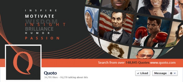
One great example is Quotery. Quotery’s primary color is a strong orange that designer Cherie Smith used in the sample Facebook cover photo she created below. Quotery smartly used the orange in its logo, with splashes of orange as the theme color on its Twitter page. The result is a consistent brand identity across various platforms.
Additionally, the cover photo for Facebook and Twitter is easily applicable to both platforms. Though having the exact same cover photo isn’t necessary given the different types of followers and the differences in content produced for each platform, it keeps the branding consistent and therefore stronger.
2. Be aware of best practices on each platform
Facebook, Twitter, YouTube, Instagram and Pinterest are the some most popular social media platforms and they all attract a different type of user. Therefore, the content that is created for each should be different.
The easiest platform to differentiate content for is YouTube – you’d be hard pressed to find someone intent on posting article links and sweepstakes promotional images to their YouTube profile. But what about Facebook vs Twitter? And Instagram vs Pinterest?
Platform content is harder to differentiate and a lot of the “rules” change based on your company. But in general, follow these guidelines:
- Use simple branded images and videos on Instagram, such as a peek at a new product
- Use shareable images that can have many interpretations on Pinterest, such as a DIY or recipe with an attractive image that can be pinned to recipe boards, foodie boards and party planning boards
- Use large images that can stand out in a news feed on Facebook, such as a sale or an event poster
- Use time sensitive or less important links on Twitter since it stands the possibility of getting, such as an article about an event the night prior
Something else to consider is using the design of platform assets as a means of highlighting information that is relevant to that specific platform.
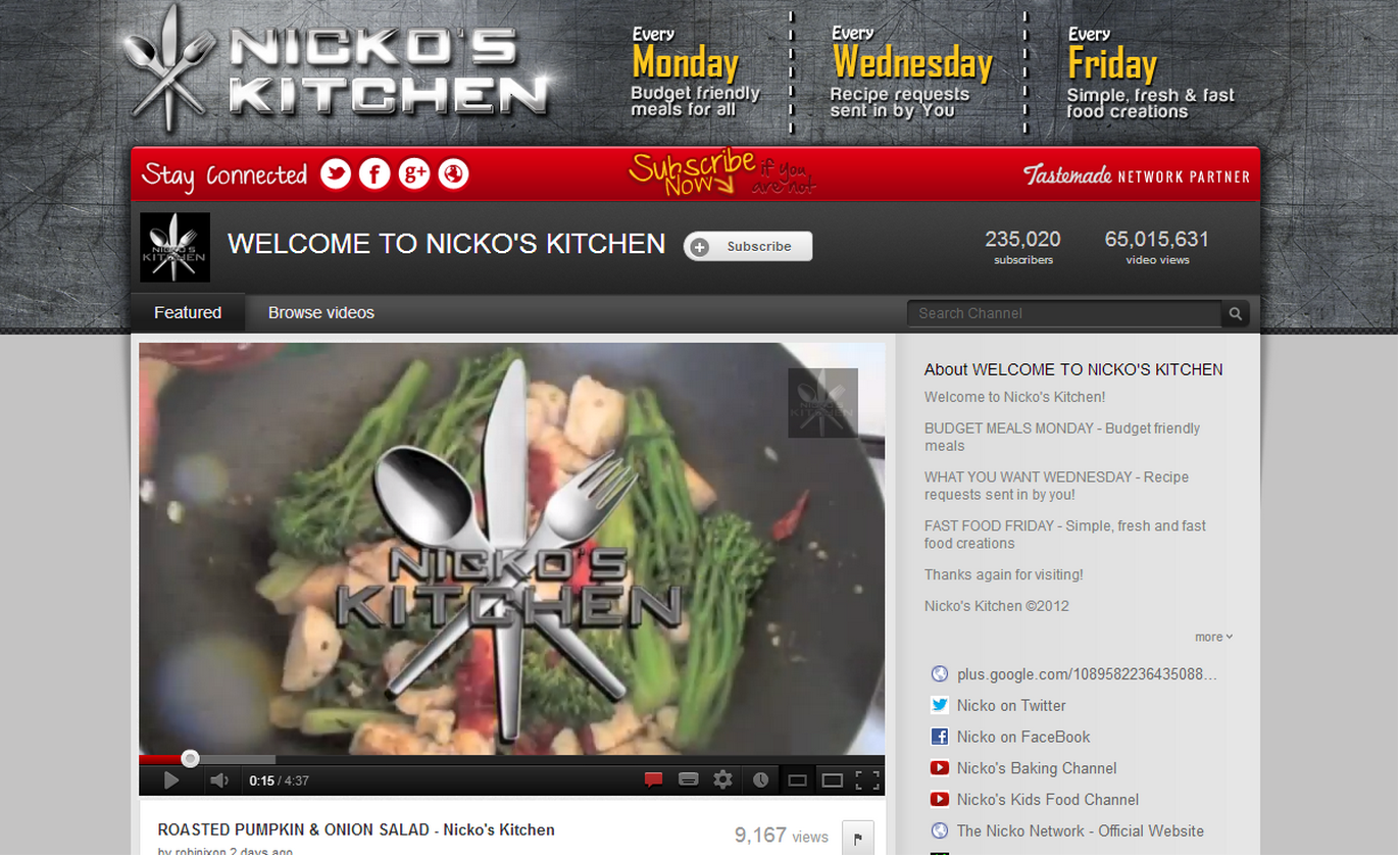
Take the example below from Nicko’s Kitchen, a YouTube cooking show that releases new episodes three times a week. Nicko’s page design uses the top area to display the upload schedule so that every visitor can quickly see when the next video is going to be uploaded and what kind of episode to expect.
The easier to interpret and relevant the content provided and design implemented, the more engaged your followers will become.
3. Keep your profile picture simple and consistent
The profile picture of any social media profile is the most visible image across the platform. It shows up in followers’ feeds, in platform search results, in comments made – the list goes on.
The profile picture is your brand’s primary visual identity on any platform and as such should be designed with care. Your picture lives in many different places on any given platform so it should work well standing alone and should be simple enough to adjust to any size without compromising the design.
Successful profile pictures are easily recognized by followers as belonging to your brand when they are scanning their feeds, and they don’t distract from the feed content by being too flashy or complicated. Above all, your profile picture should be lasting so that it’s always recognizable.
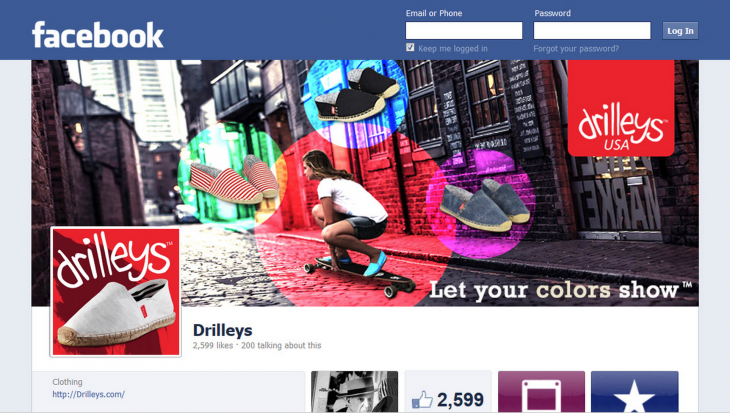
Shoe company Drilley’s picked a profile image that is simple, clearly displays the brand name, and features the company’s core product – the canvas slip on. Anyone searching for Drilley’s profile or any followers scanning their feeds are easily able to recognize the brand and its content, which results in more meaningful impressions and a higher rate of brand recognition.
4. Keep your profile fresh
Followers use social media profiles to stay abreast of important brand related developments. Do you have an upcoming product launch? Are you sponsoring an event in a few weeks? Take advantage of your social media profiles to advertise milestones. That way, whenever someone lands on your profile, they can easily see time-sensitive information such as an event or contest and can get involved.
Furthermore, the Facebook cover photo is a great space to use for temporary brand elements because it is the first thing visitors see upon navigating to your profile. Changing the cover image also reflects as a post in followers’ Facebook feeds, acting as an easy billboard for upcoming products, events and themes.
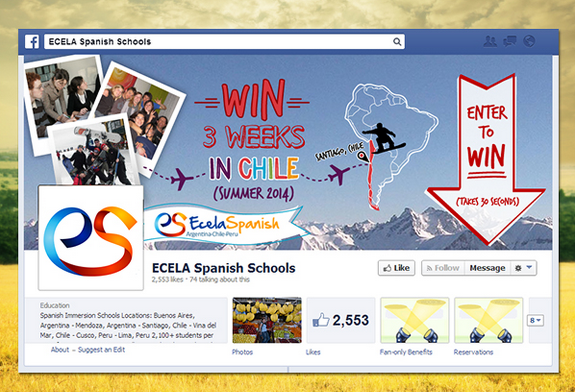
In the below example from ECELA Spanish Schools, the company used the Facebook cover photo area to advertise a sweepstakes contest they were holding. New visitors are immediately prompted to become involved with the brand instead of simply being perusing content without engaging further, and returning visitors can access details related to ECELA’s most recent content.
Easy access to information results in higher levels of engagement, so be sure to place anything time sensitive with a longer lifespan than a week in the first place visitors see when arriving on your page.
5. Use space creatively
Once you’ve mastered all the above, the next step is to be creative with the space made available to you on each platform. This is best explained using the example below from German company Schimpfen & Fluchen. Facebook and Twitter have positioned their profile and cover images to overlap in such a way that they can easily be used together as elements of a larger image. This is tricky but very compelling when executed properly.
As shown below, Schimpfen & Fluchen uses a profile image that can easily stand alone, but when viewed on a profile page, the red bar becomes part of the arm in the cover image. The cover image is simple and reveals more about the company’s purpose, but it can still stand alone without the profile picture when it shows up in follower’s feeds.
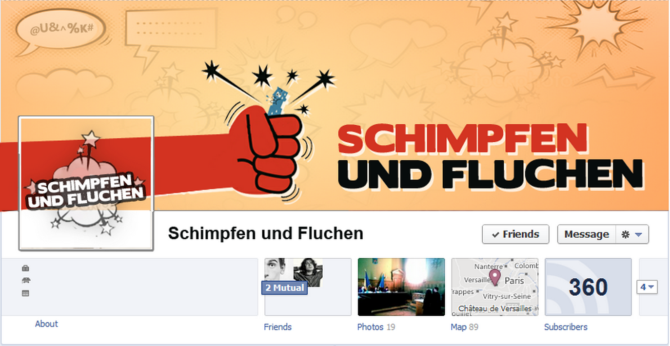
The red stripe that makes up part of the arm is simple enough that if the company wanted to create a temporary cover image to advertise a particular event, they could easily integrate the red into a different design.
In summary, keep profiles consistent across platforms, be aware of how each platform fits into your followers’ social media lives, profile images should be be eternal, cover photos are a great space for brand milestone advertising and be creative about placement of different assets to really stand out.
As your company’s social media presence becomes more important to engagement initiatives be sure to be conscious of what you put up and follow best practices. Strong social media and strong branding mean strong engagement at minimal monetary cost – it’s worth putting in the time to make it perfect.
Get the TNW newsletter
Get the most important tech news in your inbox each week.