Visuals are an essential aspect of your marketing campaigns, especially when it comes to your email messaging on behalf of your organization since 40 percent of people respond better to visual information over plain text.
Since visuals are an important factor in the success of your email marketing efforts, it’s helpful to continually A/B test your creative to understand what resonates more effectively with your audience.
Why start with A/B testing your creative?
Testing the types of buttons, images, headers, product photos and other visuals will benefit your email campaigns in the long-term, since you’ll no longer need to rely on intuition alone but instead straightforward data driven insights.
A/B testing your creative is beneficial for your business because it measures the actual behaviors of your customers online and therefore, can provide insights on future business decisions that need to be made in regards to your email campaigns.
These insights can help test industry best practices for email as well, since every website, company and customer base is unique and could react differently to visuals on one site as compared to another.
As a form of analysis, A/B testing enables your team to measure very small differences in the performance of various aspects of your emails, not limited to the creative used.
By being able to analyze small differences between each version of your email, that are still statistically significant, you’ll be able to understand the difference in anything from taking action on an email to how many sales one version of the email drove over the other.
Lastly, A/B testing your email creatives is affordable for businesses of all sizes with any budget due to the variety of tools available. Therefore, it’s a cost effective method of increasing the ROI of your email marketing campaigns that only requires access to a designer and an A/B testing tool.
Start with what you already know
To begin, take a look at the data and insights you already know about past email marketing campaigns and from your list of subscribers. Establish what you already know about the habits of your email list in terms of what types of campaigns receive the most open rates, clicks and conversions and how the visual elements of your emails impacted those metrics.
With further A/B testing you’ll be able to build upon the information you’ve collected about the visual aspects of your emails and more. This is the stage of the process where your team should begin to ask questions based off of what you already know and what you don’t currently know about the success of the visuals in your email campaigns.
Ask questions like:
- What types of visuals drove higher email engagement?
- Did the visuals of your email increase click-thru-rates?
- Which emails drove more conversions? Did the images used in the email influence these conversions?
- Which type of call-to-action buttons in your email drove more clicks?
- Does the type or amount of product photography affect engagement with your emails?
- Would the colors of the images included in your email increase or decrease conversions?
These are all questions A/B testing can help your organization answer overtime about the different types of creative assets used in your emails.
Your team should also consider taking into account the feedback of your customers in regards to your website. Listening to their input can be an extremely effective way of identifying issues with your website and therefore, more variables to start A/B testing.
Develop creative
Once you’ve gathered ideas on what you’d like to A/B test from your existing data sets, it’s time to prepare for testing by designing and creating multiple versions of your email campaigns.
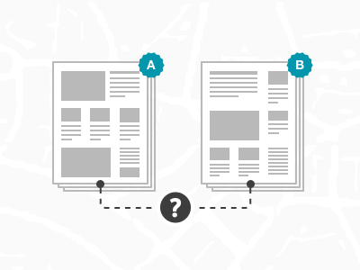
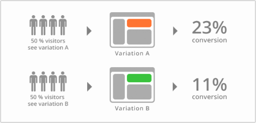
A/B testing compares the results of two identical emails with one altered variable to see which improves the conversion rate of your email. This variable could be an altered header, call-to-action button, product image or any other visual element that you’d like analyze from your emails.
Therefore, when trying to determine the effectiveness of one visual element over the use of another, create two versions of the particular email campaign to see what is more effective at helping your company reach its goals.
Design these emails ahead of time to prepare for you’re A/B testing; the sooner your organization starts, the sooner you’ll be able to discover insights from your campaigns.
Run tests and process results
Once you’ve decided what visual aspects you’ll be testing and what determines success for your campaigns, it’s time to start running your A/B tests. This begins the process of testing a new visual element in your email against another to see which increases conversions, clicks or whatever other metrics you’ve decided determines success.
Now that many of your predictions about what works best on your website are being tested in real-time, the results will begin to come in about your visual elements a week or two later after the two separate emails have been sent to different members of your audience.
Many times the variables under the microscope of an A/B test don’t generate any actionable results because the difference in the use of each variable isn’t statistically significant enough.
Basically, this means that both visual elements work just as well and the test didn’t prove anything other than these items produce similar results. Don’t worry if this happens because it happens to everyone and it’s a sign that it’s time to create a new A/B testing experiment that compares two different visual features on your emails.
This is also a reason why your organization should be running a few different experiments across email campaigns to constantly be testing what works and what doesn’t with different segments of your email list.
To avoid running tests that don’t produce results as often as possible, always base your theories for testing on qualitative data like customer feedback and existing data sets your company has compiled overtime.
When your A/B tests are successful, there is statistically significant difference between how one visual element drives interactions or conversions from your email. Use this insight to power the remainder of that email campaign with the visuals that best resonated with your audience, while using the lessons learned about these visuals in your future email initiatives.
Lastly, continue experimenting consistently with your visuals and other elements of your email marketing to ensure you’re getting the most return from your messaging efforts. It’s a never-ending process of improvement powered by testing.
What has your business learned about your emails through A/B testing? What types of visuals do you think perform the best in an email newsletter? Share your thoughts in the comments below.
Get the TNW newsletter
Get the most important tech news in your inbox each week.
This post has been brought to you by GetResponse: Create stunning newsletters and landing pages in minutes.


