Brian Honigman is a marketing consultant, a professional speaker and a freelance writer. This post originally appeared on the Positionly blog.
Landing pages help sell the value of your company’s products, services, content and more to help encourage increased conversions from your Web traffic. Many factors of a landing page impact if a visitor will convert like the inclusion of an explainer video, trust elements like a client logo or a recent award, a bulleted list of benefits the resource offers, a strong call-to-action and more.
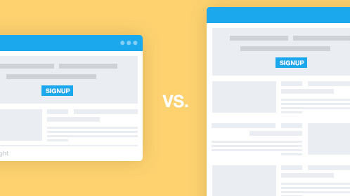
The length of a landing page also impacts how well visitors convert – but what’s better to increase conversions: a shorter, more concise landing page or a longer, extensive resource-rich one?
Both long landing pages have advantages and disadvantages, as do short landing pages. It is all dependent on a few factors, but is mostly impacted by what resource is actually being featured on the landing page and what goals you’re trying to achieve.
Experimenting with landing pages is key
The best route to take when it comes to choosing the right length for your landing pages is to perform extensive testing to see what works best for your audience. A/B test two versions of your landing pages where one aspect is altered to see if it helps one version perform better over another.
Perform multiple A/B testing experiments to confirm what you already know about your online audience, while also learning something new about the preferences of your Web traffic.
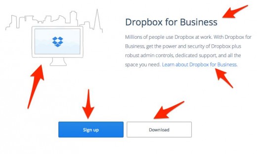
This Dropbox landing page could be extensively A/B tested to see if each aspect of the page is in the right place, the correct imagery is being used, if the call-to-action is helping increase conversions etc.
Test the length of your sign-up forms by adding and reducing the number of fields that need to be filled out to see the biggest change in the amount of conversions related to the length of your landing page.
Long landing pages
Longer landing pages are better for generating more trust and credibility to motivate a Web visitor to convert since they have more room for information about your company and more opportunity to convince a visitor to perform an action.
The bigger the ask, the longer the page should be says KISSmetrics and Crazy Egg cofunder Neil Patel, which is a good rule of thumb to follow.
The advantage of this is that the user who scrolls through to the bottom where the sign-up form is located and views all the aspects of the page is typically a higher quality lead. Not to mention, the more quality text and properly optimized visuals on your landing pages the better they’ll do in the search engines in the long-term.
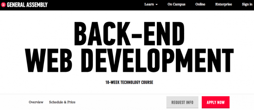
General Assembly, a tech education startup, uses long landing pages to display information about its courses and help better inform visitors of what to expect from signing up.
The apply now call-to-action button follows a visitor throughout the landing page, allowing them to become a lead at whatever point they become interested in the course after learning more about its benefits. A non-invasive scrolling call-to-action button helps improve the likelihood that a visitor converts, a strategy any company should experiment with regardless of the length of their landing page.
Longer landing pages are more suited for products offerings that require someone to purchase the item when they fill out the form, since the ability to add more copy typically helps increase quality conversions.
When someone is making a purchase from your website, they need more information to gain their trust and decide to spend their money on your product. Long landing forms are the most ideal when encouraging potential customers to make a purchase, as well as build your company’s relationship with them for the long-term.
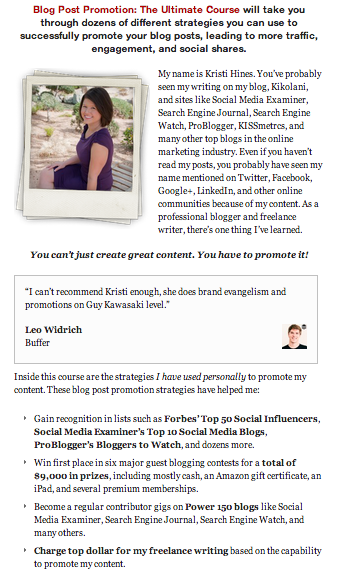
Well-known freelance writer and blogger Kristi Hines uses a longer landing page to explain the value of her premium course and help illustrate her credibility as an expert at what she does best. Her landing pages provide a context as to who she is as a professional as you continue to scroll down through to view text, images, examples of her past work, testimonials from well-known leaders in the marketing industry and more.
Long-term relationship building on a longer landing page is achieved through adding extensive trust elements to the page. This helps to fulfill promises like a full refund if there isn’t satisfaction with the purchase, and provide complete transparency as to what customers should and shouldn’t expect from purchasing a resource from your company. You can build trust with your customers that could extend past their first interaction with your business if done right.
The disadvantage to a longer landing page is that you’ll receive less leads overall because the barrier to entry is much higher as opposed to a shorter landing page with less elements to distract them from clicking.
Short landing pages
If you’re looking to increase the number of leads overall, then using shorter landing pages is the key to achieving your goal, which are often referred to as more successful depending on the circumstances.
Shorter landing pages feature less information, which means fewer distractions that deter a person from signing up. When the sign-up form is shorter on your landing page, it is easier for a person to fill it out and become a lead then if it is particularly extensive and time consuming.
The major advantage of a shorter landing page is that it helps increase conversions if the elements on the page are enough to convince a person to perform an action since it is kept simple and short, which many regard as an effective means of driving conversions.
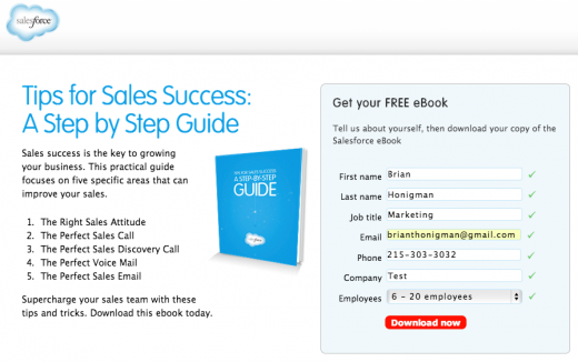
Salesforce typically uses short form landing pages to entice its visitors to download its premium content. Shorter landing pages are the most ideal when you’re offering a free resource like a white paper or eBook, signing up for an email newsletterm or other low commitment actions that don’t cost a person anything other then some information about themselves to take action.
Signing up for a free eBook is a low risk action for a visitor to your website, therefore the landing page doesn’t need to be as extensive as long as it captures helpful information about them for future use in your CRM.
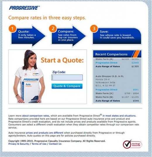
Insurance brand Progressive uses short landing pages to get leads to sign up for an insurance quote since there isn’t a heavy commitment to perform this task and therefore, it doesn’t require the inclusion of extensive credibility driving information to drive people to take action.
The visual elements on the shorter landing page help direct a person to perform the action of comparing insurance quotes, effectively making use of the limited space on this particular landing page.
The use of visual elements throughout your landing pages, no matter the size, are a highly effective technique for increasing conversions.
The main disadvantage of a shorter landing page is the fact that the leads generated from it are much lower in quality. The quality of the leads decreases since it is much easier to sign-up on your form and the page overall requires a much lower barrier to entry.
Does your business typically use long or short landing pages to capture leads? Have you performed A/B and multivariate testing to discover your sweet spot in terms of optimal landing page length? Sound off in the comments below!
Get the TNW newsletter
Get the most important tech news in your inbox each week.

