Sean Mitchell is an interactive designer based in Vancouver, British Columbia, and the editor of TypeRelease.
For the past few months, we’ve been rounding up the freshest typefaces from each month. Now, we look back at the year and select the most beautiful fonts of 2013.
The Northern Block: Neusa
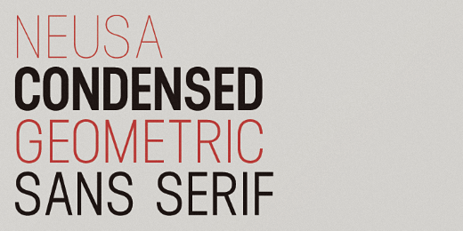
A condensed geometric sans-serif inspired by early space explorations including the iconic Life magazine coverage of the 1969 Apollo program.
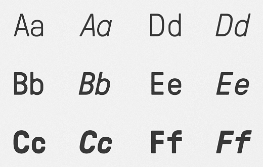
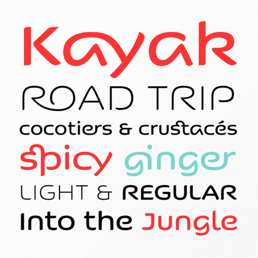
Latinotype: Trend

The 💜 of EU tech
The latest rumblings from the EU tech scene, a story from our wise ol' founder Boris, and some questionable AI art. It's free, every week, in your inbox. Sign up now!
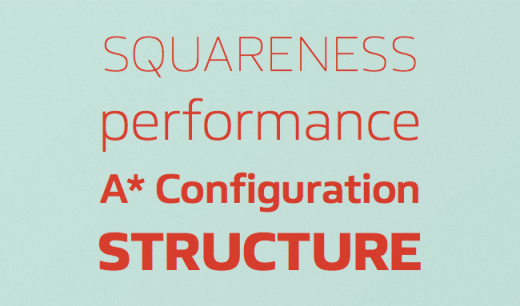
A font made of layers, taking as a basis a sans and a slab.
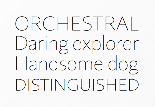
HVD Fonts: Brandon Text
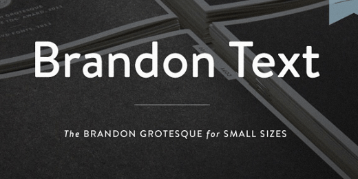
The companion of the famous Brandon Grotesque type family. It has a higher x-height than the grotesque version and is optimized for long texts, small sizes and screens.
Grilli Type: GT Pressura
Inspired by type stamped on shipping boxes, GT Pressura uses the visual effect of ink spreading under pressure as a stylistic device.
Hoefler & Frere-Jones: Landmark
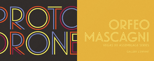
The signature alphabet of one of New York’s most significant buildings becomes a family of clear and colourful display fonts.
Letters from Sweden: Kumla
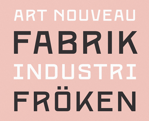
Letters from Sweden’s first release in the “Fabrik Suite” – a project inspired by Swedish industry, factories and harbours.
Letters from Sweden: Trim Poster
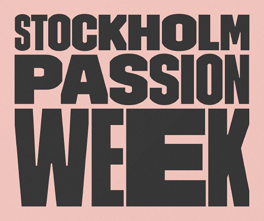
Designed with one purpose in mind: compact all-capital headlines without crashing.
Associated Typographics: Skol
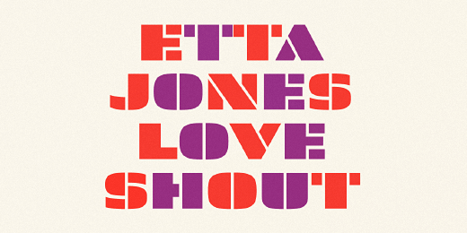
On or off the screen, Skol is a tenacious, hardy font that would make its ancestors proud.
Scribble Tone: Analog
This new take on industrial sans-serifs embodies the spirit of the solid state electronics revolution. Its energetic, generously wide proportions are balanced by confident, efficient strokes with minimal contrast.
Lost Type Co-op: Mission Gothic
A relic; a ghost from an era where letters were hand-painted on wood and glass. Made up of five weights and two styles, Mission Gothic is one of the most expansive type families available from Lost Type Co-op.
Rosetta Type Foundry: Huronia
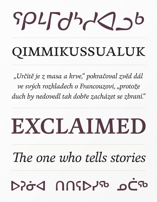
A text face with flavour, suitable for recording oral literature and for extended reading in books and academic texts.
Wordshape: Vaud
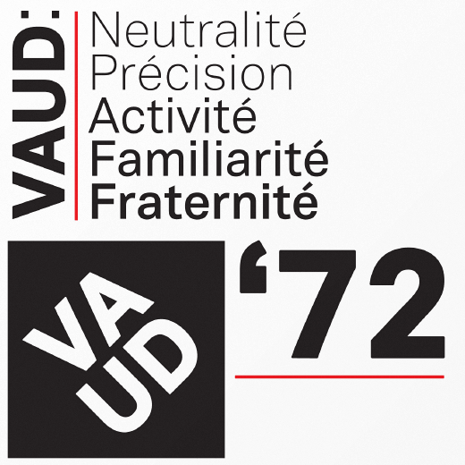
Vaud is a neutral, yet formally nuanced grotesk typeface.
Lineto: LL Circular
LL Circular strikes a balance between conceptual rigour, skilled workmanship and measured idiosyncrasy, resulting in a no-nonsense sans-serif text font with unmistakable character yet universal appeal.
Emigre: Program
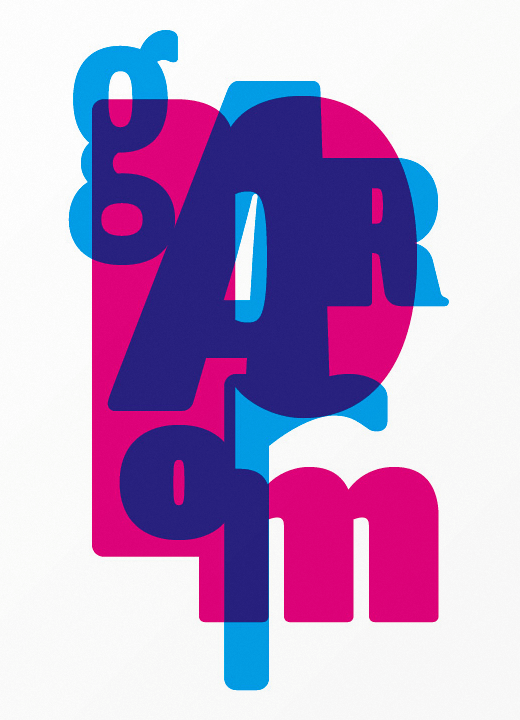
A type designer’s typeface. It’s about the craft of typeface design and the particular details and effects that type designers fret over when they design type.
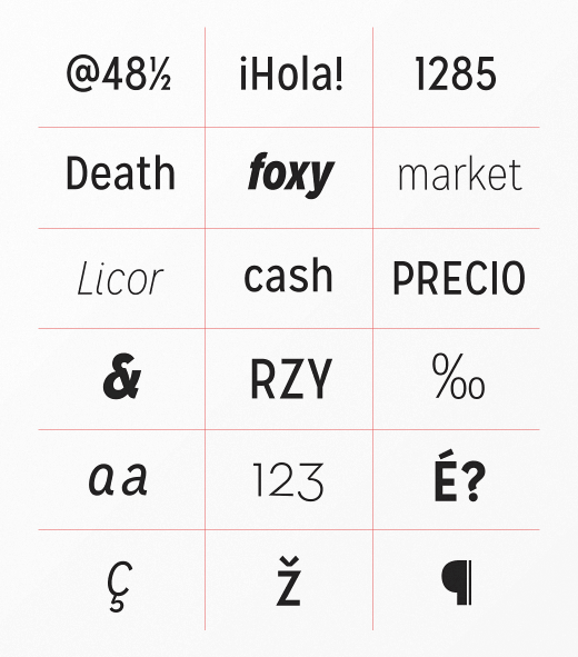
DSType: Diversa
A single typeface with nine fonts within, containing 2760 glyphs, divided into nine stylistic sets.
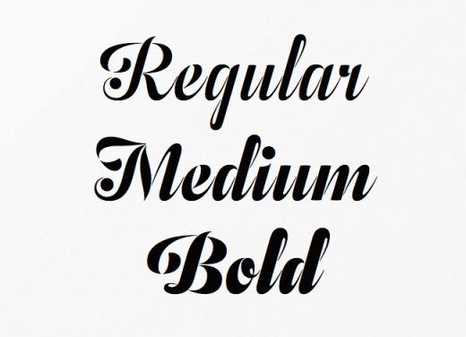
Sudtipos: Esmeralda Pro
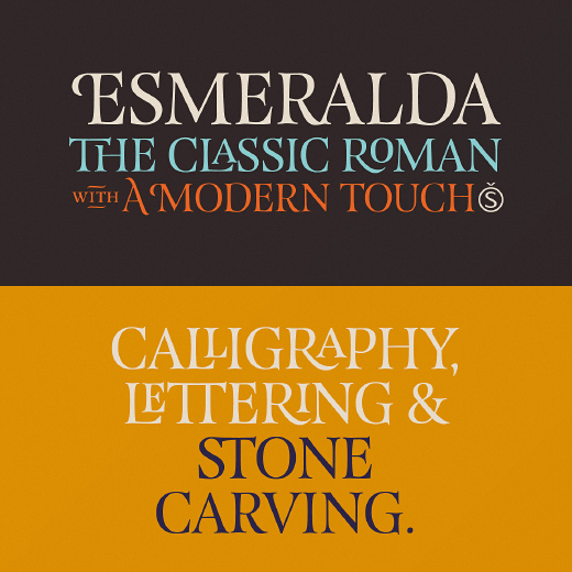
Delicate yet solid curves, serifs and endings give each composition a fine, elegant and exquisite feeling, along with a firm and sturdy look.
Typotheque: Lumin
The Lumin family includes slab-serif, sans-serif, condensed and display typefaces, all of which play with the idea of contradiction.
FaceType: Substance
Substance fulfills the primary role of emphasizing content.
Type Together: Bree Serif
A young and energetic upright italic.
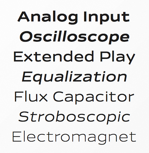
OurType: Remo
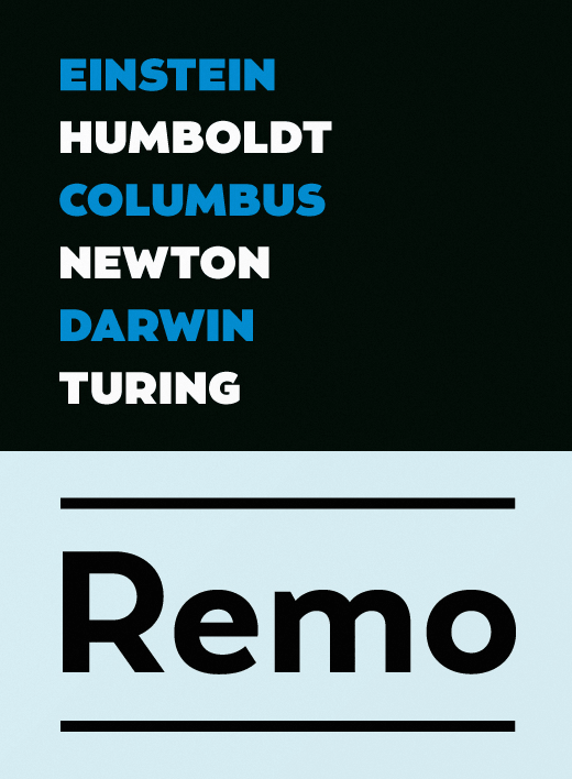
Warmth and good humour, with italics that are nothing less than sunny and delightful.
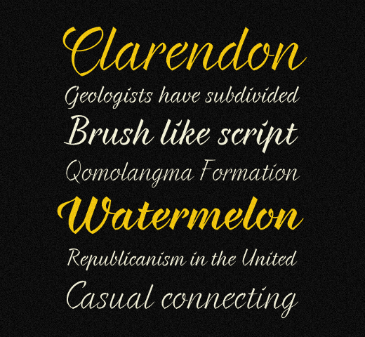
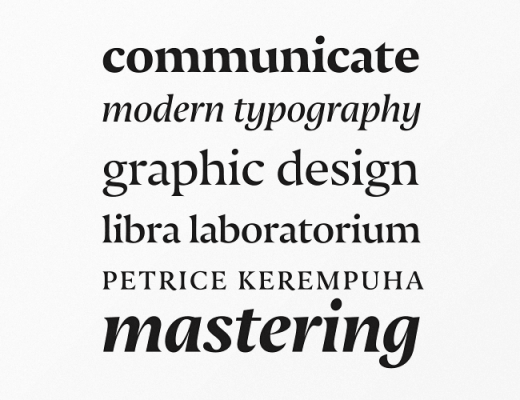
Commercial Type: Dala Moa
Originally inspired by worn gravestone lettering and lettering on shipping crates, the elegance of the forms belies their everyday origins.
Delve Fonts: Sketchnote
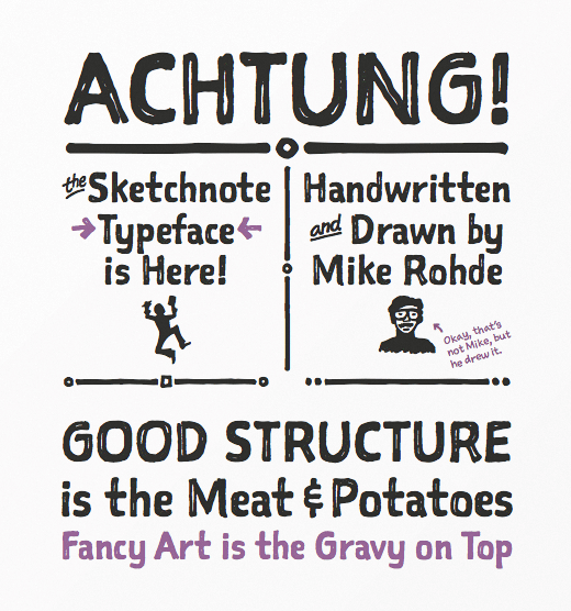
When a handcrafted aesthetic and ease-of-use are desired.
Incubator: Sharp Sans
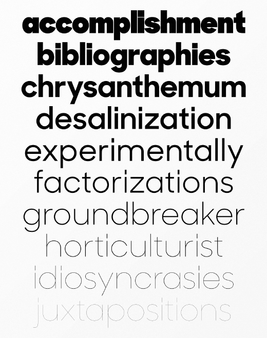
Injects some much needed humanism into the Futura model.
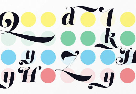
Sudtipos: Rolling Pen
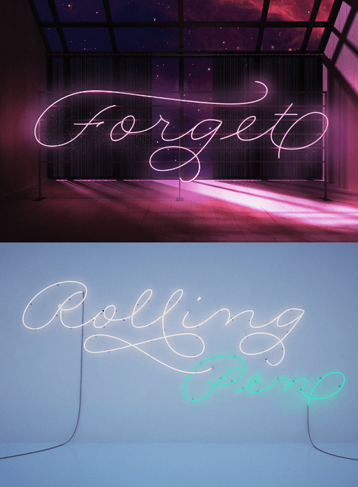
Rolling Pen runneth over with alternates, swashes, ligatures, and other techy perks.
Fontyou: Kaili FY
An exotic typeface with crazy ligatures.
Sudtipos: Zulia
Zulia is based on two calligraphic styles: italic and brush pen.
DSType: Aparo
Aparo appears to be a very simple bold italic roman typeface, but it has plenty of calligraphic flair.
Hold Fast Foundry: Prohibition
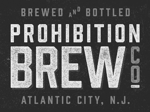
This vintage sans takes queues from classic war and workforce posters.
MVB Fonts: MVB Solitaire
A tempered sans-serif somewhere between a humanist and a gothic, MVB Solitaire captures a 21st century neutrality.
Positype: Lust Script
Lust Script is packed with alternates to play with – enough to turn you on and satisfy.
Fontfabric: Braxton
A brush flavoured script family characterized by excellent legibility in both web & print.
Laura Worthington: Charcuterie
A large and rare undertaking – a family of 10 distinct yet related typefaces, many of which have their own font families and three decorative/ornamental typefaces.
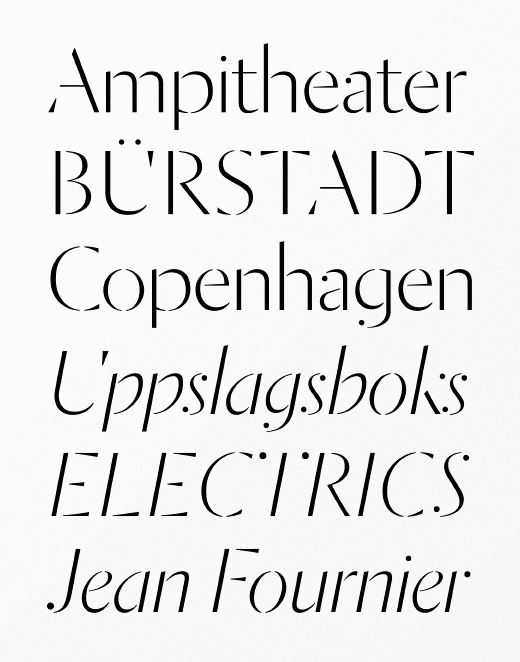
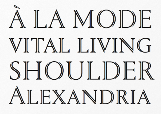
Klim: Domaine
Contemporary, curvaceous Latin detailing on a Scotch skeleton.
FontFont: FF Mark
New meets old meets technic, FF Mark is not an average geometric sans. Strong, simple, bold and created with utmost consideration and precision.
Type Supply: Balto
From casual to authoritative, classic to contemporary, passive to aggressive, Balto is ready for the job.
Typotheque: Lava
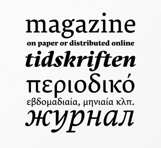
Designed for magazine use, but far transcends its original application. Lava is a no-nonsense workhorse typeface that can handle large quantities of text with ease.
FontFont: FF Kievit Slab
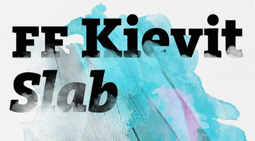
Not just Kievit Sans with slab serifs attached. It has been carefully adjusted and fine tuned in width and contrast to help make it an extremely legible typeface.
Commercial Type: Portrait
Aggressive in its simplicity but nuanced in its details.
Typonine: Nocturno
Broad-shouldered and heavy-armed: the rolling, dark silhouettes of its characters create a soothing yet forceful impression that serves to anchor words, no matter where they appear.
Village: Odesta
Seven feature-rich weights with built-in small caps, swash alternates, and contextual alternate initials & finials.
Nootype: Radikal
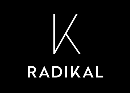
Radikal is a geometric sans-serif dedicated to the research of purity.
FontFont: FF Quixo
FF Quixo feels at home whenever a touch of personality, whim, and some symbols are required.
Kyle Wayne Benson: Tide Sans
Tide Sans’ fresh, carefree, look makes you almost forget that you’re staring at a monitor and not on the beach.
FaceType: Adria Grotesk
Adria Grotesk is a friendly sans-serif that comes in seven weights with charming upright italics.
Laura Worthington: Al Fresco
A breezy, light, yet expressive typeface.
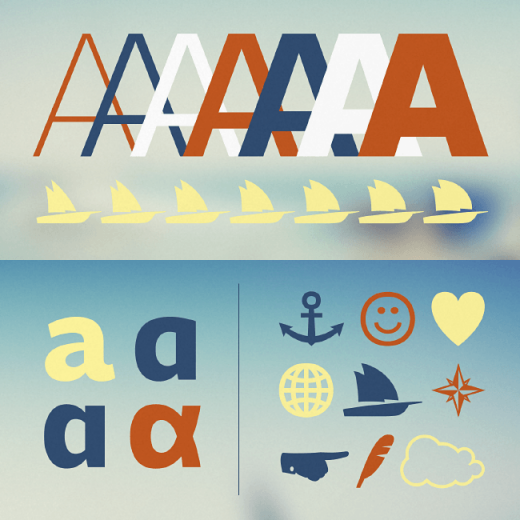
Letters From Sweden: Line
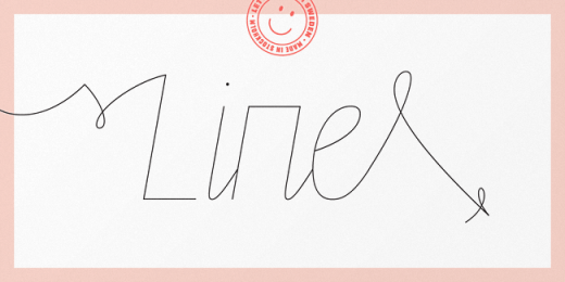
Line is inspired by beauty, handwriting, graffiti tags and scribble.
Bold Monday: Oskar
Inspired by Dutch architectural and advertising lettering from the early 20th century.
Fontsmith: FS Hackney
Meticulously honed to perform in exacting conditions.
Get the TNW newsletter
Get the most important tech news in your inbox each week.