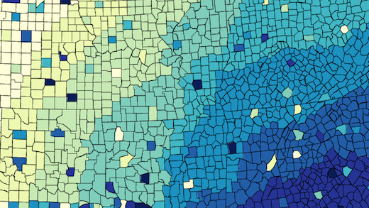
Data visualizations, the more intelligent sibling of infographics, can be a wildly productive way to make sense out of massive amounts of data. The problem is, this power typically comes with a steep learning curve. Now, thanks to a set of tools gathered together by the awesome folks behind Datavisualization.ch, creating data visualizations is a bit more approachable.
If you’re looking to get your hands dirty, visit the site and pick any of the tools at random. If you’d like to avoid code at all costs, however, you’ll want to click the “X” on the top right, next to where it says “Code?,” and the list will automatically re-order itself.
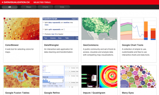
The list of tools include Web apps like: Colorbrewer, a tool for selecting colors for maps, DataWrangler, an interactive web application for data cleaning and transformation, GeoCommons, a public community and set of tools to access, visualize and analyze data with compelling map visualizations, and Impure/Quadrigram, a visual programming language aimed to gather, process and visualize information.

Datavisualization.ch Selected Tools is a collection of tools that we, the people behind Datavisualization.ch, work with on a daily basis and recommend warmly. This is not a list of everything out there, but instead a thoughtfully curated selection of our favourite tools that will make your life easier creating meaningful and beautiful data visualizations.
Check out the site via the link below and let us know if it helps you jumpstart your own data visualizations.
➤ Datavisualization.ch Selected Tools
Check out our full Design and Dev channel for more inspiration.
Get the TNW newsletter
Get the most important tech news in your inbox each week.


