We’re big fans of TestFlight at The Next Web, as it helps us test out iOS apps from developers before they hit the app store. By just sending an invite to anyone with a registered device, beta testers can start playing with your app within minutes.
While the product makes it super simple for beta testers, it wasn’t as streamlined as it could have been for the developers. The company has fixed that today with a series of UI improvements that it announced today on its blog.
If you’re a developer who’s already using TestFlight, then you’re probably using it quite a bit. Within the dashboard you can mange your app’s builds, team of testers, and check analytics. Needless to say, you see these screens a lot day in and day out.
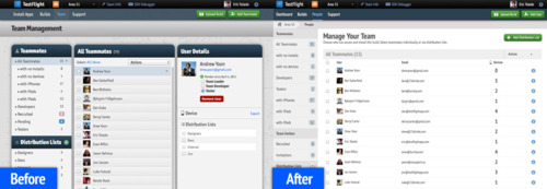
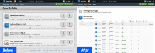
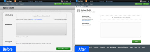
Here are a few of the changes that TestFlight has announced today, along with before and after screens:
– Build options can be accessed by selecting the build of your choice from the build table
– Build history can be accessed by clicking on the More button for apps with multiple builds
– Once in build context, find your way back with a helpful breadcrumb to give you context as you navigate between apps
– Managing your teams and testers got an overhaul with user details now launching into a modal window. Manage your users, distribution lists, and invites just as you did before
You’ll notice that all of the screens have been cleaned up and have a lighter look and feel to them. This will surely make developers happy, and proves that Burstly, the company that purchased TestFlight last month, is dedicated to making the product even better.
Get the TNW newsletter
Get the most important tech news in your inbox each week.


