Designing a typeface from scratch is one of the most challenging tasks imaginable, but if you manage to create something successful, it can be an incredibly rewarding experience.
As if designers weren’t challenged enough by the balance of art and strict letterforms, animated typography is growing in popularity (outside of traditionally animated movie titles) and some of the results are down right incredible.
Driven by highly thematic goals and precise details, animated typefaces have the potential to achieve beautiful results, creating a mood and aesthetic in video and Web design that couldn’t be recreated in any other way.
Out of the studios experimenting with the field, Amsterdam-based Calango catches my attention the most. The team designs its faces for After Effects CS3 and up and ties in static font files as well. Two typefaces from this studio can be found below, as well as two other impressive faces from independent designers.
Typogami
Typogami, created by Calango, is a free animated typeface and traditional font inspired by the art of origami.
Bianary 2.0
Bianary 2.0, also created by Calango, is a bi-colored, “filled” geometric face with a strong retro feel.
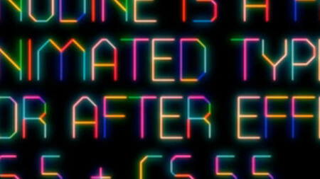
ANODINE
ANODINE is a free animated typeface created by Nicolas Lichtle for Adobe After Effects CS5 & CS5.5.
Gotham Aniversario
Gotham Aniversario is a free animated version of Gotham Black, created by Oliver Dead.
The possibilities of type design and animation are endless, and seeing the two arts brought together into a single composition is quite inspiring. Emerging technologies continue to push rich media on the Web and soon enough I have no doubt that subtle typographic animations will become more common, and will eventually find itself in branding — so long as it’s all done tastefully.
No matter what, projects like these are worth the experiment, because designers are made to push the envelope. Even if you’re not a huge fan of motion graphics, these beautifully designed typefaces are worth a few moments for you to admire.
Visit our full Design and Dev channel for more inspiration. Also, you can exclusively view typography articles here.
Get the TNW newsletter
Get the most important tech news in your inbox each week.


