The web has historically been a messy place for typography. Only recently have embedded fonts become a popular technique, but browsers are still behind on type presentation and flexibility.
This is why jQuery has been a godsend for web designers, allowing them to hack the way each and every letter is presented, thanks to plugins like Lettering.js.
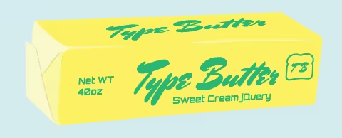
If you’re looking for complete flexibility, Lettering.js is the way to go, but if you’re just itching to kern your headlines, TypeButter is a seductive option.
If you’re not in on designer speak, know that kerning is the spacing between specific characters. Because of the way fonts are designed, sometimes certain letter groupings need to be adjusted to avoid gaps that make things harder to read.
 With TypeButter, simply install the plugin (“spread it over your type”) and your web fonts will lose the awkward spacing that designers have had to tolerate over the past decade and a half. You can demo how the plugin actually works here.
TypeButter was developed David Hudson, and features designs by Joel Richardson. By default, the plugin works immediately with Arial, Verdana and Helvetica, but the site makes it incredibly easy to “roll your own” settings for virtually any font that you can use on the web.
In other words, this is simply an awesome way to bring the beauty and precision of print design right to the web — a very, very good thing.
Visit our full Design and Dev channel for more inspiration. Also, you can exclusively view typography articles here.
Get the TNW newsletter
Get the most important tech news in your inbox each week.


