These days, everyone is consuming content differently. My mom has a netbook, I have a laptop, my friend has a 27″ iMac, my girlfriend and I have smartphones and her mom has an iPad.
Since your content is now being viewed on more devices and browsers than ever before, you have to design it with that in mind. Websites that adapt to things like screen sizes and operating systems are known as responsive designs, and this list of 10 sites shows off the future of the flexible Web.
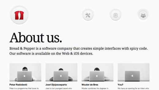
Bread & Pepper
 Bread & Pepper is a software company that creates simple interfaces with spicy code.
UPPERDOG
 Though most browser windows aren’t constantly dragged around, it’s nice that this site adjusts seamlessly (never jumpy).
➤ UPPERDOG
Food Sense
 The logo bounces from the side to the top-center on this site.
➤ Food Sense (via Splashnology)
Jux
 Instead of building out separate apps, Jux has heavily invested in a single, responsive Web design to elegantly adjust to different devices, like the iPhone, iPad and desktop (Disclosure: I worked with them before TNW).
➤ Jux
Endloop Mobile
 Endloop Mobile’s site was built off of a heavily modified responsive wordpress theme.
Gravitate
 Gravitate looks elegant at any size.
➤ Gravitate (via WebDesignDev)
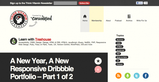
Think Vitamin
 Think Vitamin completely kills its sidebar at smaller sizes.
Clean Air Works
 Clean Air Works completely reformats its menu at smaller sizes.
➤ Clean Air Works (via WebDesignDev)
CSS Grid
 CSS Grid’s site is built around the purpose of using a flexible grid.
➤ CSS Grid
Responsive Illustration
 Built using HTML/CSS + media queries, “this is a simple interactive experiment with responsive design techniques.” We wrote about it previously, here.
The growing connectivity in our society leads to some amazing results, keeping information flowing at an astounding rate, while bringing people closer together. But there some downsides to this new era of consumption, one of them being the way websites are currently designed.
Get the TNW newsletter
Get the most important tech news in your inbox each week.


