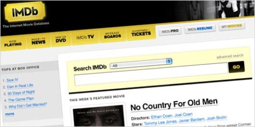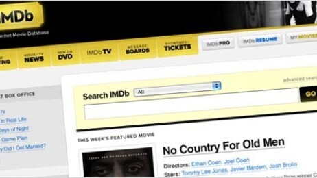
If you’re an entertainment junkie, you surely must have visited IMDb.com several times. It’s an excellent one-stop resource for all your movie and TV information, schedules, trailers, quotes and whatnot but one of the major criticisms most users have about the site is its overloaded design.
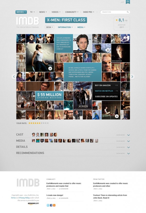
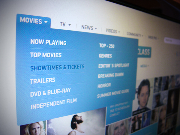
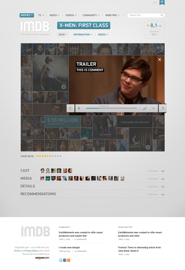
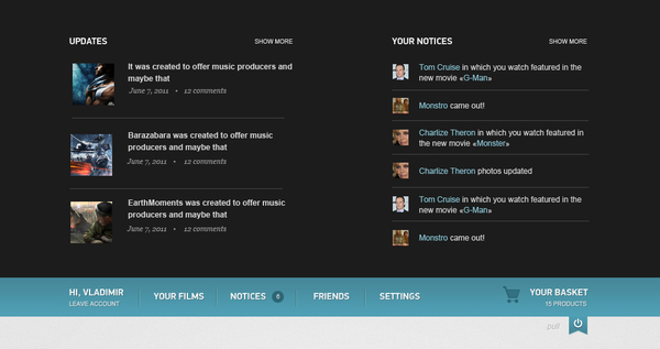
Here’s an interesting redesign concept by web designer Vladimir Kudinov on Behance that illustrates what a completely finessed IMDb — all clean and sleek — could look like, with a bit of an extra: options to stream on Netflix or purchase at Amazon.
The grid design works beautifully as it highlights the most important information within the page in one glance. I’m personally not a huge fan of the color palette used, since I have been accustomed to IMDb’s black and gold color scheme; however, the overall concept definitely makes a lot of sense.
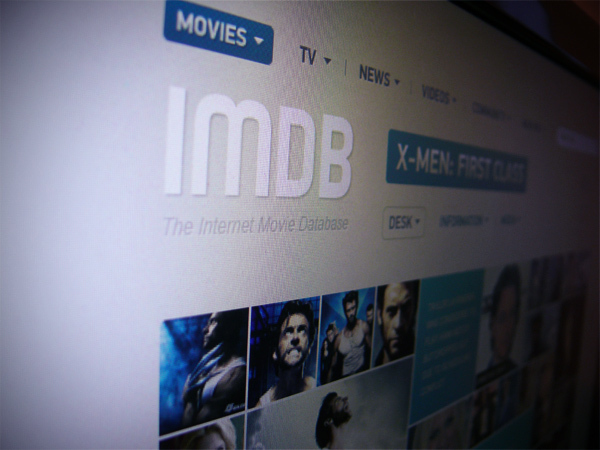
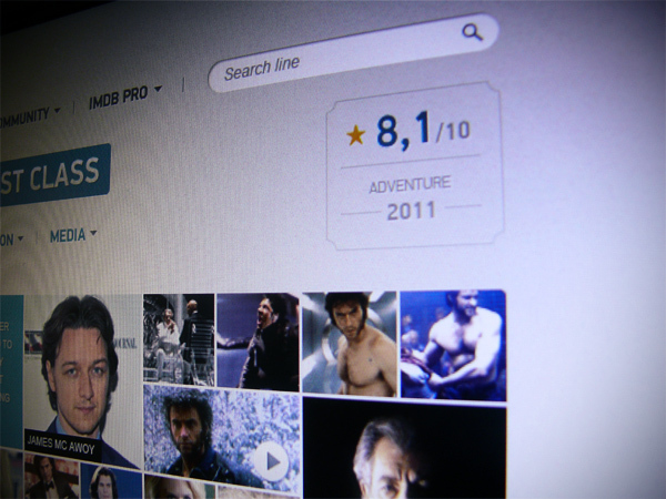
Check out more screenshots below:
Get the TNW newsletter
Get the most important tech news in your inbox each week.


