Social distribution of content by casual users is such a powerful catalyst for traffic growth that there is not a single publication that does not want to harness it. But with every strength comes a weakness, and the desire for increased social reach has led to a new reality of web design: over subscription, or the over socialization of design.
Yes, you know what I am talking about, the annoying spammy reminders of websites to subscribe, and distribute their content (often in a surreptitious manner) that seem to scream that you are not so much a reader than as a potentially tweeting, ‘liking’ tool that they can use.
It hurts my feelings. After scrolling through a good number of the web’s top 25 publications (as counted by Technorati), I have come up with an ironclad rule for website design in regards to self-trumpeting social bits: twice per page is the good-taste maximum. Call it Alex’s rule.
Let’s break into some examples so that you can see what I am talking about, and why I am right. Let’s begin with the Huffington Post. Actually, the good ol’ HuffPo starts well with a tasteful call for readers to connect their social accounts to the website:
It’s not pretty, but it’s small enough to not be annoying. The website then has a second section that wants even more from readers:
This expanded selection caters to all users, no matter the platform or location. It’s nice, and again, it’s small.
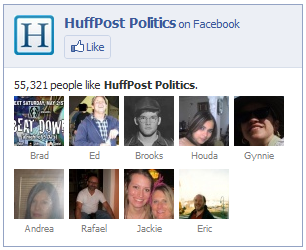
In fact, the HuffingtonPost often adds a Facebook ‘Like’ box to each of its separate topic pages, keeping the total clutter low, while the functionality high. This breaks our two per page rule, but only if the one of the other two elements is shown at the same time. In the two days in which this article was built, their design was a bit inconsistent (a/b testing?), so we can’t say if they are always breaking Alex’s rule. Anyway, this is what they have, usually, at least:
But then the wheels start to fall off of the truck, as the HuffPo just can’t help itself and begins to add in stuff like this:

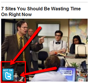
HuffPo loves their readers doing their distribution for them. It’s a bit like hand delivering your friend’s copy of the Times. But HuffPo just keeps on going:
Ok, we added in the red parts, but this is not only an annoying tool, it’s yet another call for free social love, in this case tweets. “It’s hot on Twitter,” the post says, “so be cool and share it!” No thanks. Let’s move on:
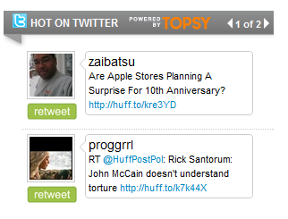
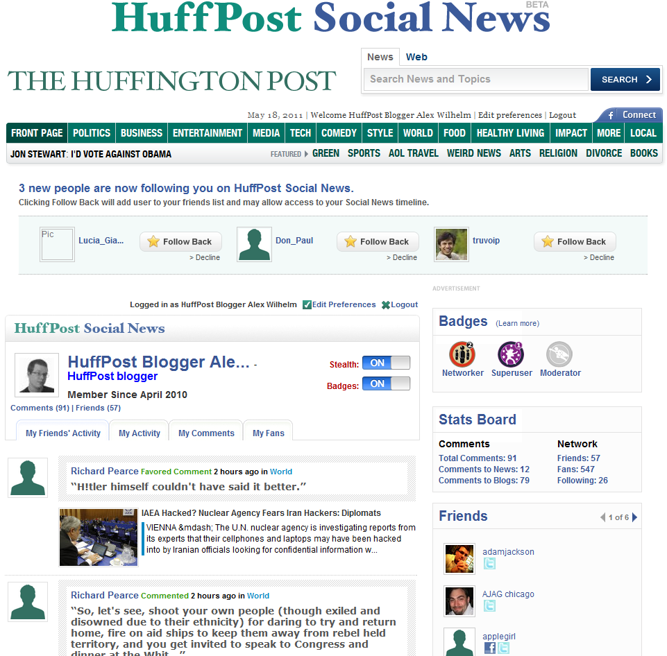
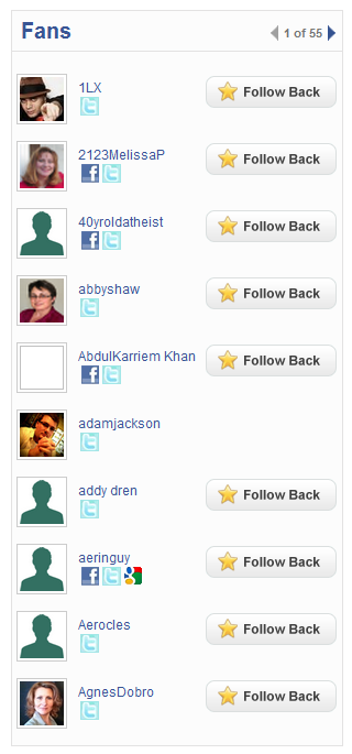
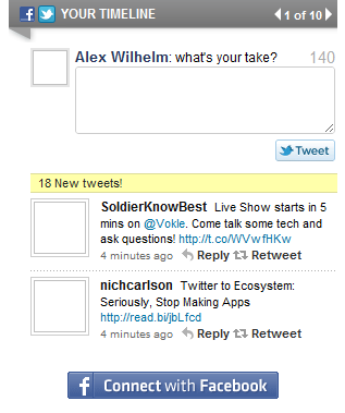
But the real crowing jewel in the HuffPo social tool debacle is a user’s “Social News Page,” or profile page on the site. What follows are elements of my page on the site, for your reference (recall that I have written for the HuffPo so I have a few more ‘fans’ than normal):
But the HuffingtonPost is not alone in suffering from a ridiculously over-subscribed design. Even the savvy Mashable can push it too far:
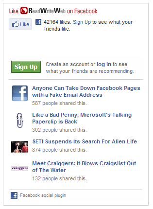
But it is not all bad news. ReadWriteWeb and TechCrunch both are quite minimal. So much so that we took the time to snap some shots to show you how some of the big boys are doing is right:

We don’t mean to pick on the HuffingtonPost, but it is a role model for many online publications, and so its choices have real impact. And we don’t want them to lead the world down the wrong path, now do we? So follow the Alex rule: two social elements per page and you are in the clear. More, and you are just shouting at me.
Sound off in the comments, how annoyed are you by the social invasion of good website design?
Get the TNW newsletter
Get the most important tech news in your inbox each week.


