As we focus on the future of web design (and design in general, for that matter) this week at TNW, it’s worth getting into the subject of how design is going to react when it comes to matters of form factors. We’re consuming more than ever on mobile devices and many sites around the Internet are catering to that fact with fast-loading, low-overhead designs. But is that enough? According to what I’ve found from a couple of designers during my research, not even close.
What’s Going Right?
The first thing that you’ll notice is that even operating systems are becoming more touch-friendly. With that in mind, it’s hard to imagine that our interaction with web-based elements wouldn’t follow the same path. The move right now has been to provide optimized sites for mobile which load faster, tend to have fewer images and often times have very simplistic CSS to make it all work.
This is undoubtedly a good idea, but it’s not the full picture of what needs to happen. What’s the answer? Rather than having different sites for each format, the way forward is to have designs that work equally as well on a tablet/touch format as they do on your laptop.
My idea here was to include an interview with a Midwest-based designer about how his firm is working on sites that do just that. Unfortunately, the flagship site that the firm is designing isn’t live yet, and so he isn’t able to talk specifics. Once it does launch, we’ll come back for a more in-depth view. Suffice it to say, however, what I’ve seen of the site so far is amazing. Firing it up on the iPad it feels just as much at home as it does when looking at it from a desktop browser. Everything just makes sense because nothing changes place.

But how do you do this? According to Mitch Canter of Studio Nashvegas, it’s all about the CSS. Canter works specifically with WordPress. As such, there are some confines to how WordPress operates when attempting to scale from a mobile to a desktop display. However, Canter overcomes those by formatting fonts and styles accordingly.
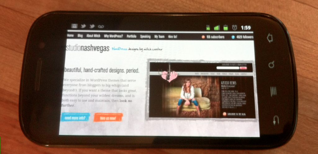
He uses his own site as an example. When viewing Studio Nashvegas on my Nexus S, a quick flip to landscape mode shows very readable fonts without any need to zoom in to any one area or another. Canter also uses larger elements on the page, allowing them to be touched more easily for navigation, rather than having tiny menu items that require filed down fingertips.
All of this leads to a generation of web design that completely forgoes specific mobile formatting in exchange for simply loading elements that work. While many of us have been fans of WordPress themes such as WP Touch, it seems that the way forward is to provide your site in full, with only minor changes to make it more usable on other formats.
Sure, you could say that my claim of forgetting about mobile formats is a bit of a stretch. I suppose that the more accurate description would be that you should forget about changing your format completely in order to make mobile happen. Re-think what you are doing with your design, look at how it would work on mobile and then change things accordingly. It’s your site, people should be able to enjoy it no matter what (modern) device that they happen to be using.
Want to keep up with the latest? Make sure to add TNW’s Design and Dev to your daily reading list.
Get the TNW newsletter
Get the most important tech news in your inbox each week.


